Case Media
Case Notes
This page keeps the media, full prompt, and original source together so you can inspect the result first and decide whether the prompt is worth copying, saving, or comparing.
Case Insights
To make this page easier to search, cite, and reuse later, the case is also broken down into practical guidance about usage, visual cues, and prompt structure.
Best Fit Scenarios
- Use this as a ui & social screens benchmark when you need a fast style baseline before rewriting your own prompt.
- It is especially helpful if your target overlaps with Portrait, Poster, UI and you want to judge the image result before tuning wording.
- Keep it as a control sample when you compare nearby prompt variants one variable at a time.
Visual Signals To Notice
- The clearest style signals here are Portrait, Poster, UI, so those should usually stay in your first rewrite.
- The important layer is usually interface density, card hierarchy, and how the screen tells the story before you read small text.
- This case keeps 2 media outputs, which makes it easier to check whether the style remains stable across multiple results.
How The Prompt Is Structured
- The prompt reads as a long, highly specified prompt, which is useful when you want to judge how much specificity this direction needs.
- Its keyword cluster is centered on Portrait, Poster, UI, so you can usually keep that cluster while swapping subject, camera, layout, or copy details.
- A practical rewrite path is: keep the outcome, keep the strongest style cues, then replace only the subject and environment blocks.
Good Follow-up Questions
- What changes first if you keep Portrait, Poster, UI but switch the subject matter?
- Which part of the result comes from section-level structure (UI & Social Screens) versus tag-level style cues?
- Which related cases in the same section give you a cleaner or more extreme variation of the same direction?
Full Prompt
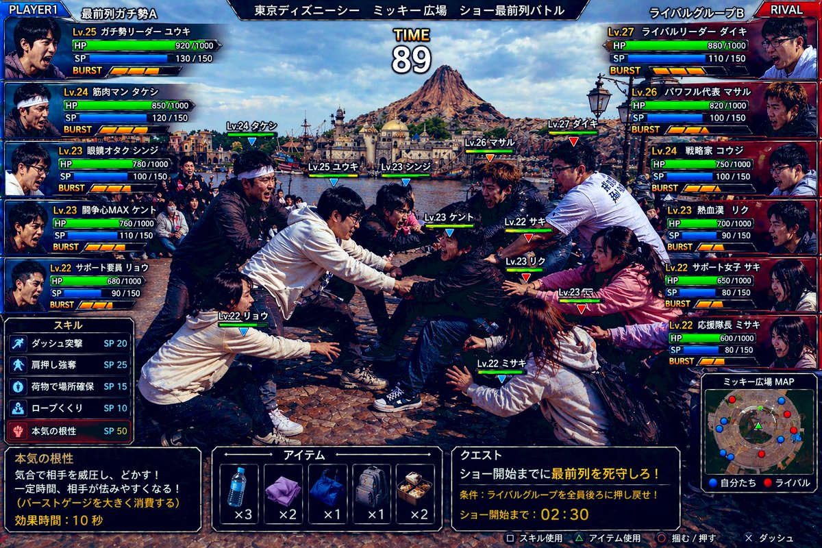
Create a hyper-detailed comedic Japanese arcade fighting game screenshot styled like a versus battle scene, using a real-world photo aesthetic with game UI overlaid on top. The scene shows an intense mock battle between two groups of theme-park fans competing for the front row at an outdoor show plaza in Tokyo DisneySea. Use a wide 16:9 composition. In the background, clearly show Mediterranean Harbor and Mount Prometheus under bright daytime skies, with the waterfront and DisneySea architecture visible. In the foreground, show exactly 10 young adult people in winter casual clothing, split into 2 opposing teams of 5, physically leaning, grabbing, reaching, and shoving in a tug-of-war-like scrum over position, with exaggerated competitive body language and frozen action as if in a fighting game. Faces should be anonymized with soft blurred blocks. Add floating character labels above each person with levels and names in Japanese. The overall tone is absurdly realistic, like a real candid photo transformed into a polished arcade game battle screen. Add a full Japanese fighting-game HUD with glossy blue-versus-red interface styling. At the very top, place a center stage title bar reading "東京ディズニーシー ミッキー広場 ショー最前列バトル" and a large timer in the middle reading "TIME 89". In the top left, add a blue team header "PLAYER1" and team name "最前列ガチ勢A". In the top right, add a red team header "RIVAL" and team name "ライバルグループB". On the left side, stack exactly 5 blue player status panels with portraits, level, Japanese class-like nicknames, HP, SP, and BURST meters. The 5 left-side labels are: "Lv.25 ガチ勢リーダー ユウキ", "Lv.24 筋肉マン タケシ", "Lv.23 眼鏡オタク シンジ", "Lv.23 開角心MAX ケント", "Lv.22 サポート要員 リョウ". On the right side, stack exactly 5 red rival status panels with the labels: "Lv.27 ライバルリーダー ダイキ", "Lv.26 パワフル代表 マサル", "Lv.24 戦略家 コウジ", "Lv.23 熱血漢 リク", "Lv.22 サポート女子 サキ". Each panel should include numeric HP and SP values and segmented BURST gauges, styled like a Japanese arcade RPG-fighter interface. Place exactly 10 in-battle nameplates above the fighters in the center scene, color-coded blue for the left team and red for the right team. The 10 labels are: "Lv.24 タケシ", "Lv.25 ユウキ", "Lv.23 シンジ", "Lv.23 ケント", "Lv.22 リョウ", "Lv.27 ダイキ", "Lv.26 マサル", "Lv.23 リク", "Lv.22 サキ", "Lv.22 ミサキ". At the lower left, add a skill menu titled "スキル" listing exactly 5 skills with SP costs: "ダッシュ突撃 SP 20", "肩押し強奪 SP 25", "荷物で場所確保 SP 15", "ロープくぐり SP 10", "本気の根性 SP 50". Beneath that, add a dark description box explaining the highlighted skill "本気の根性" with the Japanese text: "気合で相手を威圧し、どかす! 一定時間、相手が怯みやすくなる! (バーストゲージを大きく消費する) 効果時間:10秒". At the bottom center, add an item menu titled "アイテム" with exactly 5 item slots showing icons and counts: a water bottle "x3", a folded purple towel "x2", a blue drawstring bag "x1", a gray backpack "x1", and a boxed meal "x2". At the lower right, add a quest panel titled "クエスト" with the mission text "ショー開始までに最前列を死守しろ!" and condition text "条件:ライバルグループを全員後ろに押し戻せ!" and countdown text "ショー開始まで:02:30". Beside it, add a mini-map titled "ミッキー広場MAP" showing red and blue dots for both teams in the plaza. Along the very bottom edge, include small controller prompts in Japanese for actions such as skill use, item use, grab/push, and dash. Use dramatic, saturated lighting, crisp detail, realistic clothing folds, authentic plaza stone pavement, and a high-end Japanese game screenshot look. The image should feel like a ridiculous but believable crossover between a real Tokyo DisneySea crowd photo and a competitive arcade battle game interface.