Case Media
Case Notes
This page keeps the media, full prompt, and original source together so you can inspect the result first and decide whether the prompt is worth copying, saving, or comparing.
Case Insights
To make this page easier to search, cite, and reuse later, the case is also broken down into practical guidance about usage, visual cues, and prompt structure.
Best Fit Scenarios
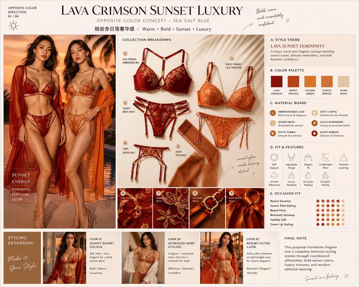
- Use this as a ui & social screens benchmark when you need a fast style baseline before rewriting your own prompt.
- It is especially helpful if your target overlaps with Fashion, Poster, UI and you want to judge the image result before tuning wording.
- Keep it as a control sample when you compare nearby prompt variants one variable at a time.
Visual Signals To Notice
- The clearest style signals here are Fashion, Poster, UI, so those should usually stay in your first rewrite.
- The important layer is usually interface density, card hierarchy, and how the screen tells the story before you read small text.
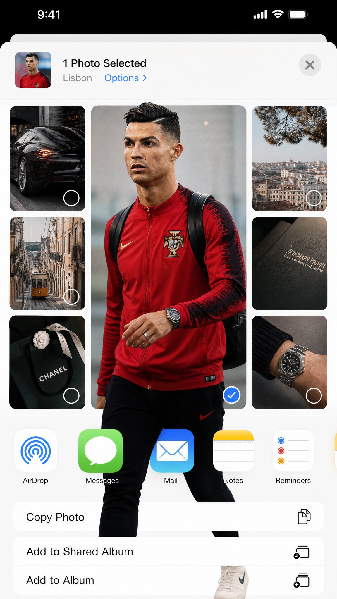
- This case keeps 2 media outputs, which makes it easier to check whether the style remains stable across multiple results.
How The Prompt Is Structured
- The prompt reads as a long, highly specified prompt, which is useful when you want to judge how much specificity this direction needs.
- Its keyword cluster is centered on Fashion, Poster, UI, so you can usually keep that cluster while swapping subject, camera, layout, or copy details.
- A practical rewrite path is: keep the outcome, keep the strongest style cues, then replace only the subject and environment blocks.
Good Follow-up Questions
- What changes first if you keep Fashion, Poster, UI but switch the subject matter?
- Which part of the result comes from section-level structure (UI & Social Screens) versus tag-level style cues?
- Which related cases in the same section give you a cleaner or more extreme variation of the same direction?
Full Prompt
Transform the uploaded image into a highly stylized iOS photo-selection interface collage while keeping ALL original iPhone / iOS system elements completely unchanged, authentic, and photorealistic. 4:5 ratio The final image must look EXACTLY like a real screenshot captured from an actual iPhone while selecting or sharing photos inside Instagram Stories, iOS Photos, or the native Share Sheet. EXTREMELY IMPORTANT: - Preserve the real iOS interface design exactly. - Keep authentic Apple UI proportions, spacing, typography, icons, buttons, status bar, battery, signal, dynamic island, navigation layout, AirDrop icon, and app icons unchanged. - DO NOT redesign the operating system. - DO NOT create a futuristic UI. - DO NOT invent fake app elements. - It must feel indistinguishable from a genuine iPhone screenshot. MAIN VISUAL STYLE: - Editorial fashion collage - Pinterest / Are .na / luxury moodboard aesthetic - Rounded rectangle image cards - Minimal luxury lifestyle feeling - Neutral beige / gray / soft white palette - Soft daylight - Realistic shadows - Subtle grain and phone screenshot compression - Spacious clean layout - Elegant asymmetrical composition VERY IMPORTANT — FRAME BREAK EFFECT: The subject MUST physically break outside the image frame boundaries. The “out of frame” effect should feel dimensional and realistic: - legs extending beyond the rounded photo card - shoes overlapping the white UI background - hands, bags, hair, jackets, or clothing protruding outside the crop - layered overlap between neighboring image cards - depth illusion as if the subject exists above the interface This effect is mandatory. The overlap must look natural, realistic, and integrated with the iOS interface — NOT like a sticker pasted on top. COMPOSITION: - One large dominant central image - Several smaller supporting images around it - Rounded corners everywhere - Authentic iOS share-sheet layout - Realistic mobile screenshot proportions - Large white negative space - Editorial balance - Clean modern composition VISUAL MOOD: - luxury editorial photography - casual European street fashion - curated lifestyle archive - minimalist tech aesthetic - polished but organic LIGHTING: - soft daylight - muted contrast - realistic reflections - subtle shadows - natural depth DO NOT: - distort iOS UI - replace Apple fonts - create fantasy interface elements - flatten the collage - make it look like a poster - remove the realism of the screenshot The final result should feel like: “A real iPhone screenshot of an ultra-stylish editorial photo-selection interface where the subject physically escapes the image frames.”