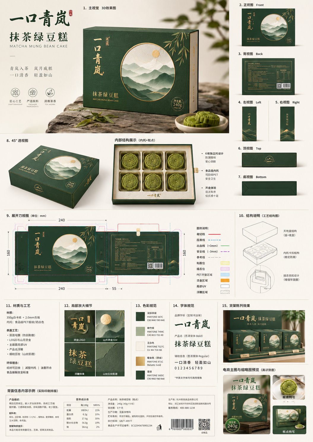
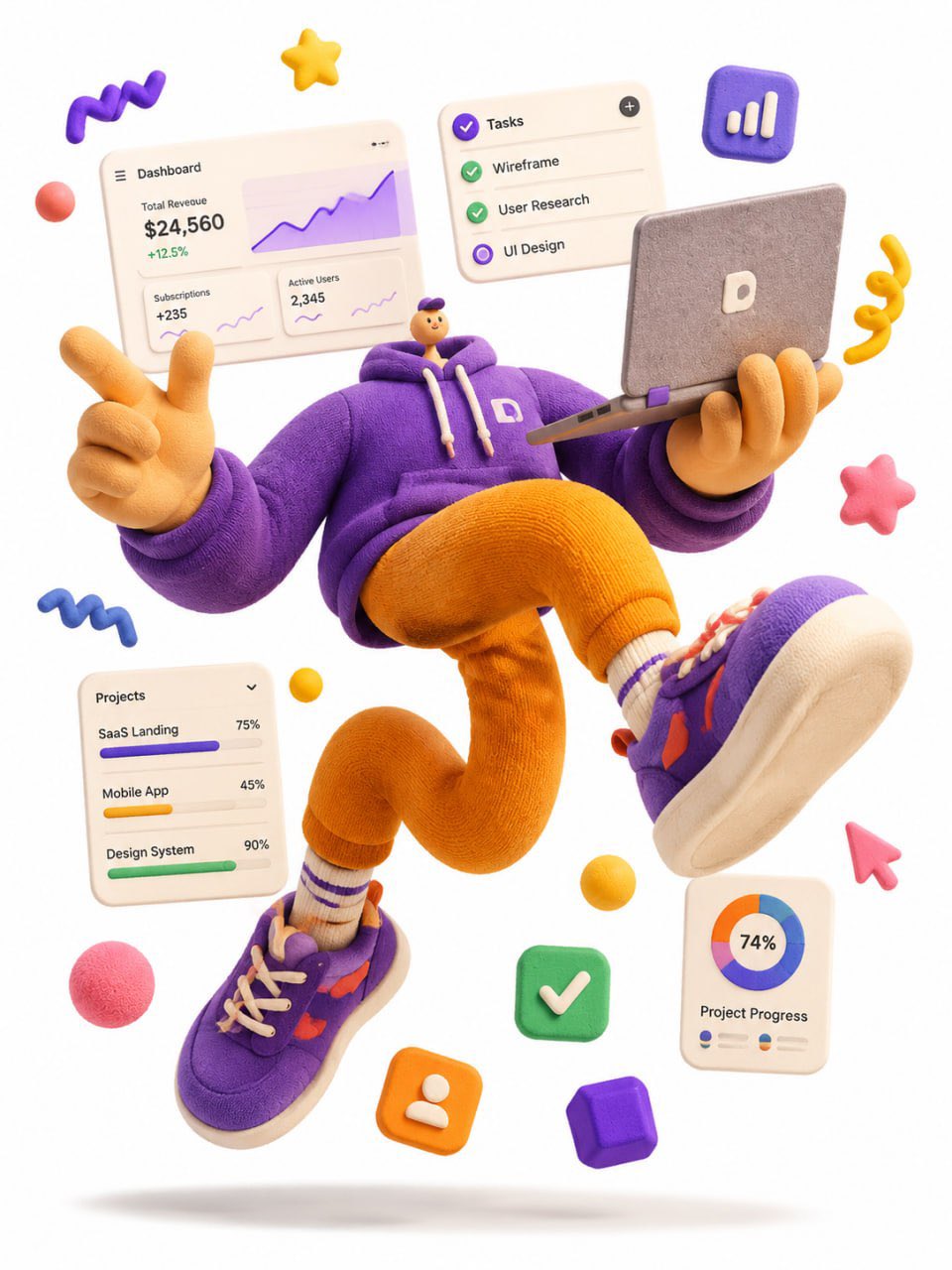
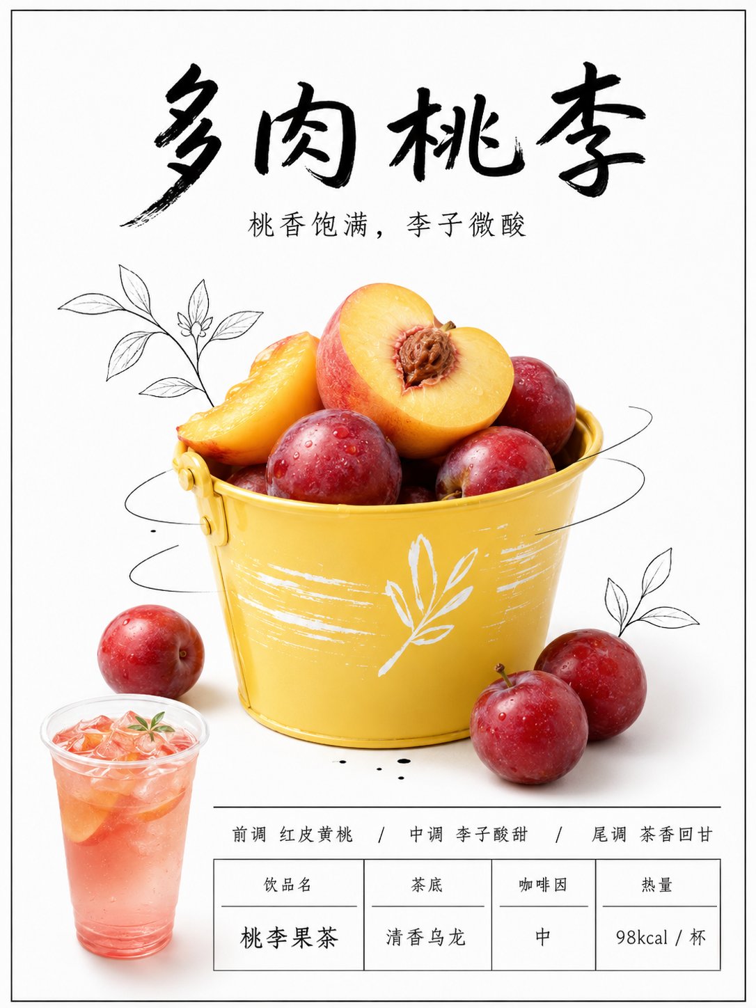
Case Media
Case Notes
This page keeps the media, full prompt, and original source together so you can inspect the result first and decide whether the prompt is worth copying, saving, or comparing.
Case Insights
To make this page easier to search, cite, and reuse later, the case is also broken down into practical guidance about usage, visual cues, and prompt structure.
Best Fit Scenarios
- Use this as a ui & social screens benchmark when you need a fast style baseline before rewriting your own prompt.
- It is especially helpful if your target overlaps with Fashion, Poster, Illustration and you want to judge the image result before tuning wording.
- Keep it as a control sample when you compare nearby prompt variants one variable at a time.
Visual Signals To Notice
- The clearest style signals here are Fashion, Poster, Illustration, so those should usually stay in your first rewrite.
- The important layer is usually interface density, card hierarchy, and how the screen tells the story before you read small text.
- This case keeps 2 media outputs, which makes it easier to check whether the style remains stable across multiple results.
How The Prompt Is Structured
- The prompt reads as a long, highly specified prompt, which is useful when you want to judge how much specificity this direction needs.
- Its keyword cluster is centered on Fashion, Poster, Illustration, so you can usually keep that cluster while swapping subject, camera, layout, or copy details.
- A practical rewrite path is: keep the outcome, keep the strongest style cues, then replace only the subject and environment blocks.
Good Follow-up Questions
- What changes first if you keep Fashion, Poster, Illustration but switch the subject matter?
- Which part of the result comes from section-level structure (UI & Social Screens) versus tag-level style cues?
- Which related cases in the same section give you a cleaner or more extreme variation of the same direction?
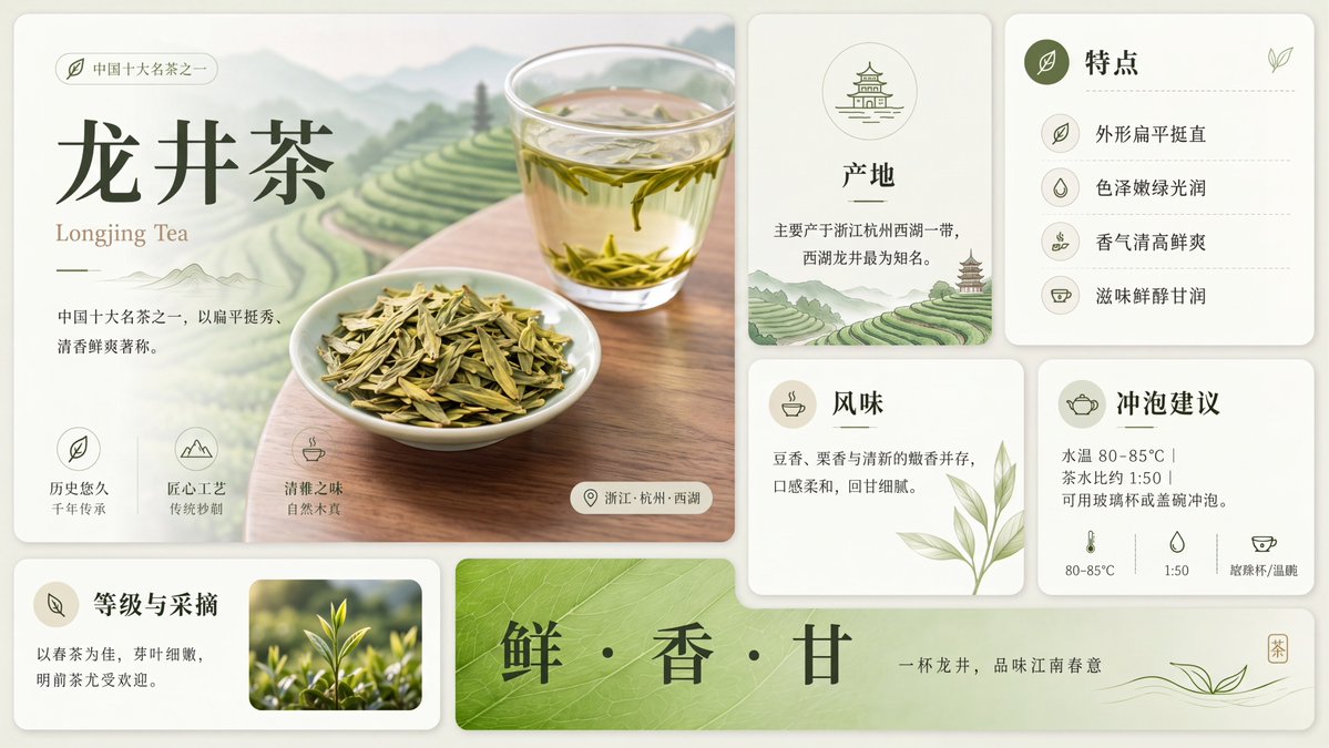
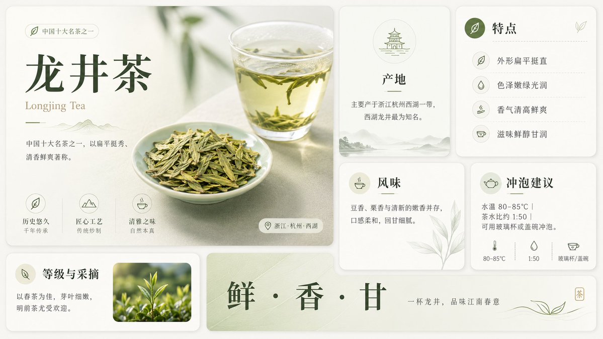
Full Prompt
Goal: Create a clean premium Chinese tea infographic poster about {argument name="tea name" default="龙井茶"}, with an elegant editorial layout, soft natural lighting, and a refined off-white and sage-green palette. Canvas: Wide horizontal 16:9 composition, approximately 1200×675 px, with a warm ivory background and rounded-card UI layout. Use subtle shadows, thin dividers, pale green botanical accents, and minimalist line icons. Overall style should feel like a polished lifestyle magazine infographic for a famous Chinese tea. Layout: Use exactly 8 rounded rectangular content cards plus 1 long bottom slogan banner. Arrange them in a neat grid. Left side contains one large hero card occupying about half the width and most of the height. Right side contains four smaller information cards in a 2×2 grid. Bottom left contains one small card. Bottom center/right contains one long horizontal slogan banner. Keep generous spacing and consistent rounded corners. Main hero card: Show a softly lit tabletop scene with a clear glass cup of pale yellow-green tea in the upper right, visible floating Longjing tea leaves, and a small white porcelain dish piled with flat green tea leaves in the lower center. Add blurred green plant shadows in the background. Text on the left: small pill label with a leaf icon and {argument name="category label" default="中国十大名茶之一"}; large dark-green Chinese title {argument name="tea name" default="龙井茶"}; smaller English subtitle “Longjing Tea”; short description in Chinese: “中国十大名茶之一,以扁平挺秀、清香鲜爽著称。” At the bottom of this hero card, include exactly 3 feature icon blocks: 1) leaf icon, label “历史悠久”, sublabel “千年传承”; 2) mountain icon, label “匠心工艺”, sublabel “传统炒制”; 3) teacup icon, label “清雅之味”, sublabel “自然本真”. Add a small location pill at the lower right with a pin icon and text “浙江·杭州·西湖”. Right information cards: Create exactly 4 cards. Card 1, top middle: “产地” with a small pagoda/temple line icon in a circle, text “主要产于浙江杭州西湖一带,西湖龙井最为知名。” and faint misty mountain scenery along the bottom. Card 2, top right: “特点” with a dark green circular leaf icon and exactly 4 listed rows separated by dotted lines: “外形扁平挺直”, “色泽嫩绿光润”, “香气清高鲜爽”, “滋味鲜醇甘润”, each with a small matching line icon. Card 3, lower middle: “风味” with a teacup icon, text “豆香、栗香与清新的嫩香并存,口感柔和,回甘细腻。” and a pale botanical leaf illustration in the lower right. Card 4, lower right: “冲泡建议” with a teapot icon, text “水温 80–85°C | 茶水比例 1:50 | 可用玻璃杯或盖碗冲泡。” At the bottom of this card include exactly 3 small brewing icons and labels: thermometer “80–85°C”, water drop “1:50”, teacup “玻璃杯/盖碗”. Bottom left card: “等级与采摘” with a leaf icon badge, text “以春茶为佳,芽叶细嫩,明前茶尤受欢迎。” and one rectangular photo inset on the right showing fresh bright green tea shoots growing outdoors with shallow depth of field. Bottom slogan banner: A long pale green banner with subtle tea-leaf texture. Center the large dark-green Chinese slogan {argument name="slogan text" default="鲜 · 香 · 甘"}. On the right add smaller text “一杯龙井,品味江南春意”, a delicate flowing line drawing of tea leaves, and a tiny vertical square seal containing “茶”. Visual style: Premium minimal Chinese design, soft natural photography mixed with clean vector icons, warm ivory cards, sage green accents, dark forest-green typography, thin elegant Chinese serif-style font for headings, smaller gray-green body text, balanced whitespace, subtle paper texture, no clutter. Constraints: Use exactly the card count and item counts described above. Keep all Chinese text crisp and legible. Do not add extra sections, extra icons, watermarks, logos, people, or unrelated decorative objects.