Case Media
Case Notes
This page keeps the media, full prompt, and original source together so you can inspect the result first and decide whether the prompt is worth copying, saving, or comparing.
Case Insights
To make this page easier to search, cite, and reuse later, the case is also broken down into practical guidance about usage, visual cues, and prompt structure.
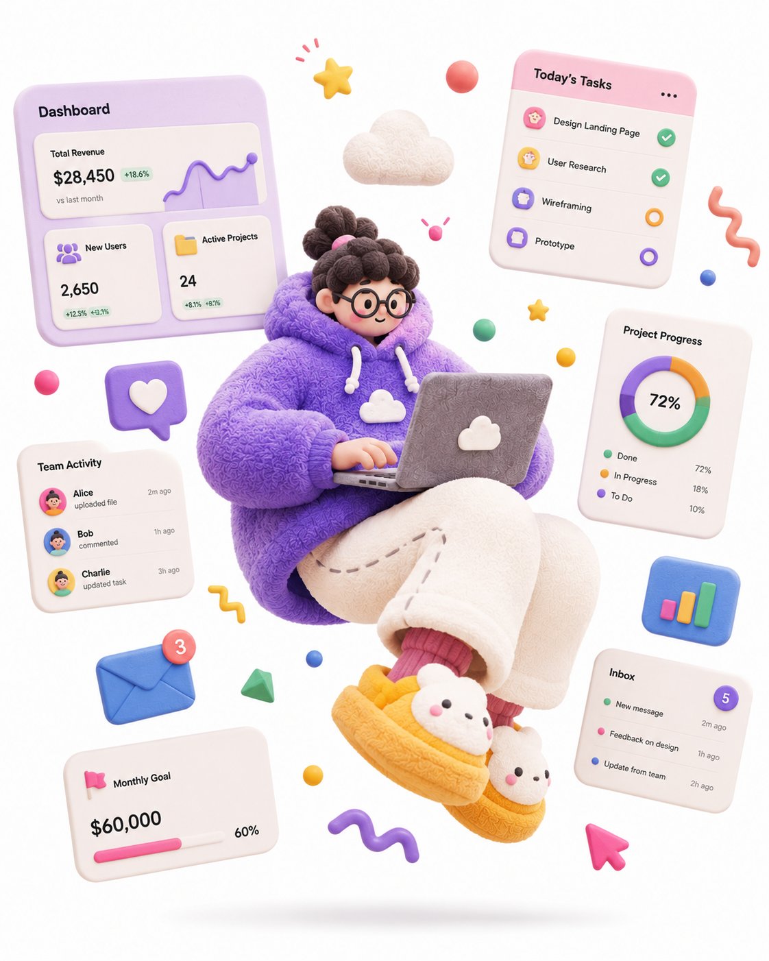
Best Fit Scenarios
- Use this as a ui & social screens benchmark when you need a fast style baseline before rewriting your own prompt.
- It is especially helpful if your target overlaps with Fashion, Illustration, UI and you want to judge the image result before tuning wording.
- Keep it as a control sample when you compare nearby prompt variants one variable at a time.
Visual Signals To Notice
- The clearest style signals here are Fashion, Illustration, UI, so those should usually stay in your first rewrite.
- The important layer is usually interface density, card hierarchy, and how the screen tells the story before you read small text.
- This case keeps 2 media outputs, which makes it easier to check whether the style remains stable across multiple results.
How The Prompt Is Structured
- The prompt reads as a long, highly specified prompt, which is useful when you want to judge how much specificity this direction needs.
- Its keyword cluster is centered on Fashion, Illustration, UI, so you can usually keep that cluster while swapping subject, camera, layout, or copy details.
- A practical rewrite path is: keep the outcome, keep the strongest style cues, then replace only the subject and environment blocks.
Good Follow-up Questions
- What changes first if you keep Fashion, Illustration, UI but switch the subject matter?
- Which part of the result comes from section-level structure (UI & Social Screens) versus tag-level style cues?
- Which related cases in the same section give you a cleaner or more extreme variation of the same direction?
Full Prompt
A complete single 3D illustration, exaggerated artistic editorial illustration style, not storyboard, not a collage layout. The subject is an exaggerated cartoon character with a tiny head, round chubby body, extremely elongated limbs, oversized hands and oversized shoes, off-balance center of gravity, frozen mid-air in a dramatic jumping pose, with strong tension and comedic energy. Overall form looks like a soft sculpture toy round, chunky, bouncy, exaggerated not anatomically correct. Materials are matte soft rubber, fuzzy fabric, knitted texture, plasticine feel, with fine fiber details, slight grain, hand-sculpted touch avoid glossy plastic toy look, avoid translucent glass look, avoid high reflections. High-saturation dopamine color palette, bold color clashes, large flat color blocks, bright but not over-glowing. Clean white background, minimal space, only a soft oval shadow on the ground, no complex scene. Floating abstract graphic elements around the character: stars, squiggle lines, balls, cubes, icons, symbols all rendered as soft rubber or paper props to enhance motion and design feel. Soft studio lighting, global illumination, soft shadows, low contrast, clean commercial render. C4D / Blender 3D illustration, stylized soft sculpture, matte clay material, fuzzy fabric texture, knitted surface detail, playful editorial 3D illustration, high quality. Theme: a SaaS-hoodie product designer floating with a laptop, surrounded by dashboard UI cards, charts and task widgets, hero illustration for a SaaS landing page