Case Media
Case Notes
This page keeps the media, full prompt, and original source together so you can inspect the result first and decide whether the prompt is worth copying, saving, or comparing.
Case Insights
To make this page easier to search, cite, and reuse later, the case is also broken down into practical guidance about usage, visual cues, and prompt structure.
Best Fit Scenarios
- Use this as a ui & social screens benchmark when you need a fast style baseline before rewriting your own prompt.
- It is especially helpful if your target overlaps with Fashion, Poster, UI and you want to judge the image result before tuning wording.
- Keep it as a control sample when you compare nearby prompt variants one variable at a time.
Visual Signals To Notice
- The clearest style signals here are Fashion, Poster, UI, so those should usually stay in your first rewrite.
- The important layer is usually interface density, card hierarchy, and how the screen tells the story before you read small text.
- This case keeps one primary output, so the first image should be treated as the main visual reference.
How The Prompt Is Structured
- The prompt reads as a long, highly specified prompt, which is useful when you want to judge how much specificity this direction needs.
- Its keyword cluster is centered on Fashion, Poster, UI, so you can usually keep that cluster while swapping subject, camera, layout, or copy details.
- A practical rewrite path is: keep the outcome, keep the strongest style cues, then replace only the subject and environment blocks.
Good Follow-up Questions
- What changes first if you keep Fashion, Poster, UI but switch the subject matter?
- Which part of the result comes from section-level structure (UI & Social Screens) versus tag-level style cues?
- Which related cases in the same section give you a cleaner or more extreme variation of the same direction?
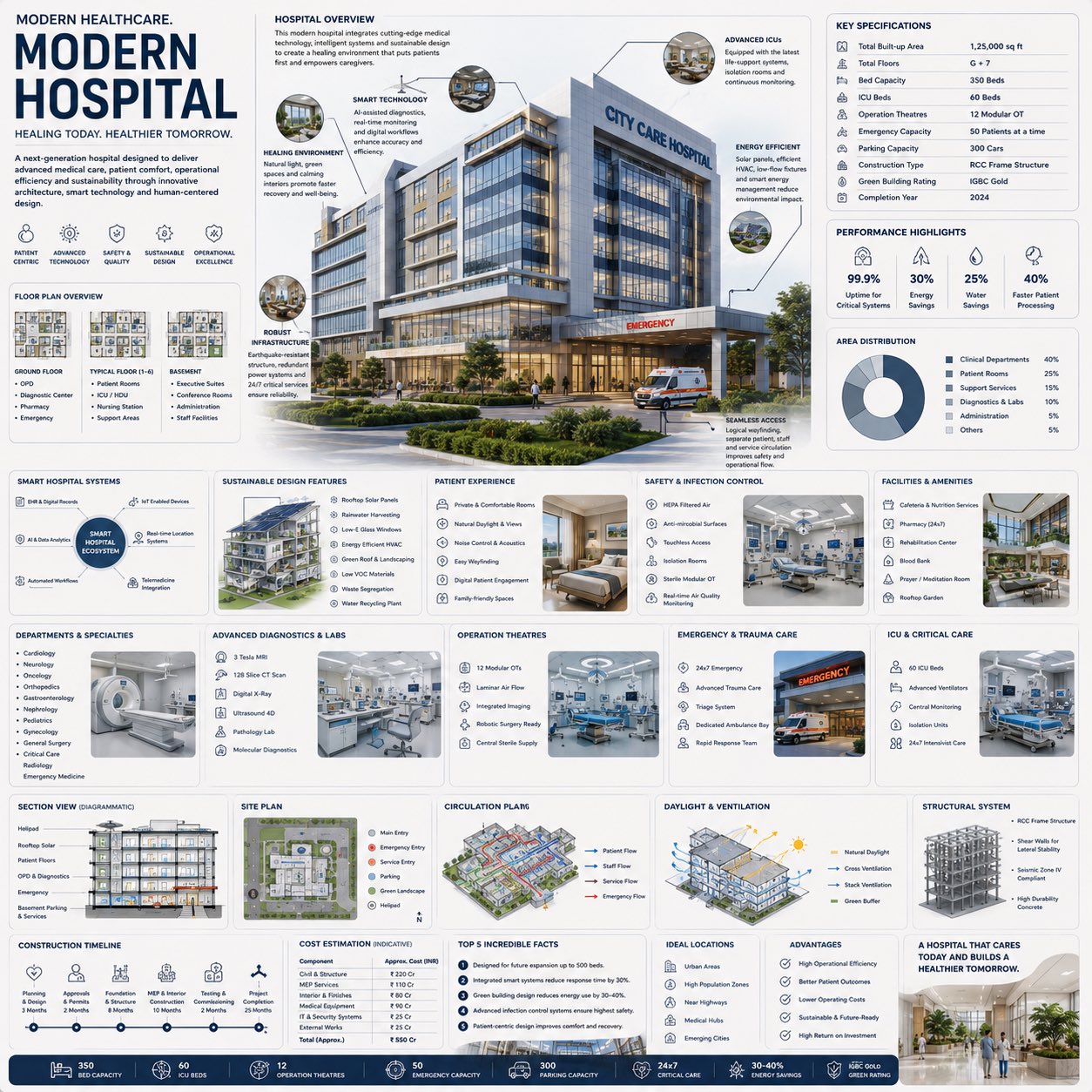
Full Prompt
Create a premium square “reference-style healthcare architecture infographic” centered around a futuristic {HOSPITAL_NAME} modern hospital, designed as a beautifully curated medical infrastructure handbook page rather than a healthcare advertisement. The composition should feel like a modern visual encyclopedia mixed with an elite hospital design manual and high-end editorial infographic system. Visual Direction: • 1:1 square composition • Soft light-toned healthcare background with subtle blueprint textures, architectural schematics, and clean medical UI elements • Elegant muted palette using white, soft gray, steel blue, navy accents, muted teal, and warm ambient lighting • Refined editorial typography hierarchy • Rounded modular information cards with clean spacing • Gentle realistic shadows and premium UI-style dividers • Minimal medical and architectural iconography • Extremely detailed central hospital render viewed in dramatic three-quarter exterior perspective during soft daylight or golden-hour lighting • Thin precision annotation lines pointing toward infrastructure systems and healthcare design features • Clean, organized “knowledge-first” layout with high information density but breathable spacing Main Subject Presentation: A stunning ultra-detailed realistic render of the {HOSPITAL_NAME} modern hospital placed at the center, featuring premium architectural realism, glass façades, emergency zones, sustainable landscaping, realistic reflections, warm healthcare lighting, ambulances, patient access systems, and advanced medical infrastructure detailing. Surround the hospital with scientific and architectural callouts explaining: • emergency care systems • ICU infrastructure • smart hospital technology • infection control systems • sustainable building systems • energy-efficient HVAC • patient circulation planning • modular operation theatres • medical diagnostics infrastructure • healing-centered architecture Include modular infographic sections such as: • Hospital Overview • Key Specifications • Floor Plan Overview • Departments & Specialties • Advanced Diagnostics & Labs • Emergency & Trauma Care • ICU & Critical Care Systems • Smart Hospital Ecosystem • Safety & Infection Control • Sustainability Features • Patient Experience Design • Sectional Architectural Views • Circulation & Workflow Planning • Construction Timeline • Cost Estimation (Indicative) • Advantages & Performance Highlights • “Top 5 Incredible Facts” section • Future Healthcare Innovation Potential Add small premium visualization modules like: • floor plan diagrams • sectional architectural cut views • airflow & ventilation graphics • patient/staff circulation maps • emergency response workflow diagrams • smart hospital network systems • energy efficiency charts • medical equipment visualization panels • sustainability breakdown graphics • miniature blueprint elevation views Style Keywords: “premium healthcare encyclopedia” “editorial hospital architecture handbook” “high-end medical infrastructure infographic” “scientific healthcare poster” “museum-quality hospital reference page” “modular healthcare knowledge system” “clean architectural editorial design” “ultra-detailed medical infrastructure visualization” Avoid: • generic healthcare advertisements • cluttered brochure aesthetics • excessive futuristic sci-fi fantasy • dark dystopian environments • dramatic disaster/emergency scenes • overly corporate marketing layouts The final result should resemble a professionally published healthcare infrastructure reference-book page created for architects, medical planners, healthcare designers, engineers, and educational design archives