Case Media
Case Notes
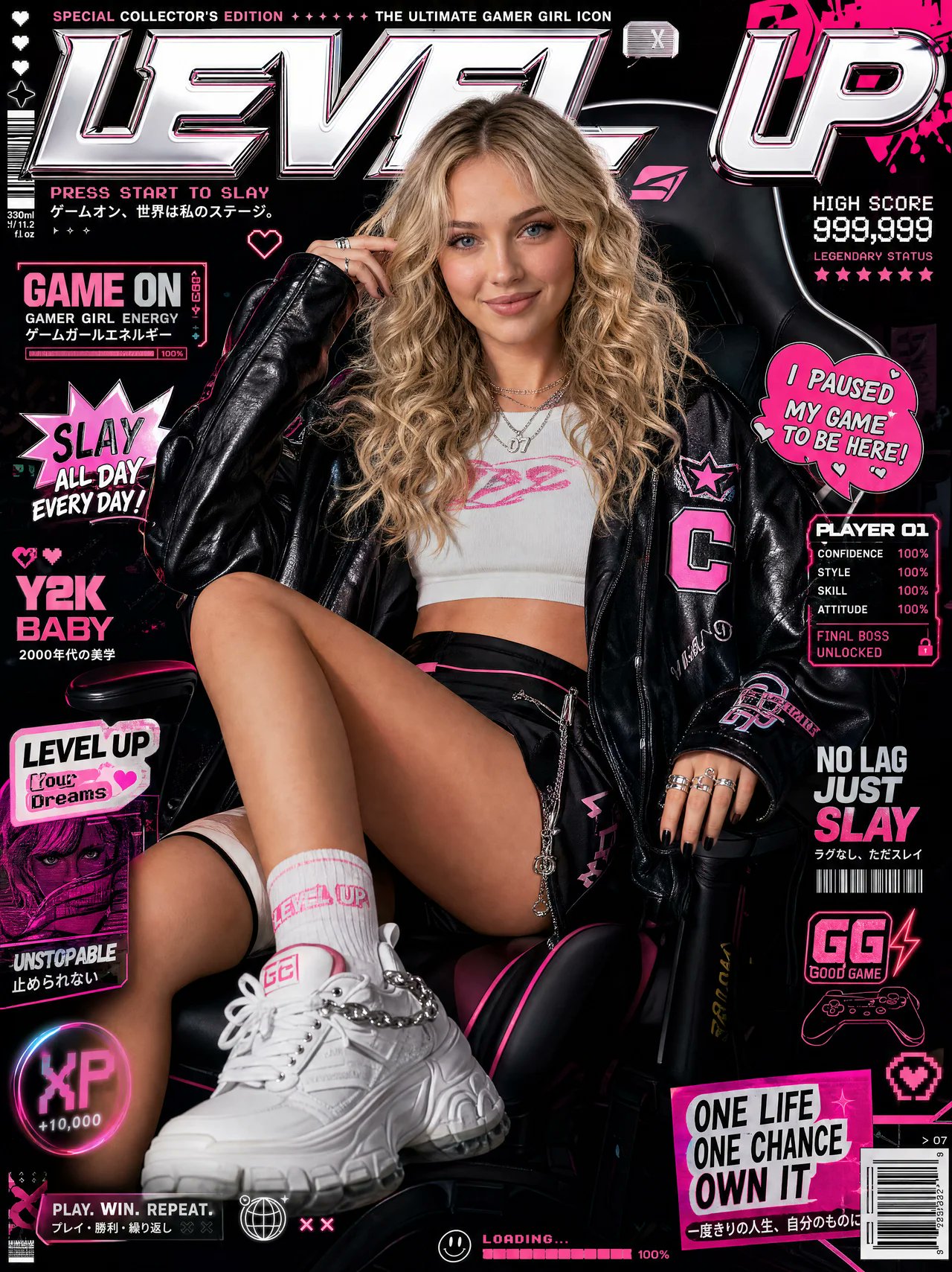
This page keeps the media, full prompt, and original source together so you can inspect the result first and decide whether the prompt is worth copying, saving, or comparing.
Case Insights
To make this page easier to search, cite, and reuse later, the case is also broken down into practical guidance about usage, visual cues, and prompt structure.
Best Fit Scenarios
- Use this as a ui & social screens benchmark when you need a fast style baseline before rewriting your own prompt.
- It is especially helpful if your target overlaps with Cinematic, Fashion, Poster and you want to judge the image result before tuning wording.
- Keep it as a control sample when you compare nearby prompt variants one variable at a time.
Visual Signals To Notice
- The clearest style signals here are Cinematic, Fashion, Poster, so those should usually stay in your first rewrite.
- The important layer is usually interface density, card hierarchy, and how the screen tells the story before you read small text.
- This case keeps one primary output, so the first image should be treated as the main visual reference.
How The Prompt Is Structured
- The prompt reads as a long, highly specified prompt, which is useful when you want to judge how much specificity this direction needs.
- Its keyword cluster is centered on Cinematic, Fashion, Poster, so you can usually keep that cluster while swapping subject, camera, layout, or copy details.
- A practical rewrite path is: keep the outcome, keep the strongest style cues, then replace only the subject and environment blocks.
Good Follow-up Questions
- What changes first if you keep Cinematic, Fashion, Poster but switch the subject matter?
- Which part of the result comes from section-level structure (UI & Social Screens) versus tag-level style cues?
- Which related cases in the same section give you a cleaner or more extreme variation of the same direction?
Full Prompt
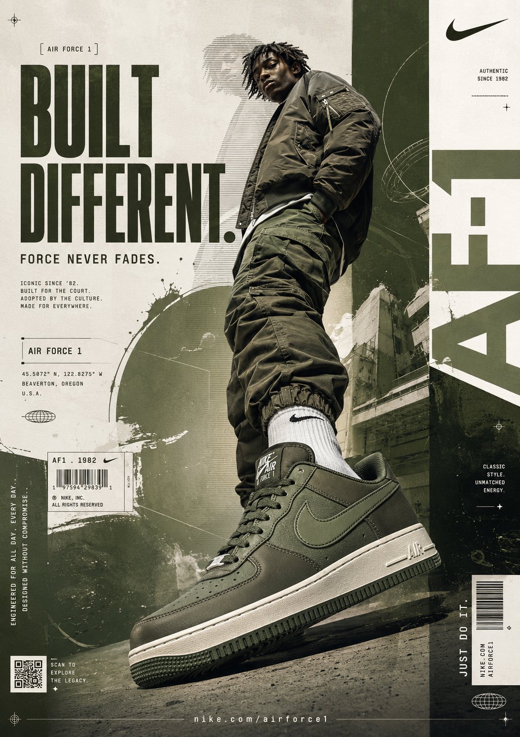
[BRAND NAME = NIKE] [PRODUCT = NIKE AIR FORCE 1] [COLORWAY = MOODY GREEN / SAIL / DARK OLIVE] Act as a world-class Nike campaign art director, luxury streetwear branding specialist, and digital collage designer creating a global-level sneaker advertisement blending Nike editorial campaigns, dystopian streetwear graphics, and high-fashion urban poster aesthetics. PHASE 1: VISUAL CONCEPT Create an aggressive high-fashion sneaker poster where the Nike Air Force 1 dominates the composition like a monument. The design language should feel: - Tactical - Architectural - Urban luxury - Editorial - Cinematic - Minimal-chaos Core Mood: “BUILT DIFFERENT.” Visual Energy: Quiet dominance. Street authority. Modern Nike campaign identity. The poster should feel like: Nike × ACRONYM × Off-White × dystopian magazine design. PHASE 2: MODEL & SHOE COMPOSITION Main Subject: One male streetwear model (18–30) Expression: Emotionless. Cold confidence. Detached attitude. Pose: Low-angle authority stance. One foot aggressively pushed toward camera. Composition Priority: The Nike Air Force 1 must dominate the foreground. Shoe Perspective: Extreme close-up hero angle. Wide distorted perspective. Sneaker occupies nearly 40% of lower composition. Outfit: Oversized dark olive bomber jacket. Baggy military-style cargo pants. Monochrome muted green styling. Nike socks visible. Photography Style: Luxury editorial sportswear photography. Sharp cutout edges. Studio-quality realism. Camera: 24mm low-angle lens for exaggerated sneaker scale. Slight cinematic distortion. PHASE 3: BACKGROUND SYSTEM Background Style: Layered editorial collage wall. Base Color: Warm off-white concrete texture. Secondary Colors: Dark olive green. Muted sage. Dirty beige. Faded charcoal. Add: - Architectural city textures - Concrete walls - Distressed paper overlays - Photocopy textures - Urban shadows - Scan-line graphics - Technical blueprint overlays Background should feel: Industrial. Premium. Street-fashion editorial. PHASE 4: TYPOGRAPHY SYSTEM Create oversized typography integrated directly into composition. MAIN HEADLINE: “BUILT DIFFERENT.” Typography Style: Huge condensed bold sans-serif. Very tall lettering. Military-industrial aesthetic. Placement: Left side stacked vertically. Color: Dark moody olive green. SECONDARY TEXT: “FORCE NEVER FADES.” Smaller supporting copy beneath headline. MICRO TYPOGRAPHY: - “AIR FORCE 1” - “ICONIC SINCE ’82” - “ENGINEERED FOR EVERYDAY” - “DESIGNED WITHOUT COMPROMISE” Add tiny editorial technical text blocks around layout. Typography should feel inspired by: Nike global campaigns, streetwear magazines, fashion posters, techwear branding systems. PHASE 5: GRAPHIC ELEMENTS Add premium Nike campaign design elements: - Barcode sticker - QR code - Nike swoosh logos - Technical registration marks - Crosshair graphics - Grid overlays - Circular orbit lines - UI-inspired data fragments - Thin divider lines - Product code labels - Tiny coordinate text - Industrial typography strips Add large vertical typography: “NIKE” cropped partially on right side. Add vertical slogan: “JUST DO IT.” Everything should feel: premium, intentional, high-fashion, globally branded. PHASE 6: LIGHTING & DEPTH Lighting Style: Moody cinematic studio lighting. Highlights: Soft reflections on sneaker leather. Glossy edge highlights. Subtle metallic reflections. Shadows: Deep grounded shadows. Heavy depth beneath shoe. Atmosphere: Dust haze. Urban fog. Subtle grain. Ambient texture depth. Sneaker must feel: heavy, real, premium, expensive. PHASE 7: COMPOSITION RULES Layout: Asymmetrical editorial structure. Visual Hierarchy: 1. Sneaker 2. Typography 3. Model 4. Graphic system Negative Space: 20% breathing room. Movement: Diagonal visual flow from top-left → bottom-right. Everything must feel balanced despite chaos.