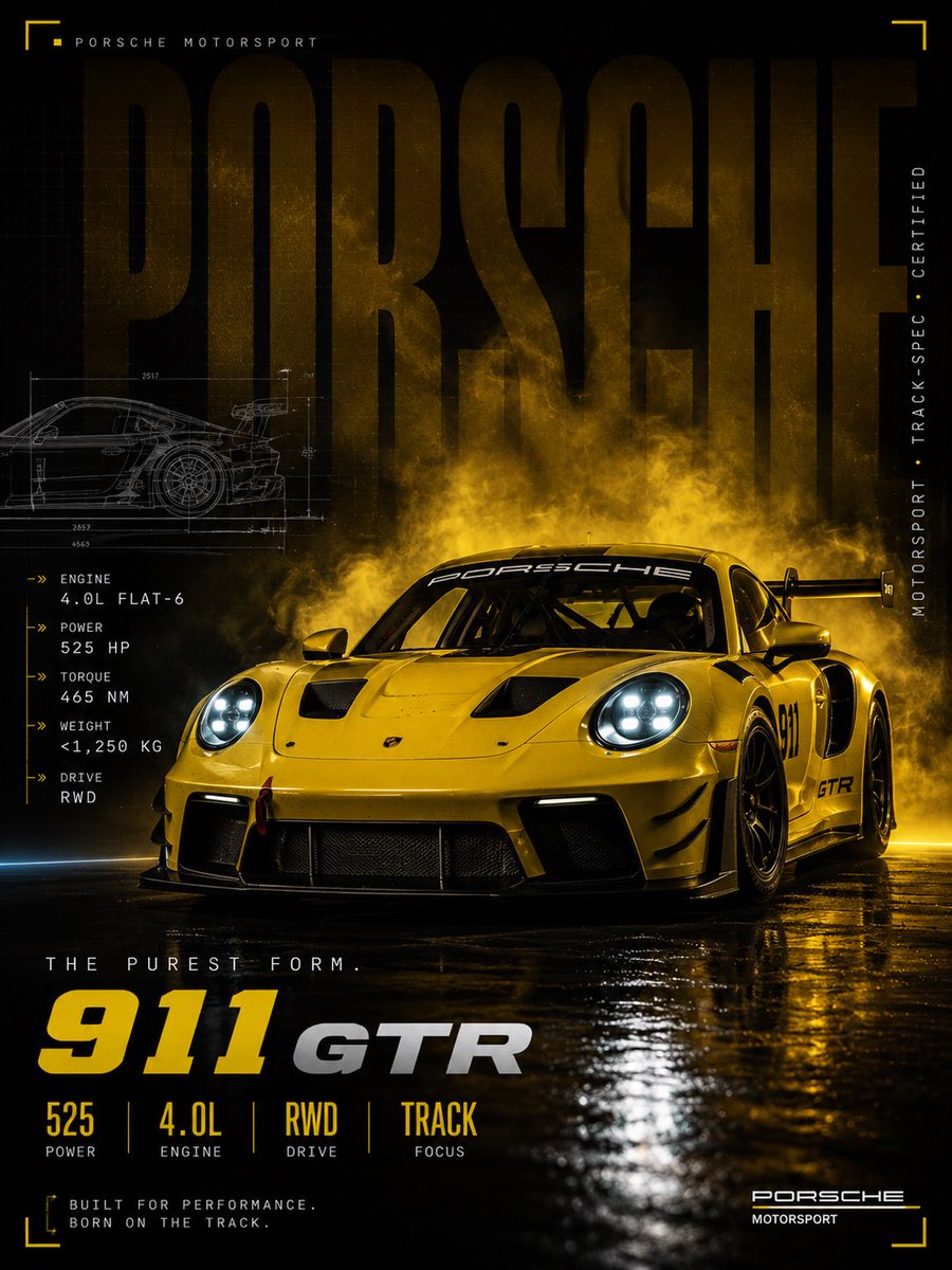
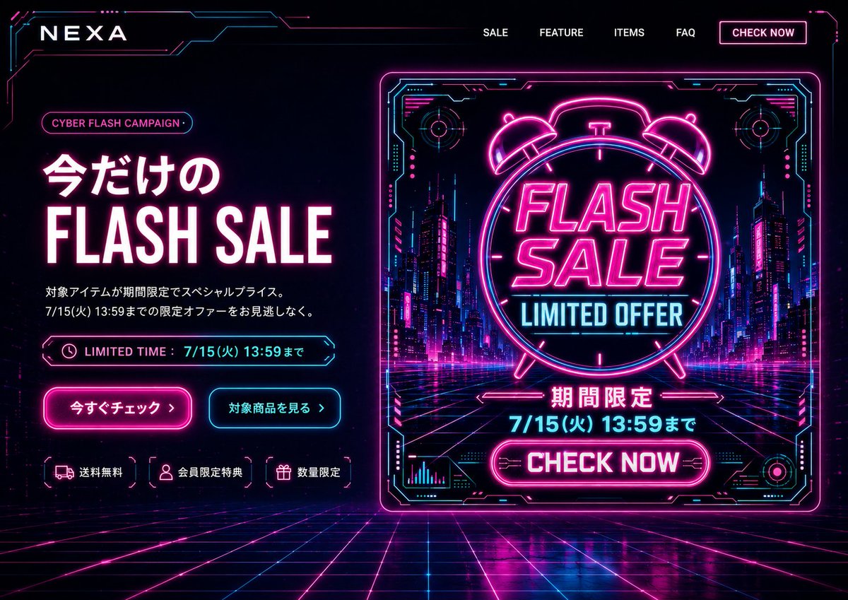
Case Media
Case Notes
This page keeps the media, full prompt, and original source together so you can inspect the result first and decide whether the prompt is worth copying, saving, or comparing.
Case Insights
To make this page easier to search, cite, and reuse later, the case is also broken down into practical guidance about usage, visual cues, and prompt structure.
Best Fit Scenarios
- Use this as a ui & social screens benchmark when you need a fast style baseline before rewriting your own prompt.
- It is especially helpful if your target overlaps with Neon, Portrait, Poster and you want to judge the image result before tuning wording.
- Keep it as a control sample when you compare nearby prompt variants one variable at a time.
Visual Signals To Notice
- The clearest style signals here are Neon, Portrait, Poster, so those should usually stay in your first rewrite.
- The important layer is usually interface density, card hierarchy, and how the screen tells the story before you read small text.
- This case keeps 2 media outputs, which makes it easier to check whether the style remains stable across multiple results.
How The Prompt Is Structured
- The prompt reads as a long, highly specified prompt, which is useful when you want to judge how much specificity this direction needs.
- Its keyword cluster is centered on Neon, Portrait, Poster, so you can usually keep that cluster while swapping subject, camera, layout, or copy details.
- A practical rewrite path is: keep the outcome, keep the strongest style cues, then replace only the subject and environment blocks.
Good Follow-up Questions
- What changes first if you keep Neon, Portrait, Poster but switch the subject matter?
- Which part of the result comes from section-level structure (UI & Social Screens) versus tag-level style cues?
- Which related cases in the same section give you a cleaner or more extreme variation of the same direction?
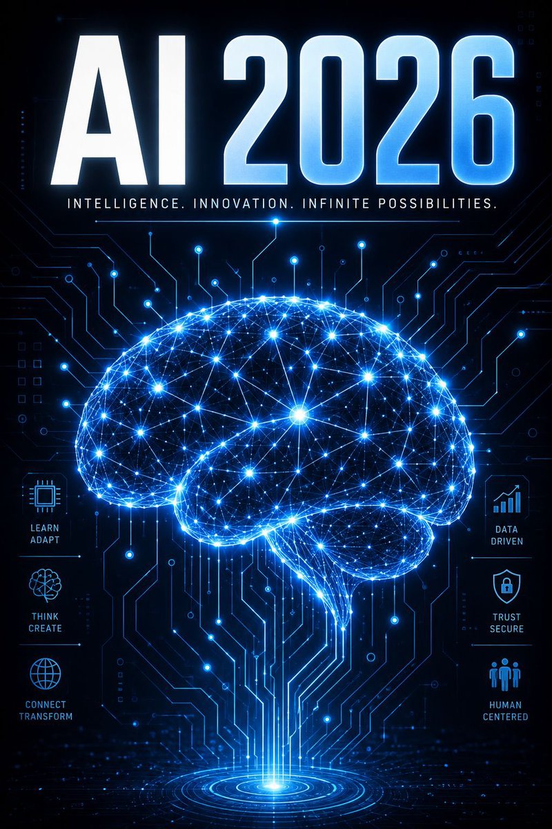
Full Prompt
Goal: Create a futuristic vertical tech poster announcing {argument name="headline text" default="AI 2026"}, centered on a glowing artificial-intelligence brain made of neural network lines and circuit traces. Canvas: Portrait poster, 2:3 aspect ratio, dark navy-to-black background, high contrast, crisp sci-fi lighting, no border or watermark. Layout: Put an enormous bold uppercase headline at the top reading {argument name="headline text" default="AI 2026"}. Use a heavy condensed sans-serif font with white-to-icy-blue gradient fill, bevel-like highlights, and electric blue outer glow. Directly below it, add a thin glowing divider line and the small spaced uppercase tagline: {argument name="tagline" default="INTELLIGENCE. INNOVATION. INFINITE POSSIBILITIES."} Main subject: In the center and lower half, draw one large side-view human brain silhouette formed from hundreds of luminous blue nodes and connecting lines, like a digital neural constellation. The brain should glow intensely with cyan, electric blue, and white points of light, with denser bright nodes scattered throughout. From the bottom of the brain, vertical circuit pathways descend into a circular holographic portal or target-like light source at the bottom center. Background: Fill the entire background with subtle printed-circuit-board traces, microchip paths, small dots, tiny squares, and faint interface markings. The circuitry should radiate around and behind the brain, mostly thin neon-blue lines on black, with some brighter connection points. Side feature panels: Include exactly 6 small icon-and-label feature blocks, three on the left and three on the right, aligned vertically beside the brain. Left side from top to bottom: 1) microchip icon labeled “LEARN ADAPT”, 2) abstract brain/flower network icon labeled “THINK CREATE”, 3) globe icon labeled “CONNECT TRANSFORM”. Right side from top to bottom: 4) rising bar chart icon labeled “DATA DRIVEN”, 5) shield with lock icon labeled “TRUST SECURE”, 6) three-person group icon labeled “HUMAN CENTERED”. Use small cyan line icons with uppercase stacked labels and thin horizontal divider lines. Visual style: Premium cyberpunk infographic poster, sharp vector-meets-3D rendering, glowing blue holographic effects, radiant lens flares, detailed circuitry, symmetrical composition, clean readable typography, ultra-detailed, high resolution. Constraints: Keep all visible text spelled exactly as specified, make the headline very legible, use only the 6 side feature blocks listed, avoid extra labels, avoid logos, avoid photographic people.