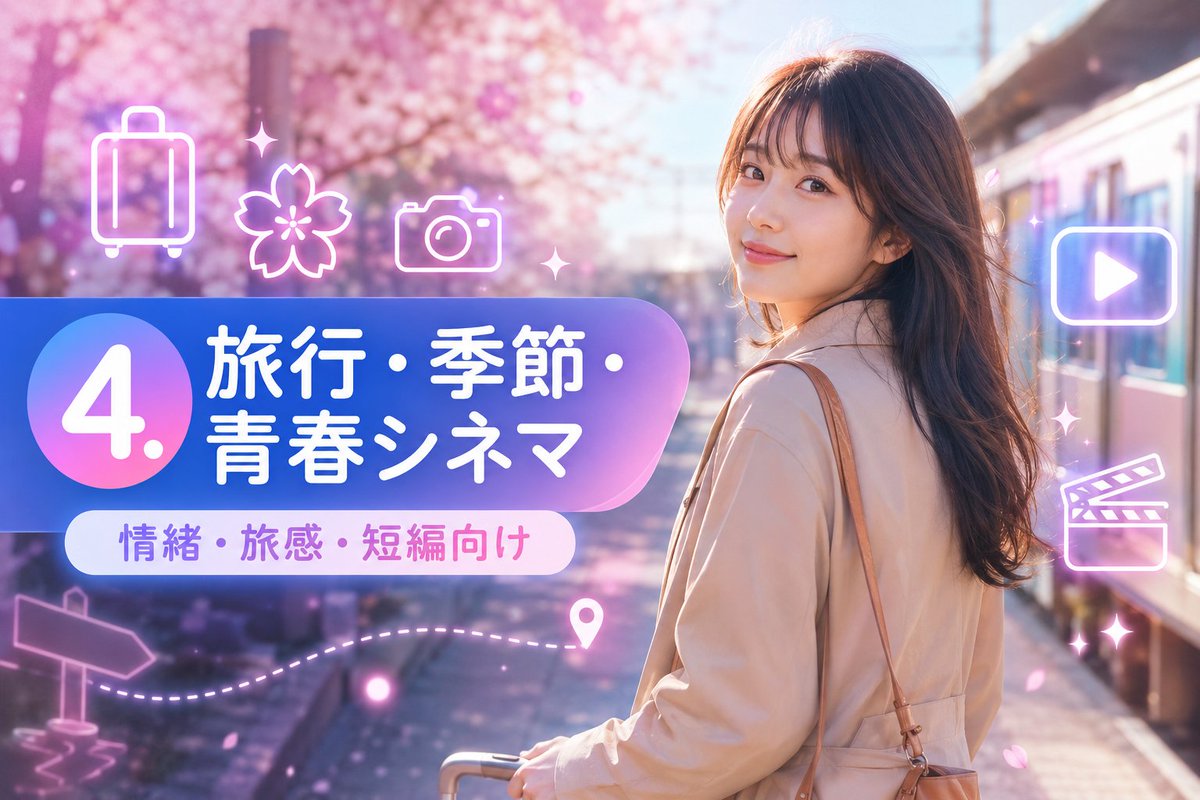
Case Media
Case Notes
This page keeps the media, full prompt, and original source together so you can inspect the result first and decide whether the prompt is worth copying, saving, or comparing.
Case Insights
To make this page easier to search, cite, and reuse later, the case is also broken down into practical guidance about usage, visual cues, and prompt structure.
Best Fit Scenarios
- Use this as a ui & social screens benchmark when you need a fast style baseline before rewriting your own prompt.
- It is especially helpful if your target overlaps with Neon, Poster, UI and you want to judge the image result before tuning wording.
- Keep it as a control sample when you compare nearby prompt variants one variable at a time.
Visual Signals To Notice
- The clearest style signals here are Neon, Poster, UI, so those should usually stay in your first rewrite.
- The important layer is usually interface density, card hierarchy, and how the screen tells the story before you read small text.
- This case keeps one primary output, so the first image should be treated as the main visual reference.
How The Prompt Is Structured
- The prompt reads as a long, highly specified prompt, which is useful when you want to judge how much specificity this direction needs.
- Its keyword cluster is centered on Neon, Poster, UI, so you can usually keep that cluster while swapping subject, camera, layout, or copy details.
- A practical rewrite path is: keep the outcome, keep the strongest style cues, then replace only the subject and environment blocks.
Good Follow-up Questions
- What changes first if you keep Neon, Poster, UI but switch the subject matter?
- Which part of the result comes from section-level structure (UI & Social Screens) versus tag-level style cues?
- Which related cases in the same section give you a cleaner or more extreme variation of the same direction?
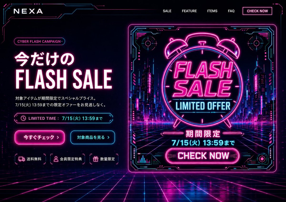
Full Prompt
Goal: Create a cyberpunk e-commerce desktop first-view landing page for {argument name="brand name" default="NEXA"}, promoting a limited-time {argument name="campaign name" default="CYBER FLASH CAMPAIGN"} in a neon futuristic style. Canvas: Wide 16:9 website hero screen, dark black/navy background, full-bleed cyber grid floor receding in perspective, glowing magenta and cyan circuitry framing the edges. High contrast, glossy reflections, electric neon bloom, futuristic HUD aesthetic. Layout: Top navigation bar with the brand logo on the left and exactly 5 navigation items on the right: “SALE”, “FEATURE”, “ITEMS”, “FAQ”, and a bordered neon button “CHECK NOW”. The hero section is split into two columns: left text-and-CTA area, right large promotional banner graphic. Left hero content: Add a small rounded pill label reading {argument name="campaign name" default="CYBER FLASH CAMPAIGN"}. Main headline in Japanese and English: “今だけの” above huge bold “FLASH SALE”, white letters with hot-pink glow. Below it, two short Japanese description lines: “対象アイテムが期間限定でスペシャルプライス。” and “7/15(火) 13:59までの限定オファーをお見逃しなく。” Add a neon outlined limited-time bar with a clock icon and text “LIMITED TIME : 7/15(火) 13:59まで”. Beneath are exactly 2 CTA buttons: a hot-pink filled glowing button “今すぐチェック ›” and a cyan outlined button “対象商品を見る ›”. At the bottom of the left column, show exactly 3 small benefit chips with icons: truck icon “送料無料”, user icon “会員限定特典”, gift icon “数量限定”. Right promotional graphic: A large square/near-square neon poster card with a glowing magenta border and cyan HUD corner details, set slightly right of center. Inside the card, show a futuristic city street at night with skyscrapers, magenta/cyan lights, and a perspective grid road. Center a large neon alarm clock outline containing bold stacked text “FLASH SALE” and cyan text “LIMITED OFFER”. Below it, add Japanese “期間限定”, then the deadline {argument name="deadline text" default="7/15(火) 13:59まで"}, then a bright magenta rounded button “CHECK NOW”. Include small decorative HUD charts, circular targets, circuit marks, and arrows around the poster, but keep all text legible. Visual style: Use black, deep navy, hot magenta, electric cyan, and white. Typography should be bold condensed sans-serif for English sale text, clean modern Japanese sans-serif for Japanese copy. Add strong neon glows, thin circuit-line borders, chromatic highlights, and polished reflections on the grid floor. Constraints: Desktop website first-view only, no browser chrome, no people, no extra product images, no watermark. Keep the exact visible counts: 5 navigation items, 2 CTA buttons, 3 benefit chips, and 1 large right-side sale poster. Make the composition feel like a finished PC landing page hero based on a banner design.