Case Media
Case Notes
This page keeps the media, full prompt, and original source together so you can inspect the result first and decide whether the prompt is worth copying, saving, or comparing.
Case Insights
To make this page easier to search, cite, and reuse later, the case is also broken down into practical guidance about usage, visual cues, and prompt structure.
Best Fit Scenarios
- Use this as a portrait & photography benchmark when you need a fast style baseline before rewriting your own prompt.
- It is especially helpful if your target overlaps with Neon, Portrait, Cinematic and you want to judge the image result before tuning wording.
- Keep it as a control sample when you compare nearby prompt variants one variable at a time.
Visual Signals To Notice
- The clearest style signals here are Neon, Portrait, Cinematic, so those should usually stay in your first rewrite.
- Focus on framing, light direction, pose, and the distance between subject and camera.
- This case keeps one primary output, so the first image should be treated as the main visual reference.
How The Prompt Is Structured
- The prompt reads as a long, highly specified prompt, which is useful when you want to judge how much specificity this direction needs.
- Its keyword cluster is centered on Neon, Portrait, Cinematic, so you can usually keep that cluster while swapping subject, camera, layout, or copy details.
- A practical rewrite path is: keep the outcome, keep the strongest style cues, then replace only the subject and environment blocks.
Good Follow-up Questions
- What changes first if you keep Neon, Portrait, Cinematic but switch the subject matter?
- Which part of the result comes from section-level structure (Portrait & Photography) versus tag-level style cues?
- Which related cases in the same section give you a cleaner or more extreme variation of the same direction?
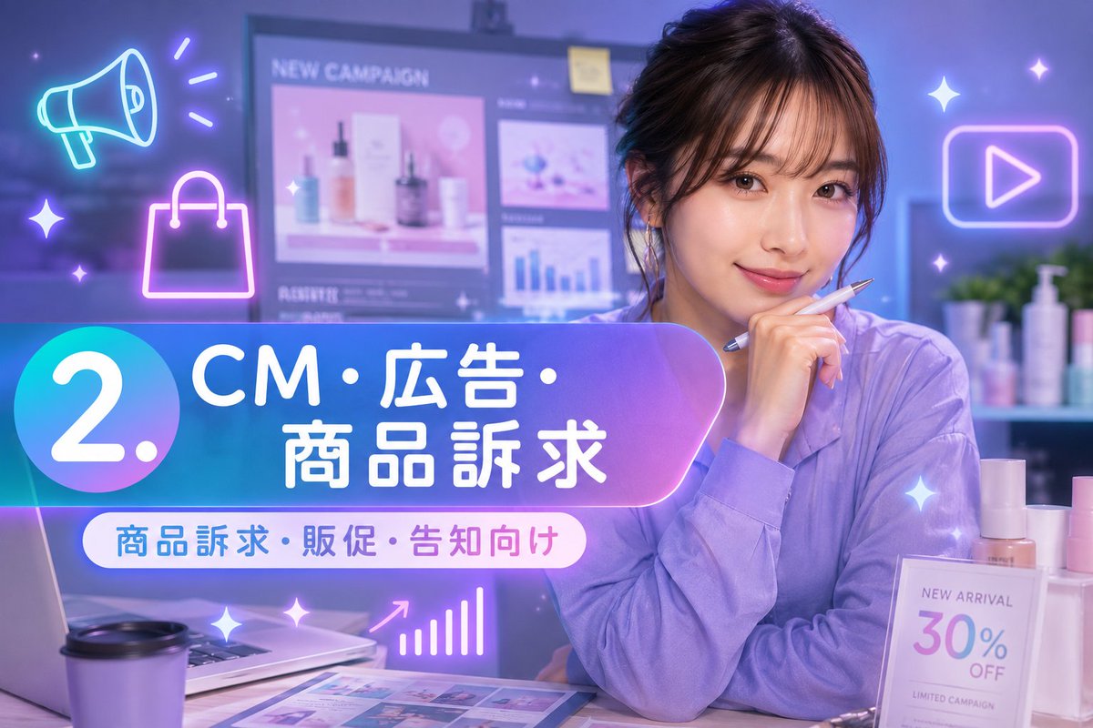
Full Prompt
Create a vibrant Japanese marketing course thumbnail for {argument name="campaign topic" default="CM・広告・商品訴求"}. Use a 16:9 horizontal canvas, 1184×768 style, with a glossy purple-blue neon aesthetic and soft depth-of-field office lighting. Background: a modern cosmetics marketing workspace with a blurred large monitor showing a campaign dashboard; visible English text on the monitor includes “NEW CAMPAIGN” and small chart/product panels. On the right, place a young woman marketer in a lavender blouse, seated at a desk with one hand near her chin holding a pen; her face is intentionally hidden by a large opaque matte brown rectangle. Desk details include exactly 5 main objects: an open laptop on the left, a disposable coffee cup in front, printed marketing sheets with colorful layout thumbnails, cosmetics bottles on the right, and a small sign reading “NEW ARRIVAL 30% OFF LIMITED CAMPAIGN.” Overlay a large rounded gradient banner across the lower-left to center, blue-to-purple with glow and transparency. On the far left of the banner, put a large circular badge with the white text “2.”. Main Japanese headline on the banner: “CM・広告・商品訴求” in bold white rounded sans-serif, with “商品訴求” on the second line. Beneath it, add a white pill-shaped label with blue and pink text: “商品訴求・販促・告知向け”. Add exactly 3 large neon line icons: a cyan megaphone in the upper left, a pink shopping bag below it, and a purple play button inside a rounded rectangle on the upper right. Add exactly 8 small glowing sparkle accents scattered around the composition, plus a small pink upward bar-chart icon near the bottom center. Overall style: Japanese YouTube thumbnail, polished digital advertising design, luminous gradients, cinematic blur, clean readable typography, no watermark, no extra text beyond the specified labels.