Case Media
Case Notes
This page keeps the media, full prompt, and original source together so you can inspect the result first and decide whether the prompt is worth copying, saving, or comparing.
Case Insights
To make this page easier to search, cite, and reuse later, the case is also broken down into practical guidance about usage, visual cues, and prompt structure.
Best Fit Scenarios
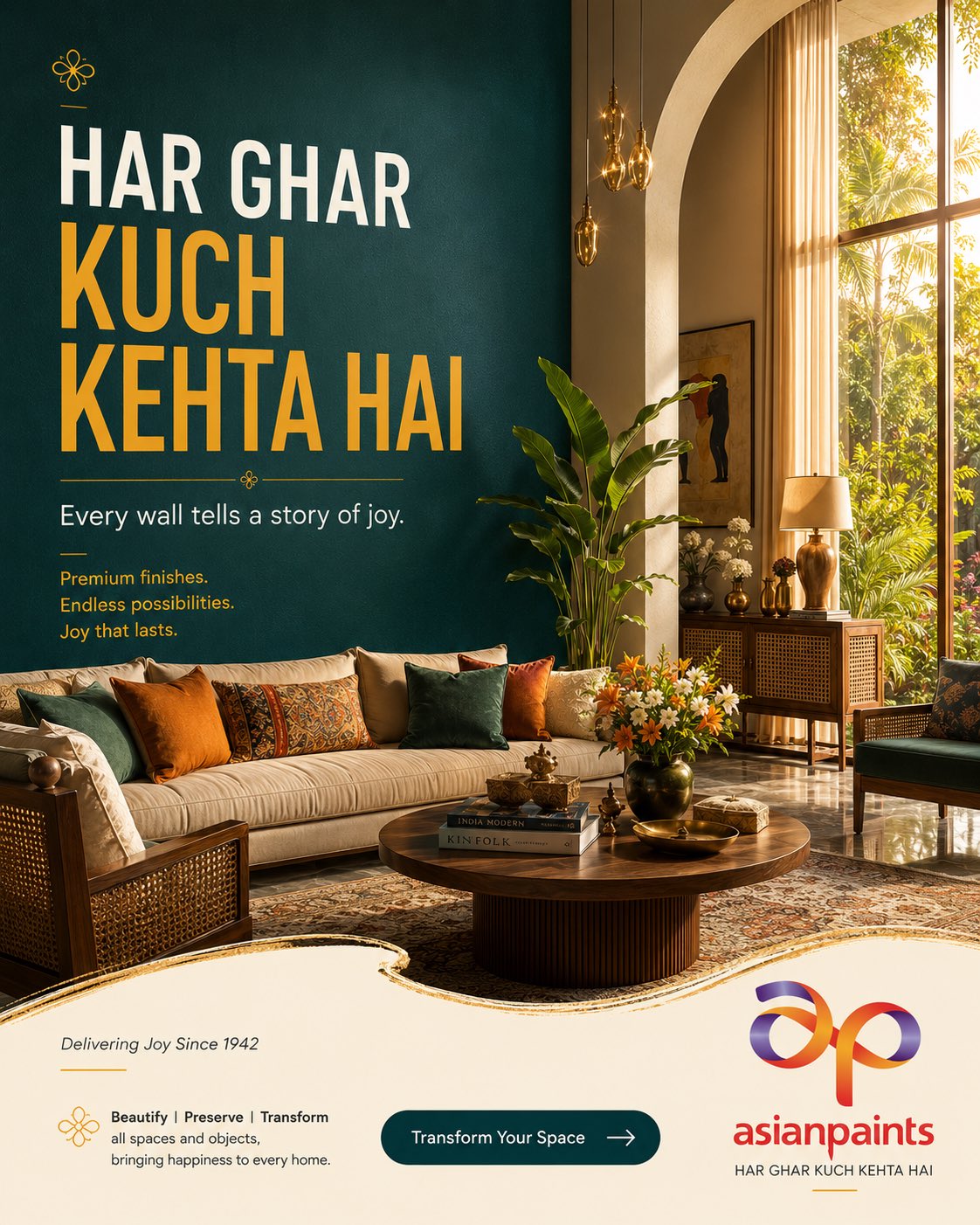
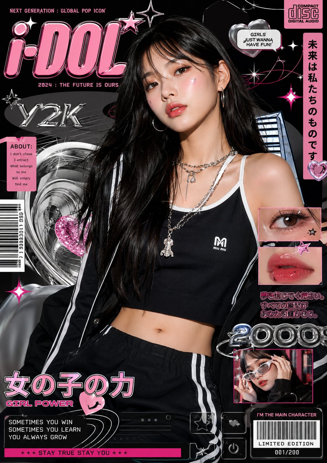
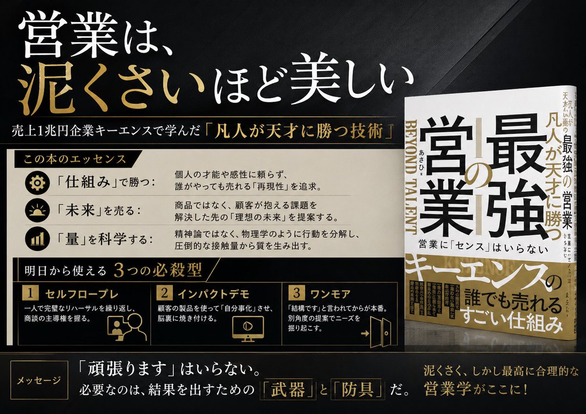
- Use this as a ui & social screens benchmark when you need a fast style baseline before rewriting your own prompt.
- It is especially helpful if your target overlaps with Cinematic, Poster, UI and you want to judge the image result before tuning wording.
- Keep it as a control sample when you compare nearby prompt variants one variable at a time.
Visual Signals To Notice
- The clearest style signals here are Cinematic, Poster, UI, so those should usually stay in your first rewrite.
- The important layer is usually interface density, card hierarchy, and how the screen tells the story before you read small text.
- This case keeps one primary output, so the first image should be treated as the main visual reference.
How The Prompt Is Structured
- The prompt reads as a long, highly specified prompt, which is useful when you want to judge how much specificity this direction needs.
- Its keyword cluster is centered on Cinematic, Poster, UI, so you can usually keep that cluster while swapping subject, camera, layout, or copy details.
- A practical rewrite path is: keep the outcome, keep the strongest style cues, then replace only the subject and environment blocks.
Good Follow-up Questions
- What changes first if you keep Cinematic, Poster, UI but switch the subject matter?
- Which part of the result comes from section-level structure (UI & Social Screens) versus tag-level style cues?
- Which related cases in the same section give you a cleaner or more extreme variation of the same direction?
Full Prompt
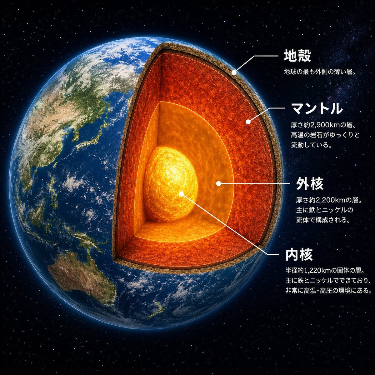
Goal: Create a dramatic scientific cutaway infographic of {argument name="planet name" default="Earth"}, showing the planet in space with its internal layers exposed like a precise 3D sectional model. Canvas: Square 1:1 composition, high-resolution, black star-filled space background. The planet fills most of the left and center of the frame, with annotation text arranged on the right side. Main subject: A photorealistic Earth viewed from space, centered slightly left, with Asia, Japan, Southeast Asia, and Australia visible on the surface. Remove a large wedge-shaped quarter section from the front-right side of the globe to reveal the interior. The cutaway should look physically carved, with a thick rocky crust rim and glowing internal layers. Add a subtle blue atmospheric glow around the planet. Cutaway structure: Show exactly 4 discrete internal/structural layers, each visually distinct and aligned with annotation leader lines: 1) a thin brown rocky crust at the outer edge, 2) a thick red-orange molten mantle layer with turbulent texture, 3) a bright orange outer core surrounding the center, and 4) a glowing yellow-white inner core sphere at the center. Make the mantle the largest visible layer, the outer core semi-spherical and luminous, and the inner core intensely bright with swirling heat texture. Text and labels: Place exactly 4 Japanese annotation blocks on the right, each with a white dot marker and thin white leader line pointing to the correct layer. Use bold white Japanese headings and smaller white explanatory text beneath each heading. The four visible labels must be: {argument name="crust label" default="地殻"} with smaller text “地球の最も外側の薄い層。”; {argument name="mantle label" default="マントル"} with smaller text “厚さ約2,900kmの層。高温の岩石がゆっくりと流動している。”; {argument name="outer core label" default="外核"} with smaller text “厚さ約2,200kmの層。主に鉄とニッケルの流体で構成される。”; {argument name="inner core label" default="内核"} with smaller text “半径約1,220kmの固体の層。主に鉄とニッケルでできており、非常に高温・高圧の環境にある。” Visual style: Photorealistic space-science educational poster, cinematic lighting, crisp typography, realistic Earth texture, glowing lava-like interior, clean white callout lines, high contrast, polished museum infographic style. Constraints: Keep exactly 4 annotation blocks and exactly 4 layer labels. Do not add extra icons, extra labels, borders, logos, watermarks, or decorative UI panels. Keep all text legible and positioned to the right of the planet.