Case Media
Case Notes
This page keeps the media, full prompt, and original source together so you can inspect the result first and decide whether the prompt is worth copying, saving, or comparing.
Case Insights
To make this page easier to search, cite, and reuse later, the case is also broken down into practical guidance about usage, visual cues, and prompt structure.
Best Fit Scenarios
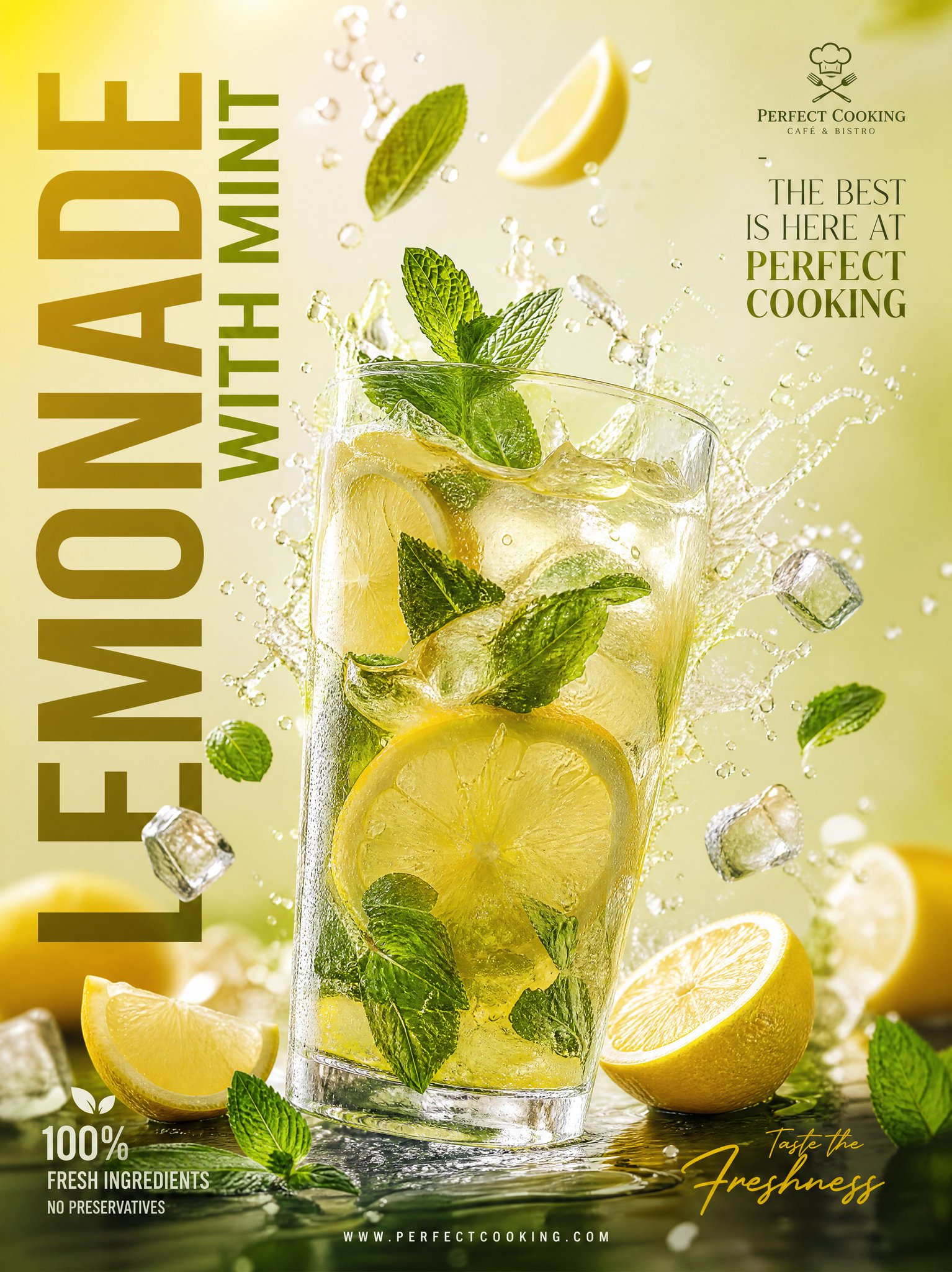
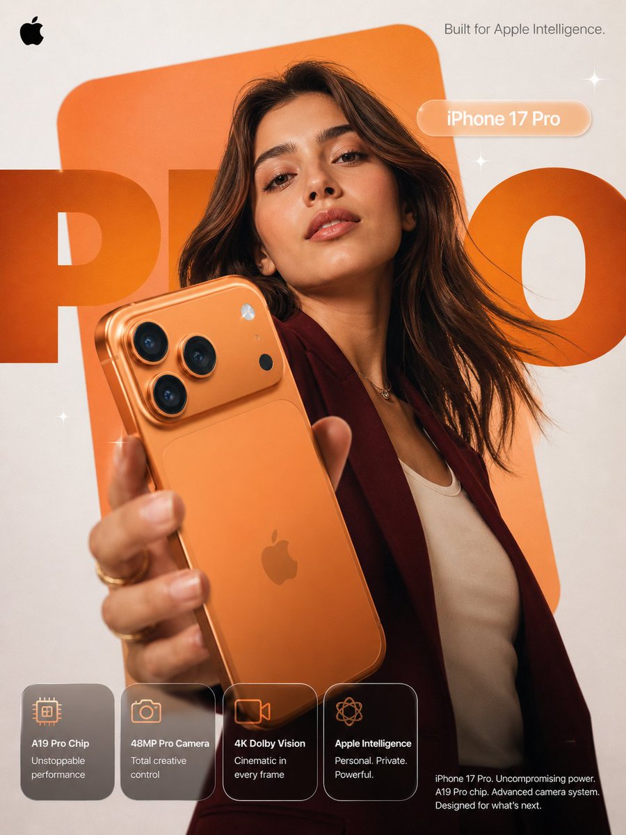
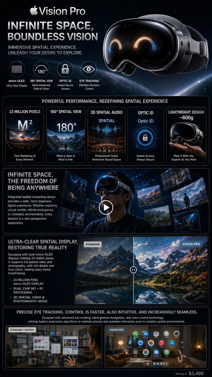
- Use this as a ui & social screens benchmark when you need a fast style baseline before rewriting your own prompt.
- It is especially helpful if your target overlaps with Cinematic, Poster, UI and you want to judge the image result before tuning wording.
- Keep it as a control sample when you compare nearby prompt variants one variable at a time.
Visual Signals To Notice
- The clearest style signals here are Cinematic, Poster, UI, so those should usually stay in your first rewrite.
- The important layer is usually interface density, card hierarchy, and how the screen tells the story before you read small text.
- This case keeps 2 media outputs, which makes it easier to check whether the style remains stable across multiple results.
How The Prompt Is Structured
- The prompt reads as a long, highly specified prompt, which is useful when you want to judge how much specificity this direction needs.
- Its keyword cluster is centered on Cinematic, Poster, UI, so you can usually keep that cluster while swapping subject, camera, layout, or copy details.
- A practical rewrite path is: keep the outcome, keep the strongest style cues, then replace only the subject and environment blocks.
Good Follow-up Questions
- What changes first if you keep Cinematic, Poster, UI but switch the subject matter?
- Which part of the result comes from section-level structure (UI & Social Screens) versus tag-level style cues?
- Which related cases in the same section give you a cleaner or more extreme variation of the same direction?
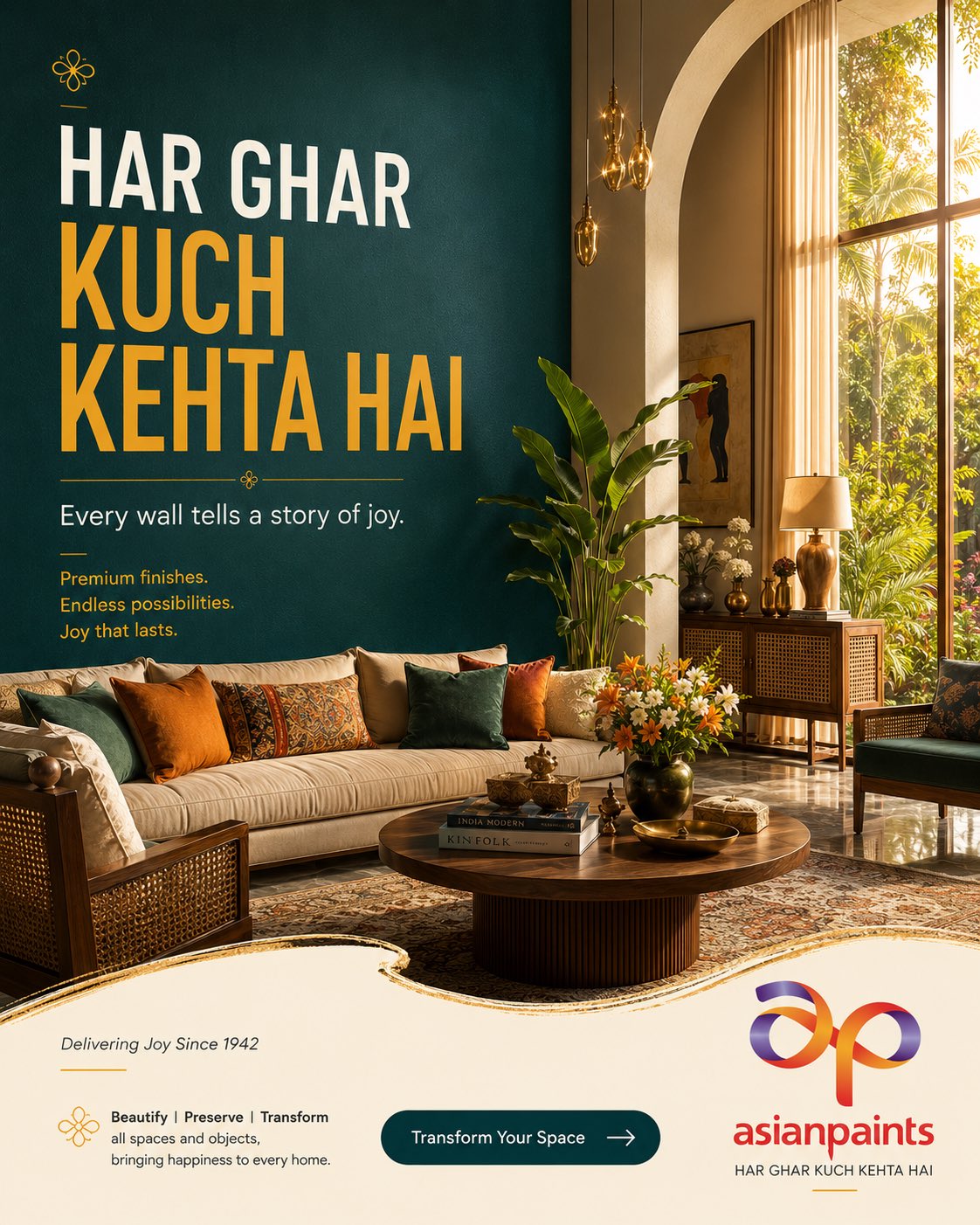
Full Prompt
4:5 vertical premium paint advertising poster ultra-photorealistic luxury interior photography Asian Paints flagship brand campaign high-conversion home décor marketing creative award-winning advertising design social-first premium campaign Behance front-page quality 8K ultra-detail architectural digest aesthetic luxury Indian lifestyle advertising CAMPAIGN CONCEPT "HAR GHAR KUCH KEHTA HAI" A beautifully designed Indian home becomes a reflection of memories, aspirations, emotions and personal identity. The wall is not simply painted—it becomes a storyteller. The paint integrates naturally into the lifestyle environment rather than appearing as a product demonstration. BRAND IDENTITY Asian Paints visual language warm emotional storytelling premium Indian home aesthetic family-oriented luxury optimistic lifestyle positioning trust-driven branding elegant approachable luxury sophisticated but welcoming SCENE Grand double-height contemporary Indian living room architect-designed luxury residence floor-to-ceiling arched windows soft golden morning sunlight flooding the space lush garden visible outside expensive handcrafted furniture warm walnut wood finishes natural cane details artisan décor pieces fresh flowers designer coffee table styling luxury rugs curated books subtle Indian craftsmanship integrated throughout The hero wall occupies nearly 40% of the composition. Wall painted in a signature Asian Paints deep peacock teal finish. Luxurious matte texture. Perfect premium paint application. Ultra-realistic micro texture visible. Rich depth and color consistency. The wall instantly becomes the focal point of the room. PAINT PRESENTATION No paint bucket visible. No construction environment. No workers. No renovation aesthetic. The paint is showcased through: wall elegance surface richness light interaction premium finish quality architectural impact The viewer immediately understands the beauty comes from the paint. COLOR PALETTE Asian Paints inspired premium palette Deep Peacock Teal Warm Ivory Saffron Gold Burnt Terracotta Natural Walnut Brown Champagne Beige Soft Cream Rich Indian luxury tones warm emotional color harmony inviting premium atmosphere TYPOGRAPHY HIERARCHY Typography integrated directly onto the painted wall. Top Left: small Asian Paints floral icon Large Headline: HAR GHAR KUCH KEHTA HAI huge bold typography occupying significant wall area premium sans serif clean spacing "HAR GHAR" warm white "KUCH KEHTA HAI" Asian Paints saffron gold Below headline: Every wall tells a story of joy. small elegant premium copy Supporting copy: Premium finishes. Endless possibilities. Joy that lasts. minimal luxury layout GRAPHIC SYSTEM Asian Paints advertising language thin saffron divider lines minimal floral iconography clean premium spacing elegant hierarchy large breathing room luxury brand discipline BOTTOM BRAND SECTION Organic flowing cream-colored brand footer premium curved paint-inspired shape luxury print-ad composition Left Side: Delivering Joy Since 1942 small elegant typography brand philosophy block Beautify | Preserve | Transform all spaces and objects, bringing happiness to every home. Center: Large premium CTA button rounded pill shape deep teal background white typography "Transform Your Space →" modern UI styling subtle glassmorphism finish luxury shadow treatment Right Side: Official Asian Paints logo large crisp premium visibility brand tagline beneath logo "HAR GHAR KUCH KEHTA HAI" ADVERTISING PSYCHOLOGY aspiration family pride home ownership pride warmth emotional connection trust timeless quality Indian luxury living LIGHTING Golden hour sunlight soft cinematic shadows warm highlights natural window illumination premium interior photography lighting realistic bounce light luxury hospitality mood magazine-quality exposure