Case Media
Case Notes
This page keeps the media, full prompt, and original source together so you can inspect the result first and decide whether the prompt is worth copying, saving, or comparing.
Case Insights
To make this page easier to search, cite, and reuse later, the case is also broken down into practical guidance about usage, visual cues, and prompt structure.
Best Fit Scenarios
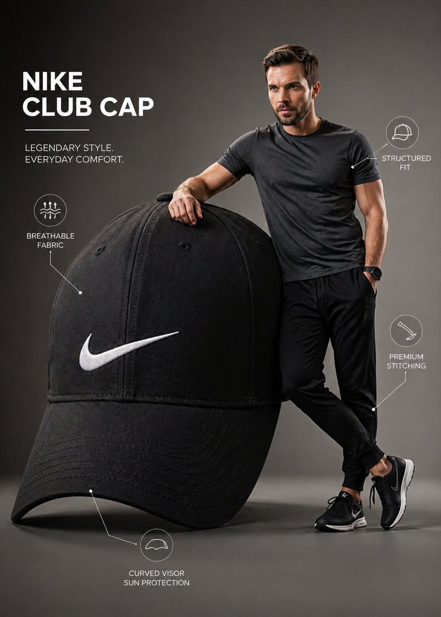
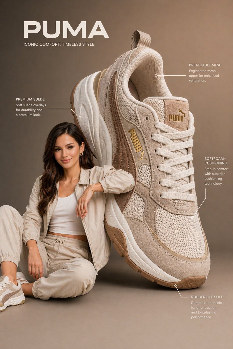
- Use this as a ui & social screens benchmark when you need a fast style baseline before rewriting your own prompt.
- It is especially helpful if your target overlaps with Fashion, UI, Screenshot and you want to judge the image result before tuning wording.
- Keep it as a control sample when you compare nearby prompt variants one variable at a time.
Visual Signals To Notice
- The clearest style signals here are Fashion, UI, Screenshot, so those should usually stay in your first rewrite.
- The important layer is usually interface density, card hierarchy, and how the screen tells the story before you read small text.
- This case keeps one primary output, so the first image should be treated as the main visual reference.
How The Prompt Is Structured
- The prompt reads as a long, highly specified prompt, which is useful when you want to judge how much specificity this direction needs.
- Its keyword cluster is centered on Fashion, UI, Screenshot, so you can usually keep that cluster while swapping subject, camera, layout, or copy details.
- A practical rewrite path is: keep the outcome, keep the strongest style cues, then replace only the subject and environment blocks.
Good Follow-up Questions
- What changes first if you keep Fashion, UI, Screenshot but switch the subject matter?
- Which part of the result comes from section-level structure (UI & Social Screens) versus tag-level style cues?
- Which related cases in the same section give you a cleaner or more extreme variation of the same direction?
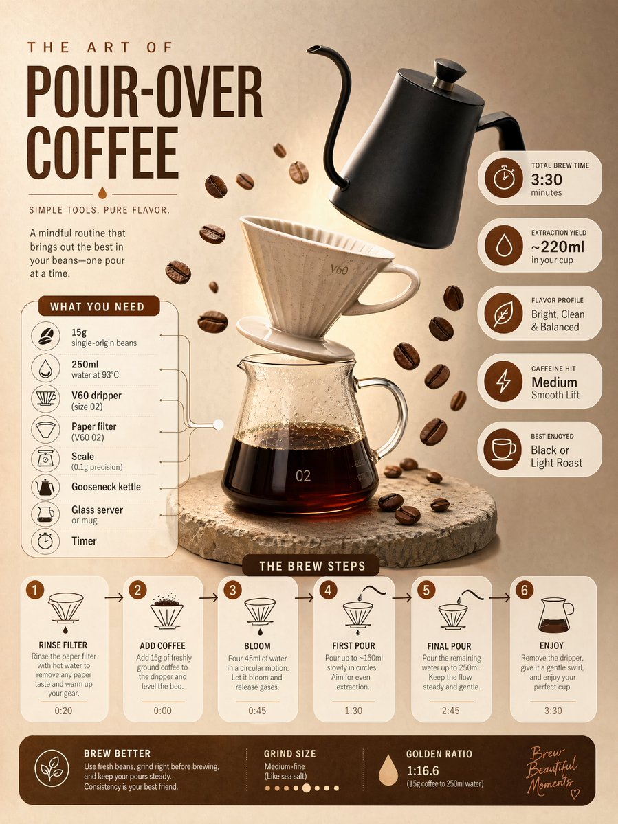
Full Prompt
Ultra-clean modern editorial infographic on the topic of a [POUR-OVER COFFEE BREWING] routine. Hero visual: a stylized flat-lay or floating arrangement of 3–4 objects (a ceramic V60 dripper, a matte black gooseneck kettle, and scattered roasted coffee beans) — slightly angled or in soft perspective, glowing subtly. Ingredients Section: Label it ‘What You Need’ — include 6–8 items with small icons next to each (e.g., '15g single-origin beans', '250ml water at 93°C'). Arranged in a cluster connected visually to the hero. Steps Section: 5–6 numbered panels with arrows or connecting lines forming a logical flow. Each step has a short action label and a small relevant icon. Panels use glassmorphism or frosted card styling. Stats Badges: 4–5 floating pill-shaped badges showing relevant metadata — total brew time, extraction yield, flavor profile, caffeine hit — displayed as clean minimal bubbles. Visual Style: Artisan, warm editorial background — roasted brown, oat cream, or soft copper tones. Rich espresso accent colors. Bold modern sans-serif typography. Clean vector icons. Subtle grain or filter-paper texture. Composition: Hero object cluster centered or slightly offset. Ingredients on one side. Steps flow opposite or below with connecting lines. Stat badges scattered as floating pills. Generous negative space. Lighting: Soft, warm morning cafe light feel emanating from the hero cluster. Premium lifestyle editorial aesthetic, social-feed optimized. Ultra-crisp. No watermark.