Case Media
Case Notes
This page keeps the media, full prompt, and original source together so you can inspect the result first and decide whether the prompt is worth copying, saving, or comparing.
Case Insights
To make this page easier to search, cite, and reuse later, the case is also broken down into practical guidance about usage, visual cues, and prompt structure.
Best Fit Scenarios
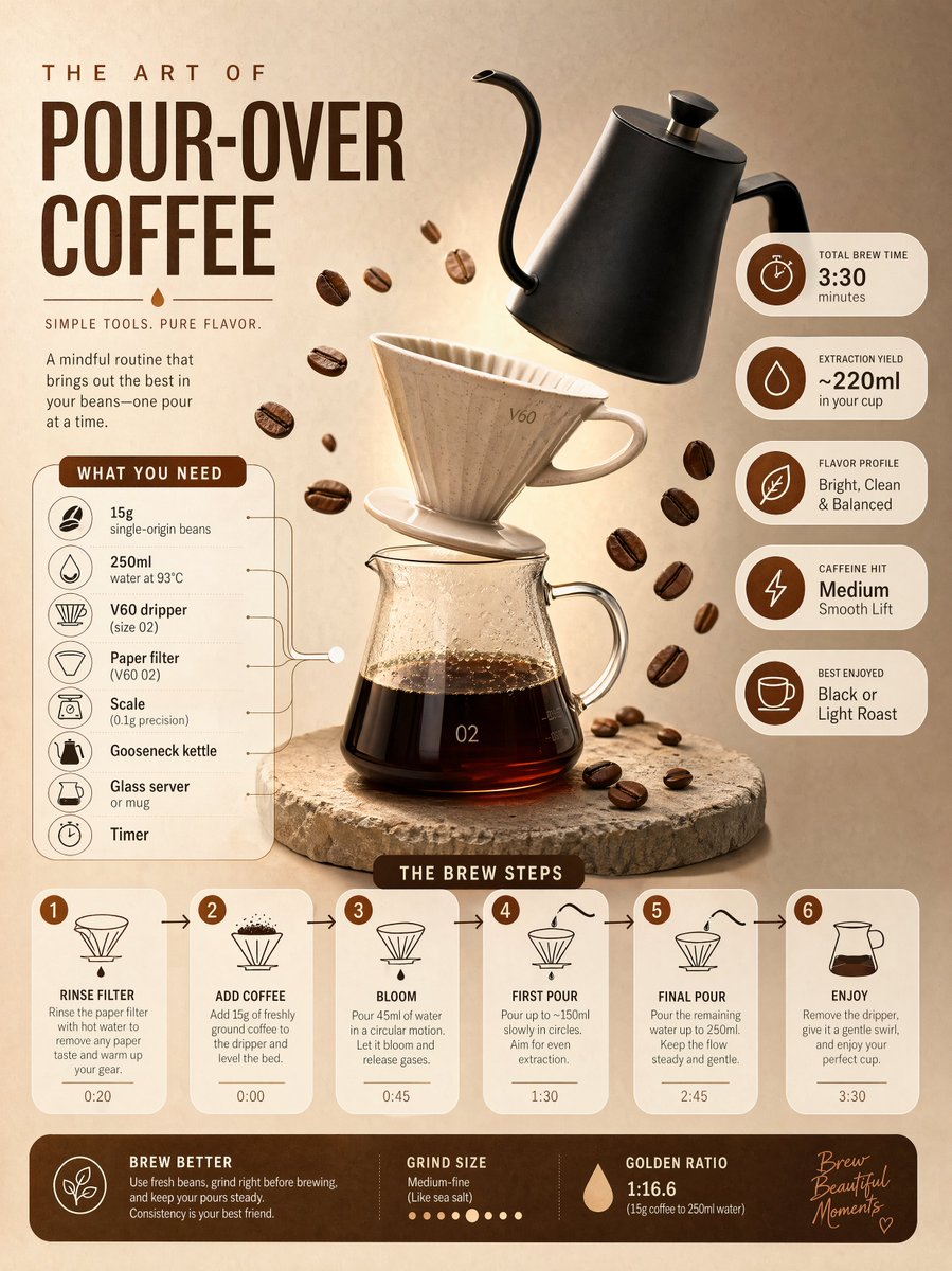
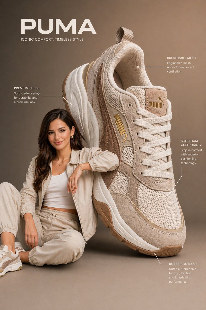
- Use this as a ui & social screens benchmark when you need a fast style baseline before rewriting your own prompt.
- It is especially helpful if your target overlaps with Fashion, UI, Screenshot and you want to judge the image result before tuning wording.
- Keep it as a control sample when you compare nearby prompt variants one variable at a time.
Visual Signals To Notice
- The clearest style signals here are Fashion, UI, Screenshot, so those should usually stay in your first rewrite.
- The important layer is usually interface density, card hierarchy, and how the screen tells the story before you read small text.
- This case keeps one primary output, so the first image should be treated as the main visual reference.
How The Prompt Is Structured
- The prompt reads as a long, highly specified prompt, which is useful when you want to judge how much specificity this direction needs.
- Its keyword cluster is centered on Fashion, UI, Screenshot, so you can usually keep that cluster while swapping subject, camera, layout, or copy details.
- A practical rewrite path is: keep the outcome, keep the strongest style cues, then replace only the subject and environment blocks.
Good Follow-up Questions
- What changes first if you keep Fashion, UI, Screenshot but switch the subject matter?
- Which part of the result comes from section-level structure (UI & Social Screens) versus tag-level style cues?
- Which related cases in the same section give you a cleaner or more extreme variation of the same direction?
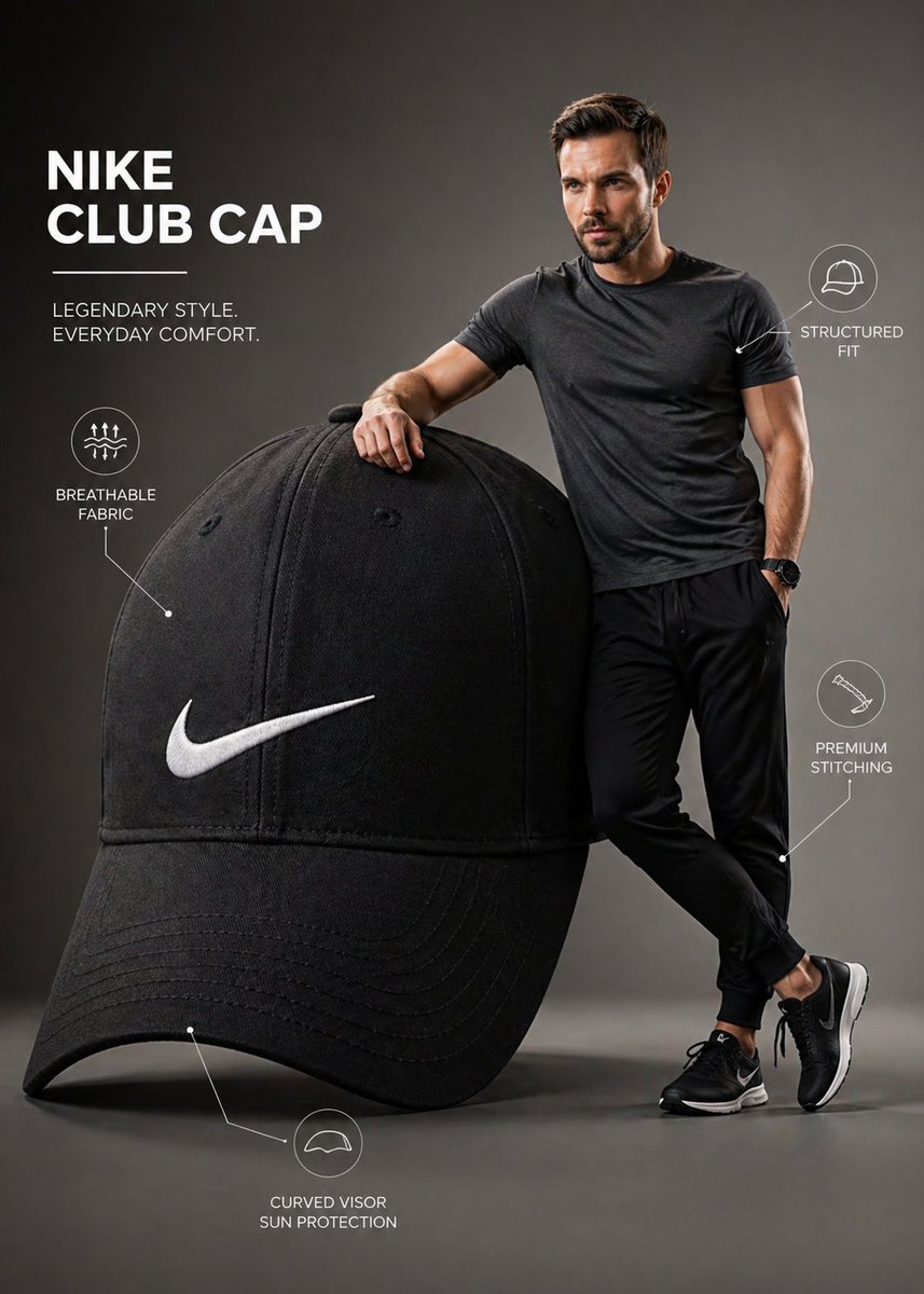
Full Prompt
A premium infographic-style visual featuring a young man standing confidently beside an oversized Nike cap. The cap is scaled dramatically large, almost equal to the height of the man, creating a bold, surreal product emphasis. The man stands naturally next to it, lightly holding or adjusting the cap, interacting with it in a relaxed, stylish way. His face must closely match the provided reference image, accurate facial structure, skin tone, hairstyle, and expression, sharp, realistic, and visually appealing. The Nike cap is ultra-detailed with crisp stitching, visible fabric texture, clean seams, and a sharp, properly proportioned Nike swoosh logo. Subtle wear realism and premium material finish. Composition is modern and minimal, set in a clean studio or soft gradient background. Include subtle infographic-style elements like thin annotation lines or minimal callouts highlighting features such as “breathable fabric,” “structured fit,” or “premium stitching,” keeping everything elegant and uncluttered. Lighting is soft studio lighting with controlled highlights and shadows, giving a polished commercial look. The model wears minimal, contemporary streetwear that complements the cap’s color palette. Color grading is crisp and slightly vibrant, with a professional advertising aesthetic. Balanced composition, sharp focus, slight depth of field for realism. Style: high-end product infographic, fashion advertisement, clean UI-inspired annotations Resolution: ultra high resolution, 4K, highly detailed, photorealistic Optional boosters: 85mm lens, f/2.8 commercial fashion shoot no distortion, accurate proportions clean typography, modern layout