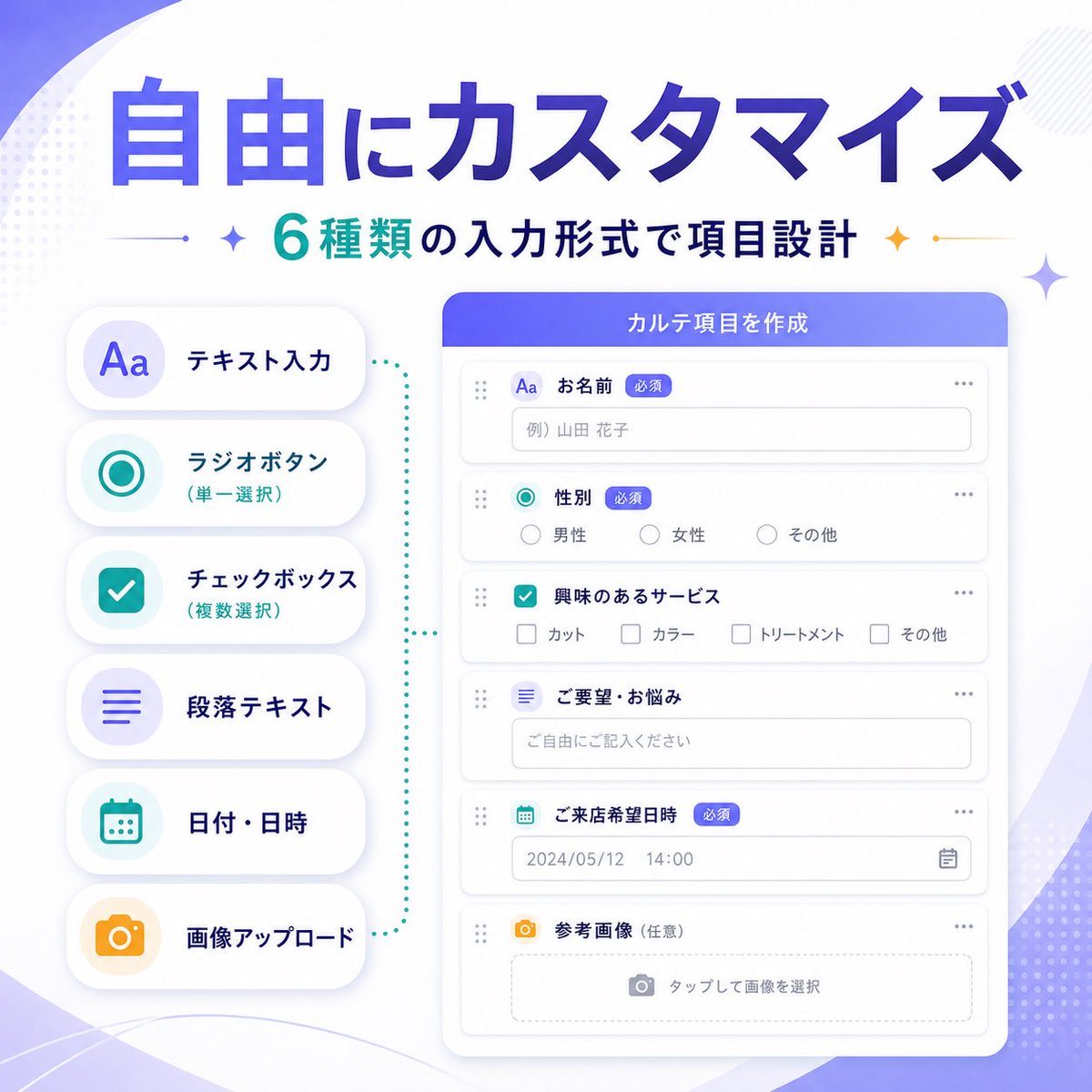
Case Media
Case Notes
This page keeps the media, full prompt, and original source together so you can inspect the result first and decide whether the prompt is worth copying, saving, or comparing.
Case Insights
To make this page easier to search, cite, and reuse later, the case is also broken down into practical guidance about usage, visual cues, and prompt structure.
Best Fit Scenarios
- Use this as a ui & social screens benchmark when you need a fast style baseline before rewriting your own prompt.
- It is especially helpful if your target overlaps with Illustration, UI, Screenshot and you want to judge the image result before tuning wording.
- Keep it as a control sample when you compare nearby prompt variants one variable at a time.
Visual Signals To Notice
- The clearest style signals here are Illustration, UI, Screenshot, so those should usually stay in your first rewrite.
- The important layer is usually interface density, card hierarchy, and how the screen tells the story before you read small text.
- This case keeps one primary output, so the first image should be treated as the main visual reference.
How The Prompt Is Structured
- The prompt reads as a long, highly specified prompt, which is useful when you want to judge how much specificity this direction needs.
- Its keyword cluster is centered on Illustration, UI, Screenshot, so you can usually keep that cluster while swapping subject, camera, layout, or copy details.
- A practical rewrite path is: keep the outcome, keep the strongest style cues, then replace only the subject and environment blocks.
Good Follow-up Questions
- What changes first if you keep Illustration, UI, Screenshot but switch the subject matter?
- Which part of the result comes from section-level structure (UI & Social Screens) versus tag-level style cues?
- Which related cases in the same section give you a cleaner or more extreme variation of the same direction?
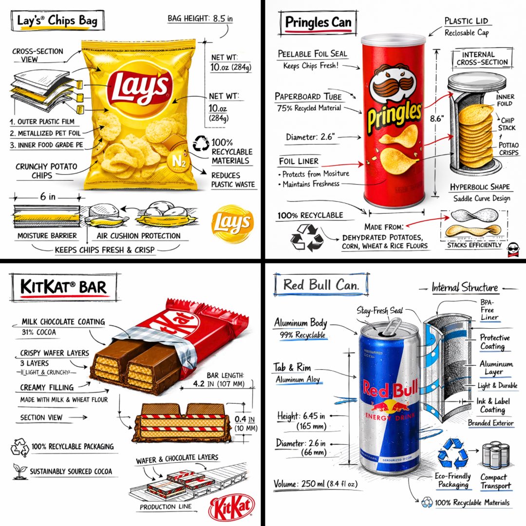
Full Prompt
[中文] 创建一个 [SNACK] 的品牌技术信息图,结合产品的真实照片或照片级真实渲染,并将技术注释覆盖层直接置于其上。在纯白摄影棚背景上使用带有策略性 [BRAND COLOR] 点缀的黑色墨水风格线条画(建筑草图外观),包括: • 关键组件标签 • 显示结构、分层或内部设计的内部截面图 • 测量数据、尺寸和规格 • 带有成分和数量的材料标注 • 指示主要功能和结构完整性的箭头 • 显示关键机械或设计元素的简单示意图或剖面图 • 可持续性标注 标题位置:位于手绘技术注释框内,带有强调色边框,粗体字显示产品名称,置于上角。 风格与布局规则: • 真实产品保持清晰可见 • 注释具有素描感、技术感和建筑感 • 强调色用于高光(占线条工作的 20-30%),黑色用于主要技术线条(70-80%) • 构图整洁,负空间平衡 • 具有教育意义、食品工程氛围和高端品牌感 • 在角落包含微妙的品牌标志 视觉风格:极简技术插画美学,黑色线条在真实图像上带有点缀,精确但略带手绘感。 调色板:白色背景,黑色注释线/文本,[BRAND COLOR] 仅用于点缀和关键标注。 输出:1080×1080,超清晰,社交媒体动态优化,无水印。 [English] Create a branded technical infographic of a [SNACK], combining a realistic photograph or photoreal render of the product with technical annotation overlays placed directly on top. Use black ink–style line drawings with strategic [BRAND COLOR] accents (architectural sketch look) on a pure white studio background, including: • Key component labels • Internal cross-section showing structure, layering, or internal design • Measurements, dimensions, and specifications • Material callouts with composition and quantities • Arrows indicating function for primary features and structural integrity • Simple schematic or sectional diagram showing key mechanical or design elements • Sustainability callouts Title placement: Inside a hand-drawn technical annotation box with accent border reading the product name in bold font, positioned in upper corner. Style & layout rules: • The realistic product remains clearly visible • Annotations feel sketched, technical, and architectural • Accents used for highlight (20-30% of linework), black for primary technical lines (70-80%) • Clean composition with balanced negative space • Educational, food-engineering vibe with premium branding • Include subtle brand logo mark in corner Visual style: Minimal technical illustration aesthetic, black linework with accents over realistic imagery, precise but slightly hand-drawn feel. Color palette: White background, black annotation lines/text, [BRAND COLOR] for accents and key callouts only. Output: 1080×1080, ultra-crisp, social-feed optimized, no watermark.