Case Media
Case Notes
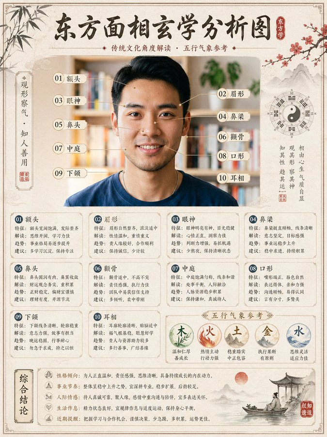
This page keeps the media, full prompt, and original source together so you can inspect the result first and decide whether the prompt is worth copying, saving, or comparing.
Case Insights
To make this page easier to search, cite, and reuse later, the case is also broken down into practical guidance about usage, visual cues, and prompt structure.
Best Fit Scenarios
- Use this as a ui & social screens benchmark when you need a fast style baseline before rewriting your own prompt.
- It is especially helpful if your target overlaps with Poster, Illustration, UI and you want to judge the image result before tuning wording.
- Keep it as a control sample when you compare nearby prompt variants one variable at a time.
Visual Signals To Notice
- The clearest style signals here are Poster, Illustration, UI, so those should usually stay in your first rewrite.
- The important layer is usually interface density, card hierarchy, and how the screen tells the story before you read small text.
- This case keeps one primary output, so the first image should be treated as the main visual reference.
How The Prompt Is Structured
- The prompt reads as a medium-detail prompt with clear visual constraints, which is useful when you want to judge how much specificity this direction needs.
- Its keyword cluster is centered on Poster, Illustration, UI, so you can usually keep that cluster while swapping subject, camera, layout, or copy details.
- A practical rewrite path is: keep the outcome, keep the strongest style cues, then replace only the subject and environment blocks.
Good Follow-up Questions
- What changes first if you keep Poster, Illustration, UI but switch the subject matter?
- Which part of the result comes from section-level structure (UI & Social Screens) versus tag-level style cues?
- Which related cases in the same section give you a cleaner or more extreme variation of the same direction?
Full Prompt
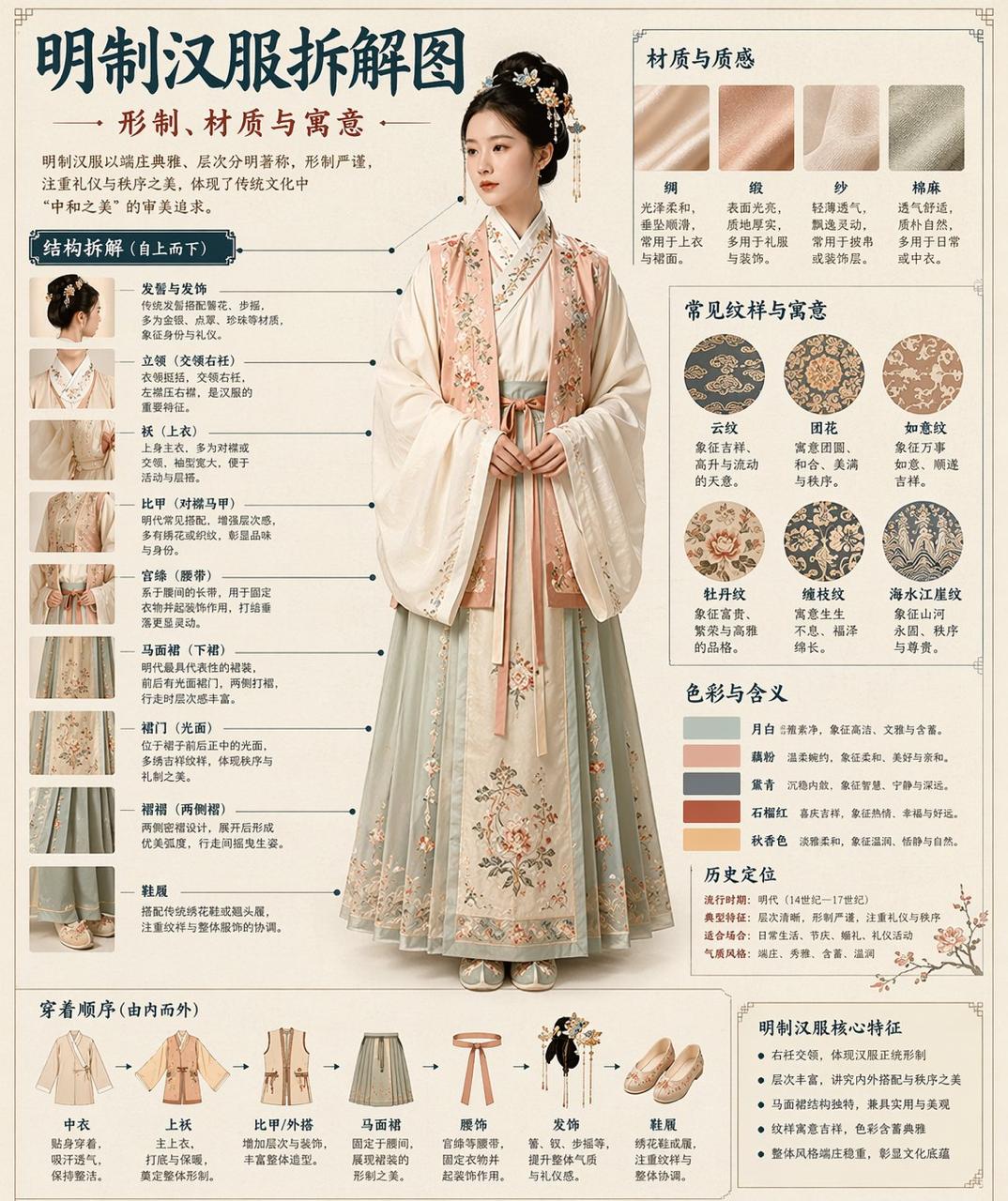
请根据【主题】自动生成一张“博物馆图鉴式中文拆解信息图”。 要求整张图兼具真实写实主视觉、结构拆解、中文标注、材质说明、纹样寓意、色彩含义和核心特征总结。你需要根据【主题】自动判断最合适的主体对象、服饰体系、器物结构、时代风格、关键部件、材质工艺、颜色方案与版式结构,用户无需再提供其他信息。 整体风格应为:国家博物馆展板、历史服饰图鉴、文博专题信息图,而不是普通海报、古风写真、电商详情页或动漫插画。背景采用米白、绢纸白、浅茶色等纸张质感,整体高级、克制、专业、可收藏。 版式固定为: - 顶部:中文主标题 + 副标题 + 导语 - 左侧:结构拆解区,中文引线标注关键部件,并配局部特写 - 右上:材质 / 工艺 / 质感区,展示真实纹理小样并附说明 - 右中:纹样 / 色彩 / 寓意区,展示主色板、纹样样本和文化解释 - 底部:穿着顺序 / 构成流程图 + 核心特征总结 若主题适合人物展示,则以真实人物全身站姿为中央主体;若更适合器物或单体结构,则改为中心主体拆解图,但整体仍保持完整中文信息图形式。所有文字必须为简体中文,清晰、规整、可读,不要乱码、错字、英文或拼音。重点突出真实结构、材质差异、文化说明与图鉴气质。 避免:海报感、影楼感、电商感、动漫感、cosplay感、乱标注、错结构、糊字、假材质、过度装饰。