Case Media
Case Notes
This page keeps the media, full prompt, and original source together so you can inspect the result first and decide whether the prompt is worth copying, saving, or comparing.
Case Insights
To make this page easier to search, cite, and reuse later, the case is also broken down into practical guidance about usage, visual cues, and prompt structure.
Best Fit Scenarios
- Use this as a ui & social screens benchmark when you need a fast style baseline before rewriting your own prompt.
- It is especially helpful if your target overlaps with Poster, Illustration, UI and you want to judge the image result before tuning wording.
- Keep it as a control sample when you compare nearby prompt variants one variable at a time.
Visual Signals To Notice
- The clearest style signals here are Poster, Illustration, UI, so those should usually stay in your first rewrite.
- The important layer is usually interface density, card hierarchy, and how the screen tells the story before you read small text.
- This case keeps 2 media outputs, which makes it easier to check whether the style remains stable across multiple results.
How The Prompt Is Structured
- The prompt reads as a long, highly specified prompt, which is useful when you want to judge how much specificity this direction needs.
- Its keyword cluster is centered on Poster, Illustration, UI, so you can usually keep that cluster while swapping subject, camera, layout, or copy details.
- A practical rewrite path is: keep the outcome, keep the strongest style cues, then replace only the subject and environment blocks.
Good Follow-up Questions
- What changes first if you keep Poster, Illustration, UI but switch the subject matter?
- Which part of the result comes from section-level structure (UI & Social Screens) versus tag-level style cues?
- Which related cases in the same section give you a cleaner or more extreme variation of the same direction?
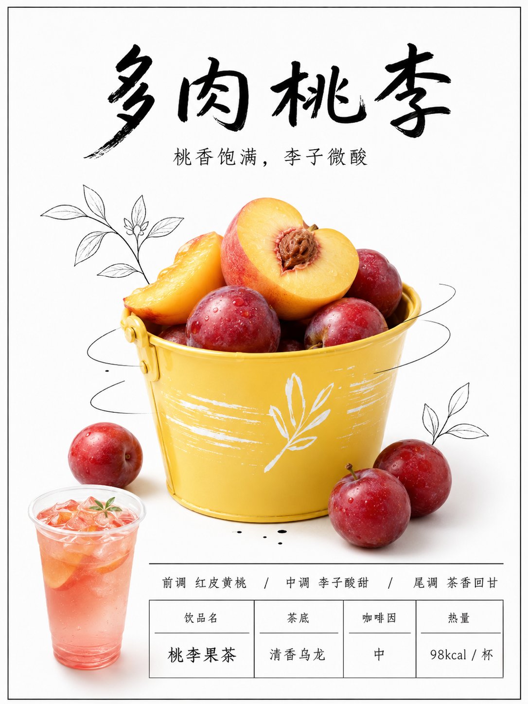
Full Prompt
Please use the uploaded fruit photo as a reference image, retaining the fruit species, shape, color, peel texture, and main body angle. Redesign this ordinary fruit photo into a 3:4 vertical 'New Tea Drink Menu Poster'. Screen Type: Do not generate phone screenshots, do not generate social media interfaces. There can be a very thin black border, but the main body must be a clean store lightbox poster. Overall Style: New tea drink store new product poster, white luminous lightbox background, minimalist negative space, black handwritten Chinese title, real fruit photography subject, a small amount of black hand-drawn line illustrations, bottom drink information area, clean, interesting, looking like a real new product menu board on a milk tea shop wall. Layout Requirements: Top 20% for the main title. The main title uses black handwritten font, large characters, with a sense of relaxation. Place a small subtitle below the main title. Middle 50% for the fruit subject, black stick-figure characters, lines, leaves, arrows, or small icons can be added to make the fruit interact with the hand-drawn lines. Bottom 25% for the product information area, including small cup drink images, flavor descriptions, tea base, calorie or caffeine information, separated into a concise table using thin lines. Text Content: Main Title: 'Fill in product name here' Subtitle: 'Fill in a taste description here' The bottom can write: Top Note / Middle Note / Base Note Drink Name Tea Base Caffeine Calories Visual Details: The white background should be clean, with a slight lightbox glowing feel. Black text and lines should look like handwritten markers. Fruit should be real, not cartoonish. The bottom information area should look like store menu design, not too crowded. Avoid: No real brand logos, no watermarks, no garbled characters, no complex backgrounds, no fruit stall feel, no high-saturation cheap advertisements, do not change the fruit variety, no human photos, no phone interfaces.