Case Media

Case Notes
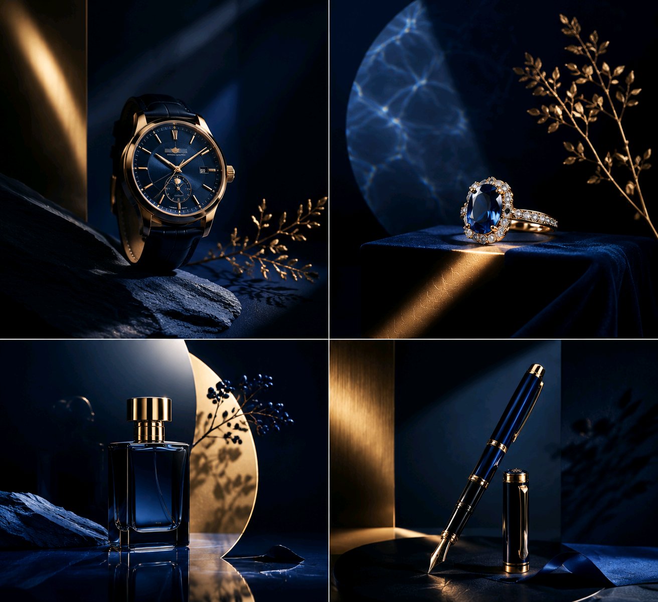
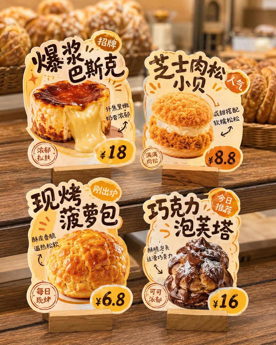
This page keeps the media, full prompt, and original source together so you can inspect the result first and decide whether the prompt is worth copying, saving, or comparing.
Case Insights
To make this page easier to search, cite, and reuse later, the case is also broken down into practical guidance about usage, visual cues, and prompt structure.
Best Fit Scenarios
- Use this as a poster & illustration benchmark when you need a fast style baseline before rewriting your own prompt.
- It is especially helpful if your target overlaps with Poster, Illustration, Product and you want to judge the image result before tuning wording.
- Keep it as a control sample when you compare nearby prompt variants one variable at a time.
Visual Signals To Notice
- The clearest style signals here are Poster, Illustration, Product, so those should usually stay in your first rewrite.
- Pay close attention to layout rhythm, headline hierarchy, illustration texture, and how information is staged in the frame.
- This case keeps 2 media outputs, which makes it easier to check whether the style remains stable across multiple results.
How The Prompt Is Structured
- The prompt reads as a long, highly specified prompt, which is useful when you want to judge how much specificity this direction needs.
- Its keyword cluster is centered on Poster, Illustration, Product, so you can usually keep that cluster while swapping subject, camera, layout, or copy details.
- A practical rewrite path is: keep the outcome, keep the strongest style cues, then replace only the subject and environment blocks.
Good Follow-up Questions
- What changes first if you keep Poster, Illustration, Product but switch the subject matter?
- Which part of the result comes from section-level structure (Poster & Illustration) versus tag-level style cues?
- Which related cases in the same section give you a cleaner or more extreme variation of the same direction?
Full Prompt
Generate a visual work with the order of a portfolio cover centered on a specific theme. The core object should not be displayed in its entirety, but first compressed into a main mass deviating from the central axis, submerged between a translucent atomized surface layer and a low-saturation background field; the complete outline, secondary details, and ordinary descriptions of the object are swallowed by embossed glass particles, tiny refractive displacements, milky atomization, and low-contrast blurring, with a clean and clear narrow window cut out only at the position that best carries the thematic recognition, allowing that part to retain real texture, high contrast, and necessary color, while the rest turns into dark mass, softened outlines, broken edges, and transitions eaten by the background. The clear narrow window should be like a precise gap wiped from the material surface, restrained in size but accurate in semantics, becoming the only strong entrance for the viewer to enter the theme. The background is derived from the spatial relationship, material properties, temporal direction, and emotional temperature of the theme into a large-area low-noise color field, retaining a light airy feel at the top or outside, forming a light-colored breathing zone on one side, and pressing into a lower brightness in the area where the main body is located; the background does not carry ordinary scene narratives, but assumes the structural functions of swallowing edges, carrying white text, and creating distance and a sense of memory. Colors maintain a proportion between large-area low-saturation structural colors, low-brightness main colors, a small amount of concentrated real colors, and white information colors; the hue changes with the theme, while the brightness levels, saturation restraint, and local color value remain stable. The image uses three layers: clear, semi-clear, and out-of-focus: the clear narrow window is responsible for theme recognition, short thick white titles and numbers remain semi-clear and readable, and the majority of the subject, background, and micro-information at the bottom enter atomized defocus. The text uses modern sans-serif fonts, white or near-white, with short, thick titles that look like they are printed on glass and slightly bitten by the surface layer; corner logos, edge dates, numbers, and bottom micro-annotations form a metadata coordinate system, like work numbers, archive records, and production parameters, with text serving the reading route without covering the clear narrow window. The overall surface retains a visible granular embossed glass touch, with the texture changing density according to the brightness and darkness of the underlying layer, denser in dark areas, more milky in bright areas, with fine refraction and slight displacement at the edges, all images, objects, and text looking like they are unified by being pressed by the same piece of material. The final image should present a calm, restrained visual cover with a sense of technical archives: information is consciously hidden, and only the most critical parts are released. This theme: Crazy Thursday KFC. Ratio: 9:10.