Case Media
Case Notes
This page keeps the media, full prompt, and original source together so you can inspect the result first and decide whether the prompt is worth copying, saving, or comparing.
Case Insights
To make this page easier to search, cite, and reuse later, the case is also broken down into practical guidance about usage, visual cues, and prompt structure.
Best Fit Scenarios
- Use this as a poster & illustration benchmark when you need a fast style baseline before rewriting your own prompt.
- It is especially helpful if your target overlaps with Poster, Illustration, Minimal and you want to judge the image result before tuning wording.
- Keep it as a control sample when you compare nearby prompt variants one variable at a time.
Visual Signals To Notice
- The clearest style signals here are Poster, Illustration, Minimal, so those should usually stay in your first rewrite.
- Pay close attention to layout rhythm, headline hierarchy, illustration texture, and how information is staged in the frame.
- This case keeps 2 media outputs, which makes it easier to check whether the style remains stable across multiple results.
How The Prompt Is Structured
- The prompt reads as a long, highly specified prompt, which is useful when you want to judge how much specificity this direction needs.
- Its keyword cluster is centered on Poster, Illustration, Minimal, so you can usually keep that cluster while swapping subject, camera, layout, or copy details.
- A practical rewrite path is: keep the outcome, keep the strongest style cues, then replace only the subject and environment blocks.
Good Follow-up Questions
- What changes first if you keep Poster, Illustration, Minimal but switch the subject matter?
- Which part of the result comes from section-level structure (Poster & Illustration) versus tag-level style cues?
- Which related cases in the same section give you a cleaner or more extreme variation of the same direction?
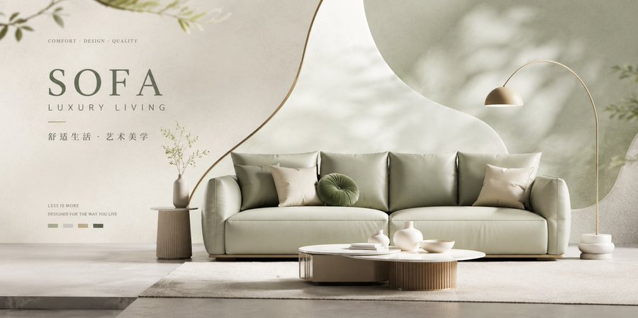
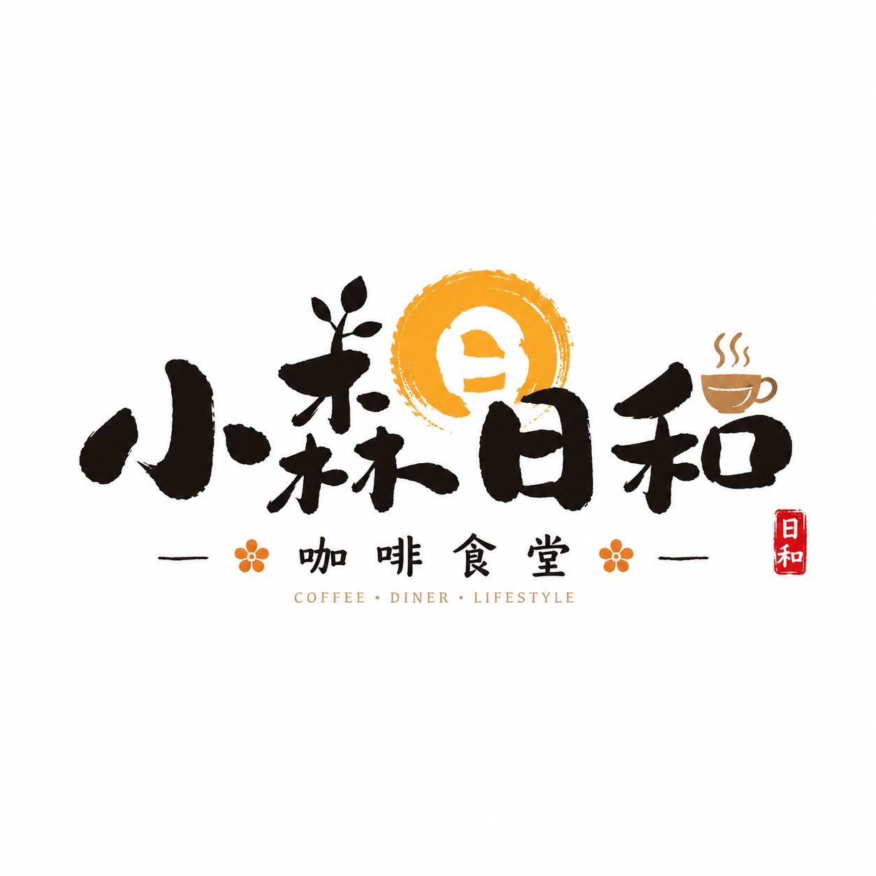
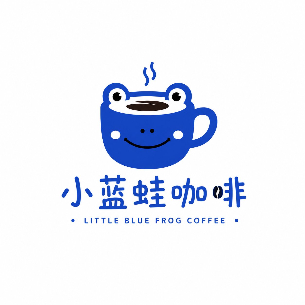
Full Prompt
Generate a brand Logo in the "Minimalist Cute Symbol" style, the brand name is [Brand Name], and the category is [Category]. Use [Subject Image] as the core visual, drawing the subject as a simple, cute, relaxed, minimalist symbol image with a bit of emotion. The overall design adopts minimal elements, rounded lines, geometric outlines, flat vector feel, and a slight handwritten feel. The shape should be simple but recognizable, no complex illustrations, no realism, no 3D, no heavy textures. The color scheme is mainly based on [Main Color], which can be matched with 1-2 low-saturation auxiliary colors, and the colors are clean and soft. The Logo consists of "graphic symbol + Chinese wordmark / can be matched with a small amount of English sub-mark". The text part should be natural, have a sense of design, and not be overly fancy. The overall layout is simple and comfortable, with sufficient white space and a pure white or light gray-white background. The image should look like a complete brand Logo proposal, with a relaxed, healing, modern, and commercial style, suitable for coffee, home, grocery, dessert, and lifestyle brands. No complex backgrounds, no redundant decorations, no poster feel, no full-page layout, only keep one complete Logo solution. Reference for replaceable fields: [Brand Name] Little Blue Frog Coffee / Mian Tu Dai Dai / Shan Qi Home / Chun Bei Little Bear [Category] Coffee Brand / Bag & Grocery / Home Brand / Dessert Brand [Subject Image] Little Blue Frog / Sleepy Bunny / Mountain shape and air symbol / Little bear and cup [Main Color] Fog Blue / Cream Yellow / Moss Green / Caramel Brown