Case Media
Case Notes
This page keeps the media, full prompt, and original source together so you can inspect the result first and decide whether the prompt is worth copying, saving, or comparing.
Case Insights
To make this page easier to search, cite, and reuse later, the case is also broken down into practical guidance about usage, visual cues, and prompt structure.
Best Fit Scenarios
- Use this as a poster & illustration benchmark when you need a fast style baseline before rewriting your own prompt.
- It is especially helpful if your target overlaps with Poster, Illustration, Typography and you want to judge the image result before tuning wording.
- Keep it as a control sample when you compare nearby prompt variants one variable at a time.
Visual Signals To Notice
- The clearest style signals here are Poster, Illustration, Typography, so those should usually stay in your first rewrite.
- Pay close attention to layout rhythm, headline hierarchy, illustration texture, and how information is staged in the frame.
- This case keeps 2 media outputs, which makes it easier to check whether the style remains stable across multiple results.
How The Prompt Is Structured
- The prompt reads as a long, highly specified prompt, which is useful when you want to judge how much specificity this direction needs.
- Its keyword cluster is centered on Poster, Illustration, Typography, so you can usually keep that cluster while swapping subject, camera, layout, or copy details.
- A practical rewrite path is: keep the outcome, keep the strongest style cues, then replace only the subject and environment blocks.
Good Follow-up Questions
- What changes first if you keep Poster, Illustration, Typography but switch the subject matter?
- Which part of the result comes from section-level structure (Poster & Illustration) versus tag-level style cues?
- Which related cases in the same section give you a cleaner or more extreme variation of the same direction?
Full Prompt
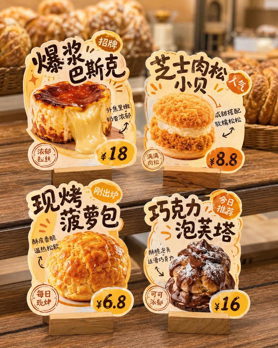
Please generate a 'store irregular table card' design display image. The background must be pure white, used for post-production cutout and separate splitting. Core Requirements: This is not a real-life store poster or a scene display image, but a white background layout. The image shows 4 independent 'store irregular table cards / dish recommendation inserts / hot item recommendation cards', convenient for cutting out each card individually later. Please design around the following content: Brand Name: [Brand Name] Store Type: [Store Type, such as Hot Pot Restaurant / Dessert Shop / Tea Shop / Bakery / Snack Shop / Cafe] Overall Style: [Style, such as Hand-drawn POP feel / Lively and Smoky / Fresh Fruit Drink / Hong Kong Style Dessert / Warm Bakery / Cute and Healing] Main Color: [Color Direction] Product List: 1. [Product Name 1] / [Price 1] / [Selling Point 1] 2. [Product Name 2] / [Price 2] / [Selling Point 2] 3. [Product Name 3] / [Price 3] / [Selling Point 3] 4. [Product Name 4] / [Price 4] / [Selling Point 4] Visual Requirements: 1. The whole image is a pure white background, clean, simple, unobstructed, no store environment, no tabletop scene, no handheld, no people, no prop backgrounds. 2. Show 4 independent store irregular table cards in the image, arranged in a 2x2 layout, neat and clear, with enough spacing between each other, no overlapping, convenient for separate cutout later. 3. Each table card must be presented completely, with clear edges, defined outlines, and a strong sense of irregular shape, not ordinary rectangular cards. 4. Each table card is based on a single product, highlighting the main visual of the food, product name, price, short selling points, and label information like Signature/New/TOP1/Popular. 5. The table card style should be like small recommendation inserts used in real stores, with a sense of commerce and practicality, not illustration posters or course assignment layouts. 6. The material of the table cards should be presented as thick cardboard die-cut cards, which can appropriately have a base, but the base should also be simple, complete, and easy to identify. 7. The font style leans towards hand-drawn POP, bold titles, friendly and lively, with a few arrows, stamps, annotations, small labels, and small decorative symbols added, but not too cluttered. 8. Each table card must have strong product recognition and different irregular outline changes, which can be designed according to the shape of the product, text flow, or ingredient elements. 9. The food should be appetizing, realistic, and look delicious, suitable for catering stores. 10. The overall visual needs to be exquisite, unified, and complete, like a set of small store irregular table card systems that can be directly delivered to customers for reference. Special Emphasis: - Background must be pure white - Show only 4 table cards - No real store scenes - No tabletop settings - No complex shadows - Do not assemble into a poster feel - The key is to let each irregular table card be used for individual cutout Final effect should be like: A design display image with a pure white background, with 4 independent store irregular table cards neatly placed on it, each complete, clear, easy to cut out, and can be directly split and used.