Case Media
Case Notes
This page keeps the media, full prompt, and original source together so you can inspect the result first and decide whether the prompt is worth copying, saving, or comparing.
Case Insights
To make this page easier to search, cite, and reuse later, the case is also broken down into practical guidance about usage, visual cues, and prompt structure.
Best Fit Scenarios
- Use this as a poster & illustration benchmark when you need a fast style baseline before rewriting your own prompt.
- It is especially helpful if your target overlaps with Poster, Illustration, Character and you want to judge the image result before tuning wording.
- Keep it as a control sample when you compare nearby prompt variants one variable at a time.
Visual Signals To Notice
- The clearest style signals here are Poster, Illustration, Character, so those should usually stay in your first rewrite.
- Pay close attention to layout rhythm, headline hierarchy, illustration texture, and how information is staged in the frame.
- This case keeps one primary output, so the first image should be treated as the main visual reference.
How The Prompt Is Structured
- The prompt reads as a long, highly specified prompt, which is useful when you want to judge how much specificity this direction needs.
- Its keyword cluster is centered on Poster, Illustration, Character, so you can usually keep that cluster while swapping subject, camera, layout, or copy details.
- A practical rewrite path is: keep the outcome, keep the strongest style cues, then replace only the subject and environment blocks.
Good Follow-up Questions
- What changes first if you keep Poster, Illustration, Character but switch the subject matter?
- Which part of the result comes from section-level structure (Poster & Illustration) versus tag-level style cues?
- Which related cases in the same section give you a cleaner or more extreme variation of the same direction?
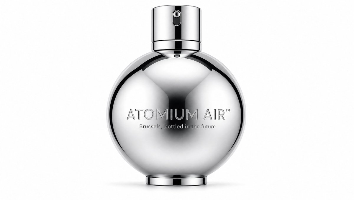
Full Prompt
Create a minimalist luxury fragrance product shot on a clean white studio background. Center a single futuristic perfume bottle shaped like a perfectly round polished chrome sphere with a flat circular base and a short cylindrical chrome spray cap on top. The bottle should look highly reflective and mirror-like, with smooth black-and-white studio reflections curving across the spherical surface, a dark soft central reflection, crisp metallic rim highlights, and subtle grounding shadow beneath. The sprayer has a tiny nozzle aperture visible near the top front, with a vertical black reflective strip running down the cap. Add engraved metallic text across the front of the sphere: {argument name="fragrance name" default="ATOMIUM AIR™"} in thin uppercase modern sans-serif lettering, and a smaller tagline beneath it reading {argument name="tagline" default="Brussels, bottled in the future"}. The composition is symmetrical, premium, quiet, and hyper-realistic, like a high-end cosmetics advertisement inspired by Belgian futurism, Art Deco chrome, rain-slick Brussels, and spacecraft-like design. Use only one bottle, one cap, one base, and two visible text lines; no people, no props, no colored background, no extra labels, no watermark.