Case Media
Case Notes
This page keeps the media, full prompt, and original source together so you can inspect the result first and decide whether the prompt is worth copying, saving, or comparing.
Case Insights
To make this page easier to search, cite, and reuse later, the case is also broken down into practical guidance about usage, visual cues, and prompt structure.
Best Fit Scenarios
- Use this as a poster & illustration benchmark when you need a fast style baseline before rewriting your own prompt.
- It is especially helpful if your target overlaps with Fashion, Poster, Illustration and you want to judge the image result before tuning wording.
- Keep it as a control sample when you compare nearby prompt variants one variable at a time.
Visual Signals To Notice
- The clearest style signals here are Fashion, Poster, Illustration, so those should usually stay in your first rewrite.
- Pay close attention to layout rhythm, headline hierarchy, illustration texture, and how information is staged in the frame.
- This case keeps 2 media outputs, which makes it easier to check whether the style remains stable across multiple results.
How The Prompt Is Structured
- The prompt reads as a long, highly specified prompt, which is useful when you want to judge how much specificity this direction needs.
- Its keyword cluster is centered on Fashion, Poster, Illustration, so you can usually keep that cluster while swapping subject, camera, layout, or copy details.
- A practical rewrite path is: keep the outcome, keep the strongest style cues, then replace only the subject and environment blocks.
Good Follow-up Questions
- What changes first if you keep Fashion, Poster, Illustration but switch the subject matter?
- Which part of the result comes from section-level structure (Poster & Illustration) versus tag-level style cues?
- Which related cases in the same section give you a cleaner or more extreme variation of the same direction?
Full Prompt
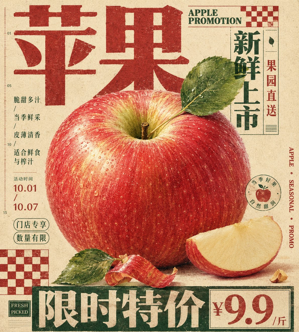
Generate a vertical print poster based on a specific theme. First, translate the theme into an enlarged tactile main specimen or main material mass, placed at the center or middle-lower part of the frame, giving it clear identifiable edges, soft volume, local high-density details, and touchable material changes. The subject is not displayed in isolation but is sandwiched by giant titles, edge text, hard-edged checkerboard modules, and low-contrast explanatory text; the titles use heavy fonts with a clear skeleton, becoming top, bottom, or side edge architecture, participating in the composition like walls, bases, or sidebars, where the text first forms a structure and then carries semantics. Let the silhouette of the subject, subordinate fragments, material edges, or symbolic fragments partially overlap the titles, vertical text, and geometric blocks, forming a clear but restrained front-to-back layer, making the image and layout interpenetrate rather than avoid each other. The background is a full sheet of warm, low-noise, printable paper field, with subtle paper grain, fiber, particles, and a slight ink-absorption feel, used to unify the realistic subject, flat text, and geometric color blocks; the background maintains breathing and medium feel, not creating real space. Colors are layered by function: the paper base occupies the largest area; the subject retains the most delicate emotional colors, soft gradients, and local saturation; the titles, edge words, or checkerboards use flatter, more stable structural colors; the body text and notes recede into the paper surface with low contrast, the overall has a clear area difference, lightness order, and a balance where sweetness is suppressed by structure. Place one or two hard-edged checkerboard modules in the corners as graphic rhythm anchors; they have no perspective, no shadows, and are printed directly on the paper to balance the subject's curves, title volume, and white space pressure. Small body text should not look like independent description cards but should be compressed into a compact information texture, embedded in the white gaps around the subject, maintaining short line spacing, restrained colors, and an editorial instruction feel. The subject's details are only concentrated in positions that best convey tactile feel and thematic identity, while other subordinate edges are allowed to be cropped, blocked, or slightly softened to maintain primary and secondary hierarchy. The final surface has vintage printing passivation, text edges are slightly soft, color blocks have ink deposition, and paper grain passes through all layers without blurring the subject's details, overall presenting a mixture of carefully typeset editorial poster, packaging plate, and specimen description. This theme: Apple promotion poster. Ratio 9:10.