Case Media

Case Notes
This page keeps the media, full prompt, and original source together so you can inspect the result first and decide whether the prompt is worth copying, saving, or comparing.
Case Insights
To make this page easier to search, cite, and reuse later, the case is also broken down into practical guidance about usage, visual cues, and prompt structure.
Best Fit Scenarios
- Use this as a model & community benchmark when you need a fast style baseline before rewriting your own prompt.
- It is especially helpful if your target overlaps with Poster, Illustration, UI and you want to judge the image result before tuning wording.
- Keep it as a control sample when you compare nearby prompt variants one variable at a time.
Visual Signals To Notice
- The clearest style signals here are Poster, Illustration, UI, so those should usually stay in your first rewrite.
- This kind of case is strongest when you watch deltas: what changed, what broke, and which prompt choice caused that shift.
- This case keeps 2 media outputs, which makes it easier to check whether the style remains stable across multiple results.
How The Prompt Is Structured
- The prompt reads as a long, highly specified prompt, which is useful when you want to judge how much specificity this direction needs.
- Its keyword cluster is centered on Poster, Illustration, UI, so you can usually keep that cluster while swapping subject, camera, layout, or copy details.
- A practical rewrite path is: keep the outcome, keep the strongest style cues, then replace only the subject and environment blocks.
Good Follow-up Questions
- What changes first if you keep Poster, Illustration, UI but switch the subject matter?
- Which part of the result comes from section-level structure (Model & Community) versus tag-level style cues?
- Which related cases in the same section give you a cleaner or more extreme variation of the same direction?
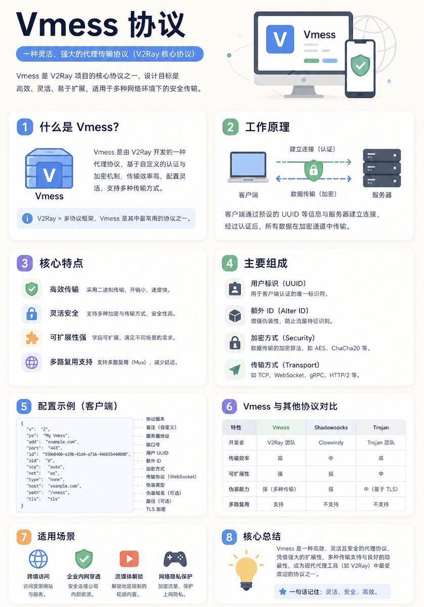
Full Prompt
A clean educational infographic poster explaining "{argument name="topic" default="Topic"}". [Overall Style] Modern minimalist UI style, background in soft light colors (e.g., cream #FAF7F2 / light gray-blue), restrained and comfortable color palette suitable for long reading sessions. [Core Requirements (Key)] Naturally organize content modules based on the information structure of the "topic". Do not force a fixed number or order of modules; prioritize clear logical information over formal symmetry. [Layout (Adaptive)] - Use grid layout (auto-select 2 columns / 3 columns / irregular distribution) - Card count adjusts based on content (usually 5–9) - High information density modules can be enlarged (higher visual weight) - Simple modules can be shrunk or merged [Card Design] - White cards (#FFFFFF) - Rounded corners + subtle shadows (soft layering) - Maintain uniform spacing and alignment [Each Information Module Includes] - Simple illustrations (unified style) - Clear headings (strong hierarchy) - 1–3 core explanatory sentences (avoid wordiness) - Examples / comparisons / summaries provided where necessary [Content Organization Principles (Emphasis)] Auto-select appropriate structure based on theme, e.g.: - Concept type → definition + principle + characteristics + example - Contrast type → A vs B (comparative structure) - Process type → steps / flowcharts - System type → components + relationships - Skill type → methods + tips + common mistakes [Visual Hierarchy] - Title > Module Title > Main Text > Supporting Information - Important info can be highlighted with color or icons [Color Suggestions] - Primary color: Choose based on theme (Tech=Blue, Learning=Green, Warning=Orange) - Secondary colors: 1–2 types suffice - Avoid high saturation and flashiness [Style Requirements] - Generous negative space, strong sense of "breathability" - Unified icons (linear or flat) - High readability as priority - Clear educational orientation [Extra Optimization (Optional)] - Can include: comparison blocks / process arrows / structure diagrams - Can have a "Core Summary" module as a visual finale.