Case Media
Case Notes
This page keeps the media, full prompt, and original source together so you can inspect the result first and decide whether the prompt is worth copying, saving, or comparing.
Case Insights
To make this page easier to search, cite, and reuse later, the case is also broken down into practical guidance about usage, visual cues, and prompt structure.
Best Fit Scenarios
- Use this as a model & community benchmark when you need a fast style baseline before rewriting your own prompt.
- It is especially helpful if your target overlaps with Fashion, Poster, Character and you want to judge the image result before tuning wording.
- Keep it as a control sample when you compare nearby prompt variants one variable at a time.
Visual Signals To Notice
- The clearest style signals here are Fashion, Poster, Character, so those should usually stay in your first rewrite.
- This kind of case is strongest when you watch deltas: what changed, what broke, and which prompt choice caused that shift.
- This case keeps one primary output, so the first image should be treated as the main visual reference.
How The Prompt Is Structured
- The prompt reads as a long, highly specified prompt, which is useful when you want to judge how much specificity this direction needs.
- Its keyword cluster is centered on Fashion, Poster, Character, so you can usually keep that cluster while swapping subject, camera, layout, or copy details.
- A practical rewrite path is: keep the outcome, keep the strongest style cues, then replace only the subject and environment blocks.
Good Follow-up Questions
- What changes first if you keep Fashion, Poster, Character but switch the subject matter?
- Which part of the result comes from section-level structure (Model & Community) versus tag-level style cues?
- Which related cases in the same section give you a cleaner or more extreme variation of the same direction?
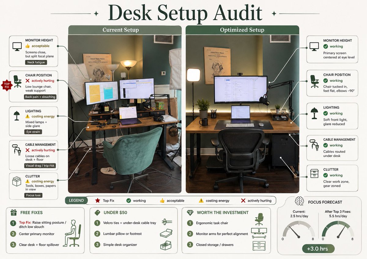
Full Prompt
Using REFERENCE_0, turn the attached desk photo and its written brief into a clean editorial-style infographic poster. Create a side-by-side comparison with exactly 2 labeled photo panels: “Current Setup” on the left using the original scene, and “Optimized Setup” on the right showing a plausible improved version of the same room and desk from a matching angle. Add a large serif headline at the top reading {argument name="headline text" default="Desk Setup Audit"}. Around the left panel, add exactly 5 issue callout cards connected by leader lines: 1) MONITOR HEIGHT — 👍 acceptable — “Screens close, but split focal plane” — tag “Neck fatigue”; 2) CHAIR POSITION — ❌ actively hurting — “Low lounge chair, weak support” — tag “Back pain + slouching”; 3) LIGHTING — ⚠️ costing energy — “Mixed lamps + side glare” — tag “Eye strain”; 4) CABLE MANAGEMENT — ❌ actively hurting — “Loose cables on desk + floor” — tag “Visual drag / trip risk”; 5) CLUTTER — ⚠️ costing energy — “Tools, boxes, papers in view” — tag “Focus loss”. Add a small red “TOP FIX” badge pointing to the chair position issue. Around the right panel, add exactly 5 improved callout cards: 1) MONITOR HEIGHT — ✅ working — “Primary screen centered at eye level”; 2) CHAIR POSITION — ✅ working — “Chair tucked in, feet flat, elbows ~90°”; 3) LIGHTING — ✅ working — “Soft front light, glare reduced”; 4) CABLE MANAGEMENT — ✅ working — “Cables routed under desk”; 5) CLUTTER — ✅ working — “Clear work zone, gear zoned”. In the optimized panel, visibly show the improvements: one main monitor centered, laptop centered below it, ergonomic office chair, cleaner desktop, cable routing hidden under the desk, softer balanced lighting, and a small drawer cabinet on the right while keeping the same room recognizable. Add a bottom legend with exactly 5 items: “LEGEND”, “Top Fix”, “working”, “acceptable”, “costing energy”, “actively hurting”. Along the bottom, add exactly 4 boxed sections: 1) “FREE FIXES” with 3 numbered items — “Top Fix: Raise sitting posture / ditch low slouch”, “Center primary monitor”, “Clear desk + floor spillover”; 2) “UNDER $50” with 3 numbered items — “Velcro ties + under-desk cable tray”, “Lumbar pillow or footrest”, “Simple desk organizer”; 3) “WORTH THE INVESTMENT” with 3 numbered items — “Ergonomic task chair”, “Monitor arms for perfect alignment”, “Closed storage / drawers”; 4) “FOCUS FORECAST” showing 2 gauges labeled “Current: 2.5 hrs/day” and “After Top 3 Fixes: 5.5 hrs/day”, plus a green pill reading “+3.0 hrs”. Use a refined magazine infographic aesthetic, muted green and cream palette, rounded boxes, minimal text, crisp icons, thin connector lines, and polished layout suitable for sharing on social media.