Case Media
Case Notes
This page keeps the media, full prompt, and original source together so you can inspect the result first and decide whether the prompt is worth copying, saving, or comparing.
Case Insights
To make this page easier to search, cite, and reuse later, the case is also broken down into practical guidance about usage, visual cues, and prompt structure.
Best Fit Scenarios
- Use this as a model & community benchmark when you need a fast style baseline before rewriting your own prompt.
- It is especially helpful if your target overlaps with Poster, Screenshot, City Visual and you want to judge the image result before tuning wording.
- Keep it as a control sample when you compare nearby prompt variants one variable at a time.
Visual Signals To Notice
- The clearest style signals here are Poster, Screenshot, City Visual, so those should usually stay in your first rewrite.
- This kind of case is strongest when you watch deltas: what changed, what broke, and which prompt choice caused that shift.
- This case keeps 2 media outputs, which makes it easier to check whether the style remains stable across multiple results.
How The Prompt Is Structured
- The prompt reads as a long, highly specified prompt, which is useful when you want to judge how much specificity this direction needs.
- Its keyword cluster is centered on Poster, Screenshot, City Visual, so you can usually keep that cluster while swapping subject, camera, layout, or copy details.
- A practical rewrite path is: keep the outcome, keep the strongest style cues, then replace only the subject and environment blocks.
Good Follow-up Questions
- What changes first if you keep Poster, Screenshot, City Visual but switch the subject matter?
- Which part of the result comes from section-level structure (Model & Community) versus tag-level style cues?
- Which related cases in the same section give you a cleaner or more extreme variation of the same direction?
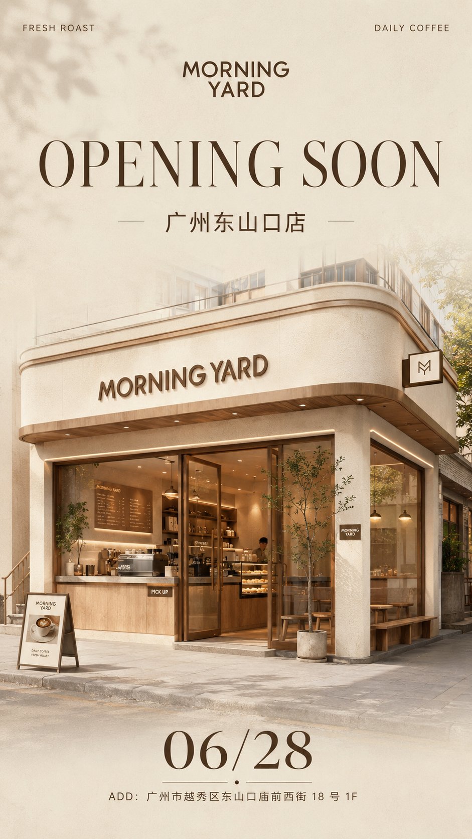
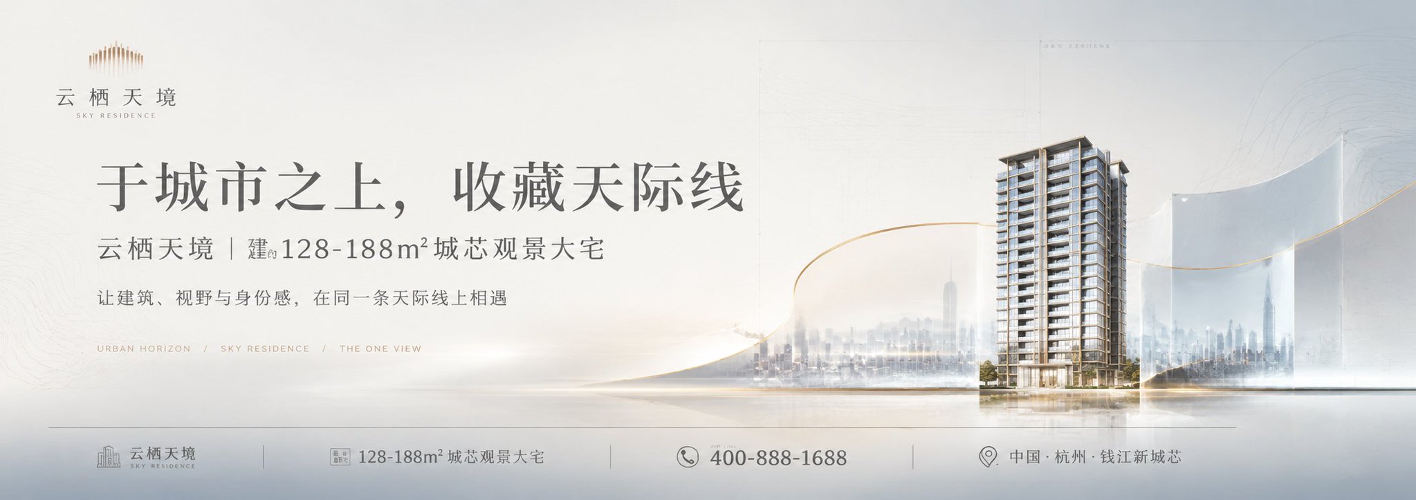
Full Prompt
Please generate a [High-end Real Estate Ultra-wide Banner Ad], single image, no collages, no multi-grids. Dimensions: Horizontal 3:1, approximately 2109×745 pixels, suitable for real estate hoardings, outdoor billboards, sales center materials, and real estate project value point posters. [Project Name]: Yunqi Tianjing [Main Title]: Fill in a high-end real estate advertising title [Subtitle]: Fill in a project value description [Core Selling Points]: City Cover / Lakefront Park / Educational Facilities / Comfortable Living Layout / Commercial Facilities / Mountain View Resources [Main Visual]: Building Facade / City Skyline / Lakefront Park / School Playground / Interior Showroom / Community Landscape [Main Color Palette]: Off-white, mist blue, light gray, pale cyan-green, champagne gold, low-saturation high-end color scheme The overall style is high-end real estate advertising, commercial proposal KV, modern Oriental minimalism, light luxury and restraint, large areas of white space, low-saturation colors, and authentic commercial material texture. The image adopts an ultra-wide horizontal composition, with the main title as the first visual center and the main visual scene as the second visual center, leaving a thin information bar at the bottom for placing project names, area ranges, hotline numbers, regional information, etc. The main visual should not be a simple texture paste; it must have a sense of design: through elements such as semi-transparent glass surfaces, curved space windows, fluid curves, paper folds, fine light gold lines, extremely faint grids, architectural line art, contour textures, and water ripple lines, package the building, landscape, or space into a high-end real estate proposal visual. Typography should be restrained and high-end: large Chinese titles are spaced out, subtitles are small, English small text as accents, information bar is thin and light, do not overfill with text. The overall look is like a real real estate hoarding advertisement / sales center main visual / outdoor banner KV. Avoid: common promotional posters, low-end real estate flyers, red-gold 'rich-and-gaudy' style, messy collages, excessive information, over-saturation, cheap template feel, images crudely pasted on, crowded text, cartoonish feel, low resolution.