Case Media
Case Notes
This page keeps the media, full prompt, and original source together so you can inspect the result first and decide whether the prompt is worth copying, saving, or comparing.
Case Insights
To make this page easier to search, cite, and reuse later, the case is also broken down into practical guidance about usage, visual cues, and prompt structure.
Best Fit Scenarios
- Use this as a model & community benchmark when you need a fast style baseline before rewriting your own prompt.
- It is especially helpful if your target overlaps with Poster, Illustration, City Visual and you want to judge the image result before tuning wording.
- Keep it as a control sample when you compare nearby prompt variants one variable at a time.
Visual Signals To Notice
- The clearest style signals here are Poster, Illustration, City Visual, so those should usually stay in your first rewrite.
- This kind of case is strongest when you watch deltas: what changed, what broke, and which prompt choice caused that shift.
- This case keeps 2 media outputs, which makes it easier to check whether the style remains stable across multiple results.
How The Prompt Is Structured
- The prompt reads as a long, highly specified prompt, which is useful when you want to judge how much specificity this direction needs.
- Its keyword cluster is centered on Poster, Illustration, City Visual, so you can usually keep that cluster while swapping subject, camera, layout, or copy details.
- A practical rewrite path is: keep the outcome, keep the strongest style cues, then replace only the subject and environment blocks.
Good Follow-up Questions
- What changes first if you keep Poster, Illustration, City Visual but switch the subject matter?
- Which part of the result comes from section-level structure (Model & Community) versus tag-level style cues?
- Which related cases in the same section give you a cleaner or more extreme variation of the same direction?
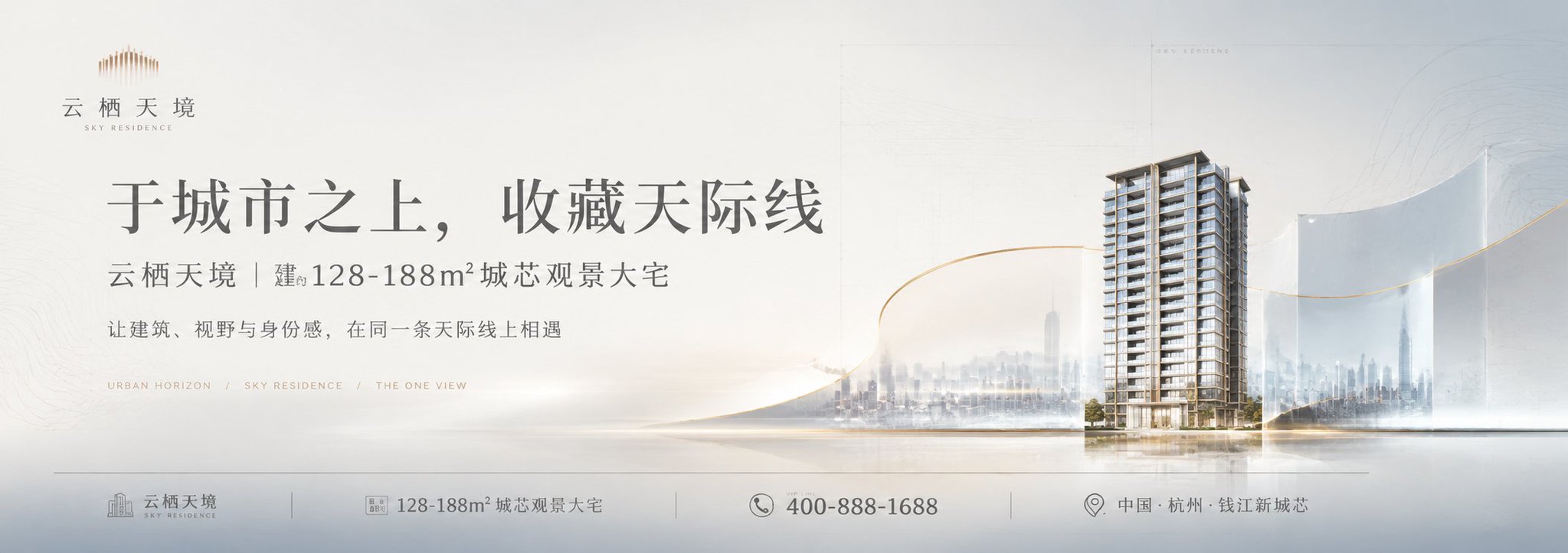
Full Prompt
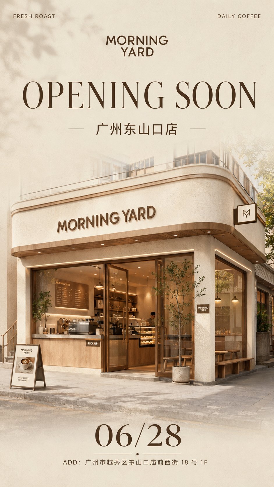
Please generate a vertical high-definition commercial poster with the theme [Brand New Store Opening Teaser Poster]. Note: This is a single independent poster, not a four-grid, do not collage. If making a series, please generate each image independently. [Basic Information] Brand Name: [Brand Name] Brand Type: [Coffee Shop / Light Food Shop / Bakery / Milk Tea Shop / Flower Shop / Fragrance Shop / Nail Salon / Pet Living Hall / Bookstore Cafe / Other] Store Name: [Store Name] Main Title Copy: [OPENING SOON / COMING SOON / GRAND OPENING / Soon to Open / New Store Opening] Subtitle: [City Name + Store Name] Opening Date: [Date] Address Information: [Full Address] Top Left Small Text: [Brand Keywords] Top Right Small Text: [Brand Philosophy / Auxiliary Phrase] [Visual Style] The overall visual should present a [Creamy Style / Minimalist / Light Luxury / Gentle / High-end / Clean / Strong Brand Sense] commercial visual style, like a new store opening poster released by a real brand, not a common renovation rendering, nor a cheap promotional advertisement. The image should have a strong sense of brand, social media shareability, and lifestyle brand temperament. [Color Setting] Main Color: [Main Color] Auxiliary Color: [Auxiliary Color] Accent Color: [Accent Color] The overall colors are low-saturation, soft and unified, clean and restrained, do not use too many colors, and do not make it excessively vivid. The background is mainly based on cream white, off-white, light khaki, warm gray, light wood color, etc., or it can be replaced with low-saturation palettes like matcha green, cherry blossom pink, mist gray-blue, or caramel brown based on the brand type. [Background Requirements] Keep the background clean and simple, with slight paper texture, faint grain, soft gradients, and high-end white space. The background should not be complex, not cluttered, without large areas of pattern stacking, and should have a brand poster and light magazine feel. [Main Visual] Place a fully visible high-quality 3D store space rendering main visual in the center of the screen. The space format is [Street-side Store / Mall Counter / Pop-up Kiosk / Island Store / Flagship Store Facade / Community Small Shop]. The storefront must clearly display the brand name [Brand Name]. The interior or exterior of the space may include: cash register, display cabinets, product displays, light boxes, windows, counters, shopping bags, signature drinks / bread / bouquets / fragrance / product props, etc., matching the [Brand Type]. Materials must be realistic, including [Light Wood Grain / Stone / Micro-cement / Glass / Metal / Acrylic / Warm Light Strips], etc. The overall needs to have real commercial space proportions, real perspective, delicate materials, real lighting and shadows, and architectural visualization-level texture. It should not look like a toy model, should not be cartoonish, and should not be an illustration. [Typography Structure] The overall layout adopts brand poster style typography, with a clear structure and sufficient white space. Place the brand logo / brand name [Brand Name] in the top middle. Place [Top Left Small Text] in the top left corner and [Top Right Small Text] in the top right corner. Enlarge the main title copy [Main Title Copy] in the upper middle area. The title needs to be clear, grand, and have a sense of design, using high-end serif or modern bold sans-serif styles. Place the [Subtitle] below the title. The middle part highlights the main visual of the store space. The [Opening Date] is clearly displayed below. Address information is placed at the bottom: ADD: [Address Information]. Clear reading path: Brand Name → Opening Title → Store Name → Store Main Visual → Date → Address. [Image Texture] The overall should look like a warm-up poster released by a real brand, high-definition and exquisite, with strong commercial design sense, real 3D rendering feel, soft lighting, clear materials, and professional typography, suitable for use on Xiaohongshu, Public Accounts, WeChat Moments, brand social media, investment proposals, and store opening publicity. [Adaptation Suggestions] If it's a coffee shop: can add coffee machines, takeout cups, dessert displays. If it's a light food shop: can add salad bowls, fruit and vegetable displays, freezers. If it's a bakery: can add croissants, baguettes, cake cabinets, bread trays. If it's a flower shop: can add bouquets, flower buckets, window displays. If it's a fragrance shop: can add candles, perfumes, diffuser bottles, scent testing stations. If it's a nail salon: can add front desk, nail tables, display walls, soft light mirrors. [Output Requirements] Output one complete vertical poster, ratio is [4:5 / 3:4 / 9:16]. Recommendation: Prioritize 4:5. Please ensure the store is fully visible, text layout is clear, visuals are unified, and the brand sense is strong. If making a series, please maintain the same layout logic, but generate each image independently, do not merge them. [Avoidance Items] Avoid spelling errors, avoid logo deformation, avoid messy store structures, avoid spatial perspective errors, avoid low resolution, avoid plastic-like materials, avoid messy colors, avoid cartoon style, avoid illustration style, avoid cheap e-commerce feel, avoid promotional poster feel, avoid excessive decoration, avoid toy model feel.