Case Media
Case Notes
This page keeps the media, full prompt, and original source together so you can inspect the result first and decide whether the prompt is worth copying, saving, or comparing.
Case Insights
To make this page easier to search, cite, and reuse later, the case is also broken down into practical guidance about usage, visual cues, and prompt structure.
Best Fit Scenarios
- Use this as a model & community benchmark when you need a fast style baseline before rewriting your own prompt.
- It is especially helpful if your target overlaps with Screenshot, Character, Typography and you want to judge the image result before tuning wording.
- Keep it as a control sample when you compare nearby prompt variants one variable at a time.
Visual Signals To Notice
- The clearest style signals here are Screenshot, Character, Typography, so those should usually stay in your first rewrite.
- This kind of case is strongest when you watch deltas: what changed, what broke, and which prompt choice caused that shift.
- This case keeps one primary output, so the first image should be treated as the main visual reference.
How The Prompt Is Structured
- The prompt reads as a long, highly specified prompt, which is useful when you want to judge how much specificity this direction needs.
- Its keyword cluster is centered on Screenshot, Character, Typography, so you can usually keep that cluster while swapping subject, camera, layout, or copy details.
- A practical rewrite path is: keep the outcome, keep the strongest style cues, then replace only the subject and environment blocks.
Good Follow-up Questions
- What changes first if you keep Screenshot, Character, Typography but switch the subject matter?
- Which part of the result comes from section-level structure (Model & Community) versus tag-level style cues?
- Which related cases in the same section give you a cleaner or more extreme variation of the same direction?
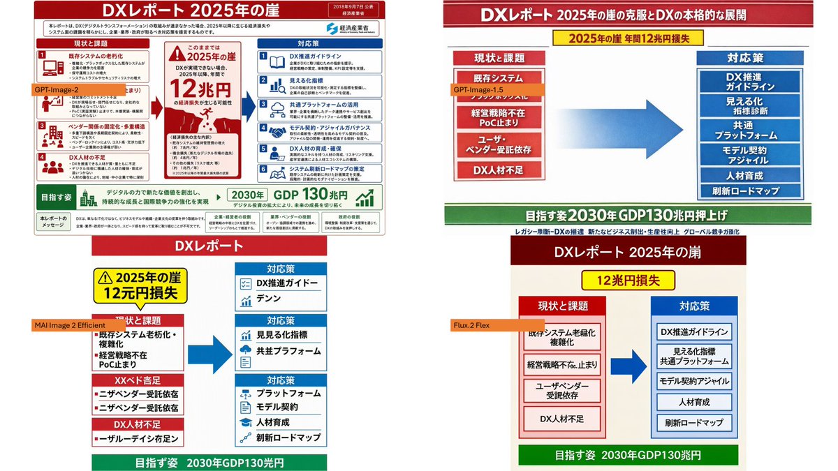
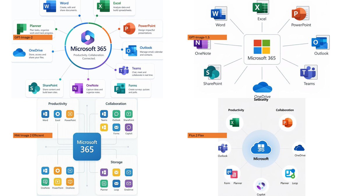
Full Prompt
Using the provided reference image as a benchmark for a clean, readable business infographic style, create a 16:9 comparison slide that demonstrates how different image generation models render an infographic about {argument name="topic" default="Microsoft 365"}. Replace the Japanese DX report content with four separate sample infographic outputs arranged in a 2×2 grid on a white background. Layout: Use exactly 4 panels, each showing a different Microsoft 365 ecosystem diagram, with a small horizontal orange model label near the left side of that panel. The four labels must be: 1) {argument name="top left model label" default="GPT-Image-2"}, 2) {argument name="top right model label" default="GPT-Image-1.5"}, 3) {argument name="bottom left model label" default="MAI Image 2 Efficient"}, and 4) {argument name="bottom right model label" default="Flux.2 Flex"}. Panel content: Each panel should visualize Microsoft 365 at the center with surrounding app icons and labels. Include recognizable Microsoft-style app tiles/icons such as Word, Excel, PowerPoint, Outlook, Teams, OneDrive, SharePoint, OneNote, Forms, Planner, Loop, and Copilot where appropriate. Make the top-left panel the most polished and text-readable, with a circular hub-and-spoke diagram and concise app descriptions. Make the top-right panel simpler, with icons connected to a central Microsoft 365 box. Make the bottom-left panel look like a structured category chart with Productivity, Collaboration, and Storage sections. Make the bottom-right panel look like a softer radial diagram with category headings and some imperfect or slightly inconsistent labels to imply model comparison. Style: Clean corporate SaaS infographic aesthetic, lots of white space, thin gray connector lines, Microsoft-like blue/green/orange/purple icon colors, crisp readable English text. Preserve the reference image’s practical business-document feel, but do not recreate its Japanese government-report layout, red warning sections, arrows, or original text. Constraints: Show exactly four model comparison examples, no extra title banner, no watermark, no Japanese text, and keep all text legible enough to compare model performance.