Case Media
Case Notes
This page keeps the media, full prompt, and original source together so you can inspect the result first and decide whether the prompt is worth copying, saving, or comparing.
Case Insights
To make this page easier to search, cite, and reuse later, the case is also broken down into practical guidance about usage, visual cues, and prompt structure.
Best Fit Scenarios
- Use this as a model & community benchmark when you need a fast style baseline before rewriting your own prompt.
- It is especially helpful if your target overlaps with Screenshot, Minimal, Typography and you want to judge the image result before tuning wording.
- Keep it as a control sample when you compare nearby prompt variants one variable at a time.
Visual Signals To Notice
- The clearest style signals here are Screenshot, Minimal, Typography, so those should usually stay in your first rewrite.
- This kind of case is strongest when you watch deltas: what changed, what broke, and which prompt choice caused that shift.
- This case keeps one primary output, so the first image should be treated as the main visual reference.
How The Prompt Is Structured
- The prompt reads as a long, highly specified prompt, which is useful when you want to judge how much specificity this direction needs.
- Its keyword cluster is centered on Screenshot, Minimal, Typography, so you can usually keep that cluster while swapping subject, camera, layout, or copy details.
- A practical rewrite path is: keep the outcome, keep the strongest style cues, then replace only the subject and environment blocks.
Good Follow-up Questions
- What changes first if you keep Screenshot, Minimal, Typography but switch the subject matter?
- Which part of the result comes from section-level structure (Model & Community) versus tag-level style cues?
- Which related cases in the same section give you a cleaner or more extreme variation of the same direction?
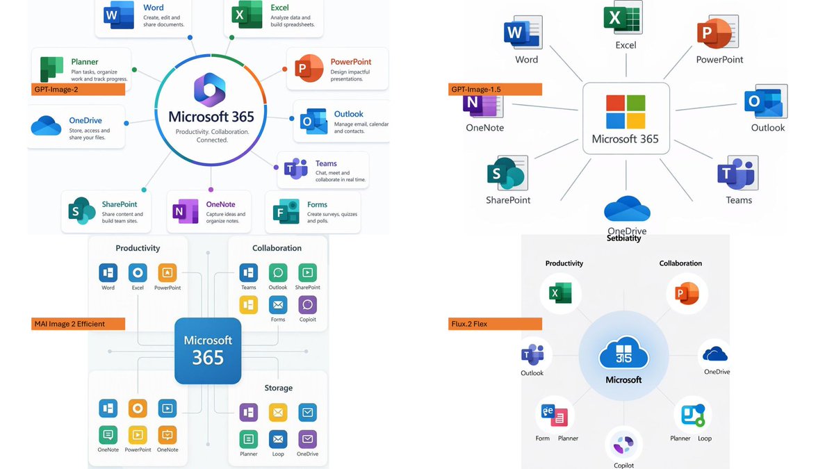
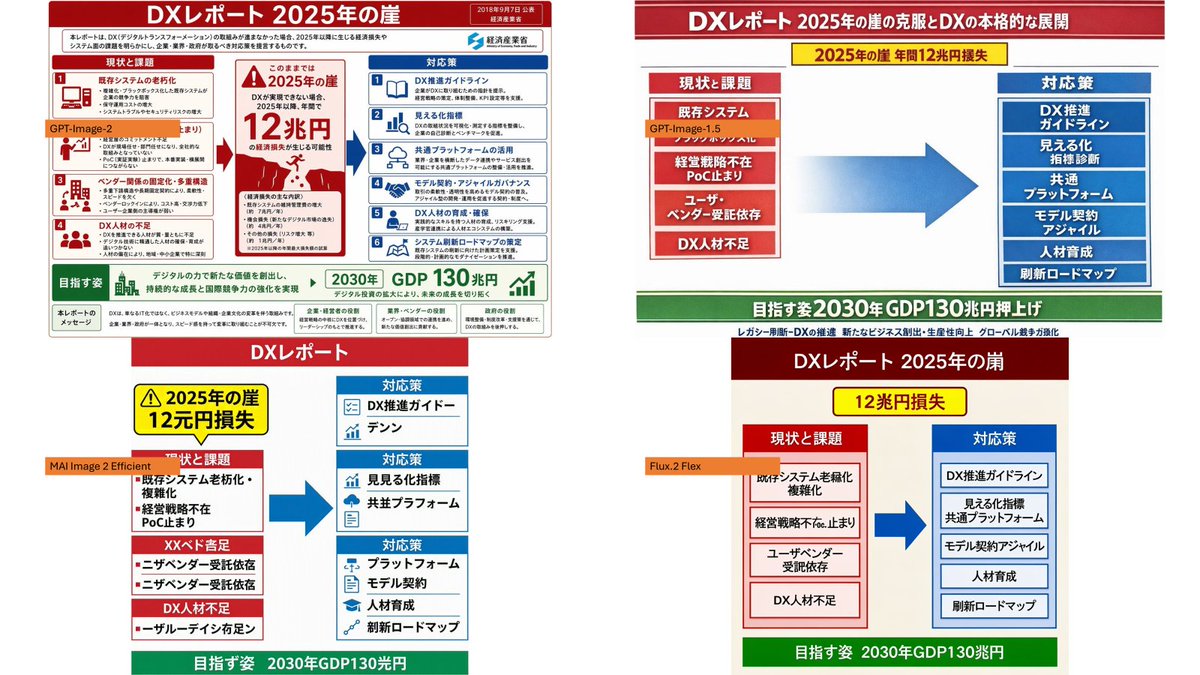
Full Prompt
Using the provided reference image as the source slide, create a 16:9 white comparison canvas showing four different regenerated versions of the same Japanese government-style DX report slide. Layout: Arrange exactly 4 panels in a 2×2 grid with generous white margins. The top-left panel should keep the provided reference slide nearly unchanged and scaled down. The other three panels should be simplified reinterpretations of the same content, each with the same overall logic: red header, red “current issues” block on the left, blue “countermeasures” block on the right, a large blue arrow pointing from left to right, and a green goal band at the bottom. Panel labels: Add exactly 4 small orange model labels over the panels: {argument name="top left model label" default="GPT-Image-2"}, {argument name="top right model label" default="GPT-Image-1.5"}, {argument name="bottom left model label" default="MAI Image 2 Efficient"}, and {argument name="bottom right model label" default="Flux.2 Flex"}. Text and content to preserve from the reference: Keep the main theme as {argument name="main headline" default="DXレポート 2025年の崖"}. Preserve readable Japanese key phrases such as “2025年の崖”, “12兆円損失”, “現状と課題”, “対応策”, “既存システム”, “経営戦略不在”, “DX人材不足”, “DX推進ガイドライン”, “見える化指標”, “共通プラットフォーム”, “モデル契約・アジャイル”, “人材育成”, “刷新ロードマップ”, and the green goal message about “2030年 GDP130兆円”. Panel differences: The top-right version should look like a clean, simplified PowerPoint infographic with a long red title bar, a yellow warning banner near the top, stacked red issue boxes on the left, stacked blue solution boxes on the right, and a large gradient blue arrow in the center. The bottom-left version should look more compact and slightly imperfect, with multiple red issue sections on the left and three blue response sections on the right. The bottom-right version should look like a neat minimal slide with a dark red title bar, a yellow loss badge, two bordered columns, and a green bottom goal bar. Style constraints: Make the overall image look like a screenshot of a PowerPoint slide comparing output quality across image models. Keep all four panels legible, flat, and infographic-like. Do not add photo-realistic elements, people, watermarks, or extra panels.