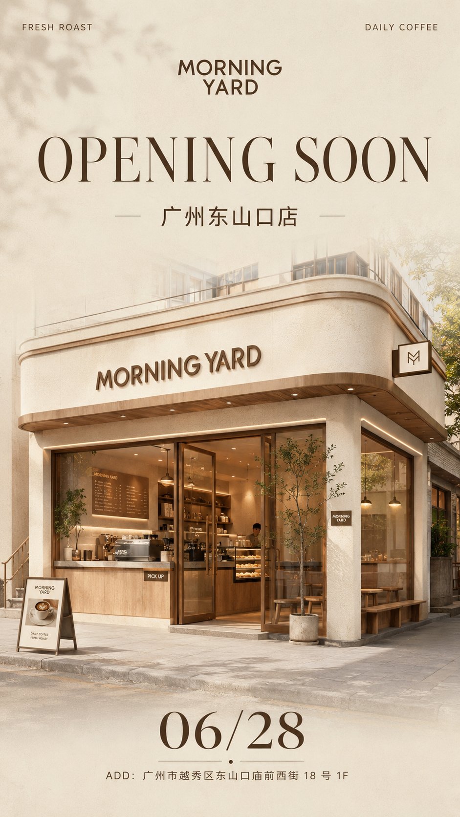
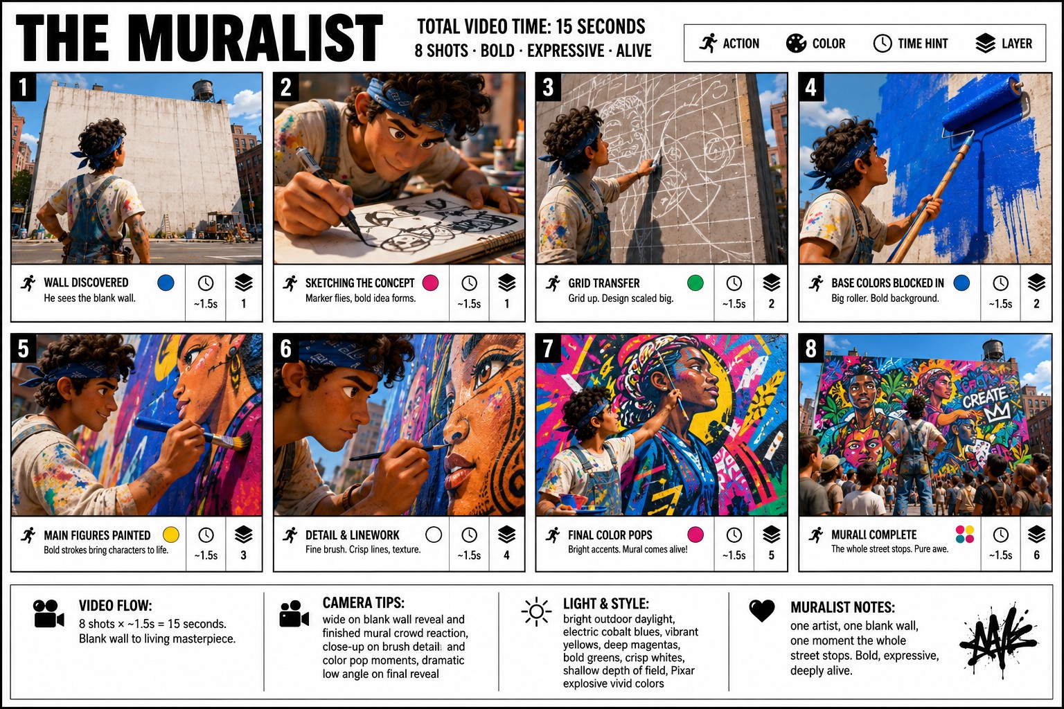
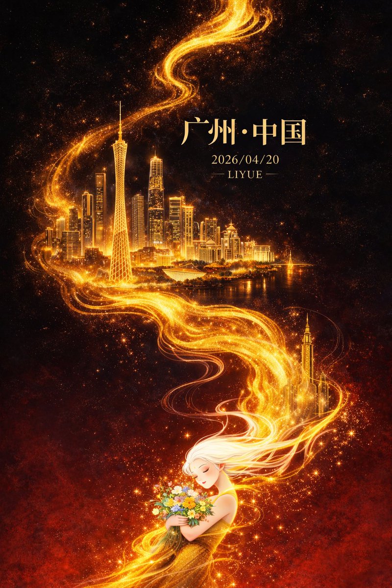
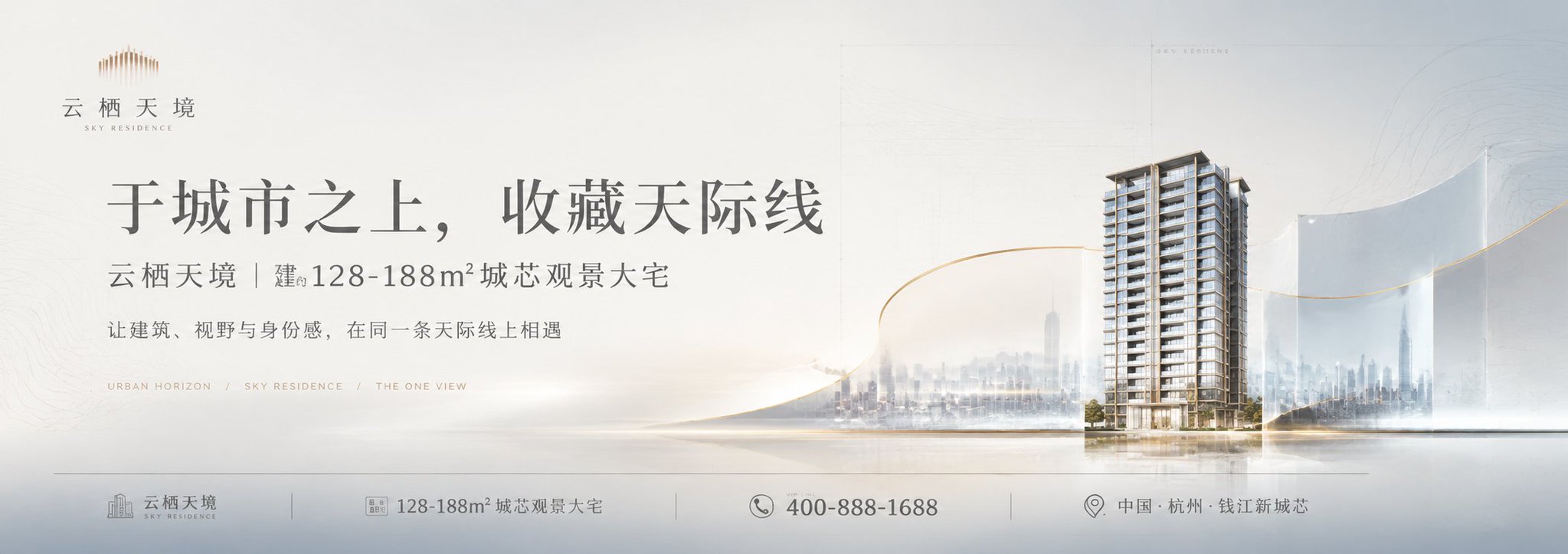
Case Media
Case Notes
This page keeps the media, full prompt, and original source together so you can inspect the result first and decide whether the prompt is worth copying, saving, or comparing.
Case Insights
To make this page easier to search, cite, and reuse later, the case is also broken down into practical guidance about usage, visual cues, and prompt structure.
Best Fit Scenarios
- Use this as a model & community benchmark when you need a fast style baseline before rewriting your own prompt.
- It is especially helpful if your target overlaps with Poster, Illustration, City Visual and you want to judge the image result before tuning wording.
- Keep it as a control sample when you compare nearby prompt variants one variable at a time.
Visual Signals To Notice
- The clearest style signals here are Poster, Illustration, City Visual, so those should usually stay in your first rewrite.
- This kind of case is strongest when you watch deltas: what changed, what broke, and which prompt choice caused that shift.
- This case keeps 2 media outputs, which makes it easier to check whether the style remains stable across multiple results.
How The Prompt Is Structured
- The prompt reads as a long, highly specified prompt, which is useful when you want to judge how much specificity this direction needs.
- Its keyword cluster is centered on Poster, Illustration, City Visual, so you can usually keep that cluster while swapping subject, camera, layout, or copy details.
- A practical rewrite path is: keep the outcome, keep the strongest style cues, then replace only the subject and environment blocks.
Good Follow-up Questions
- What changes first if you keep Poster, Illustration, City Visual but switch the subject matter?
- Which part of the result comes from section-level structure (Model & Community) versus tag-level style cues?
- Which related cases in the same section give you a cleaner or more extreme variation of the same direction?
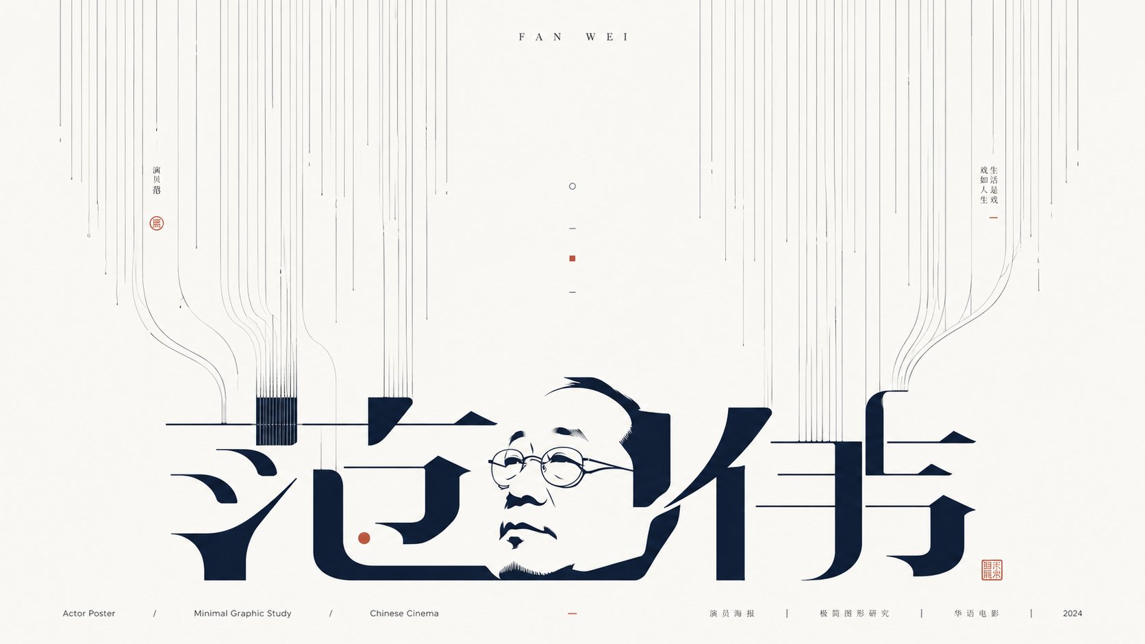
Full Prompt
Generate a minimalist graphic image around any subject, letting the theme appear as if pulled downward by an invisible force and growing in white space: the upper part consists of a large number of slender, uniform lines with slight hand-drawn pauses falling from the edges toward the interior, with the line groups maintaining clear spacing to form directional pressure like roots, light beams, or data streams; the middle part retains a highly airy white space, letting a few broken lines, short strokes, and tiny symbols become breathing points; the lower part features a giant main form derived from the subject, which can be transformed from the subject's name, core glyphs, symbolic outlines, or abstract structures, with strokes elongated, split, and bent, creating connections and echoes with the line groups, appearing as both text and a graphic installation. The information layer should be sparse and precise, with a short English title at the top and tiny explanatory text at the bottom, using starkly different font size hierarchies; the main form is the heaviest, while small text is calm and restrained like design archive annotations. Colors are extracted from the material, emotion, and cultural signals of the subject itself, mapped as large areas of high-brightness clean background colors, a few clear structural colors, and very few accent colors, maintaining a bright, clear, clean, calm, and precise mood; dark colors only carry lines, text, and structural skeletons, with controlled saturation and sharp boundaries, without any dirty, smoky, grayish-yellow, or retro stains. The overall completion should be like a combination of font design experiments and Eastern negative space concepts, building memory points through line density, intermittence, negative space, and glyph tension, rather than filling the screen with complex illustrations. Subject: Dream of the Red Chamber Purpose: Book Poster Ratio: 16:9