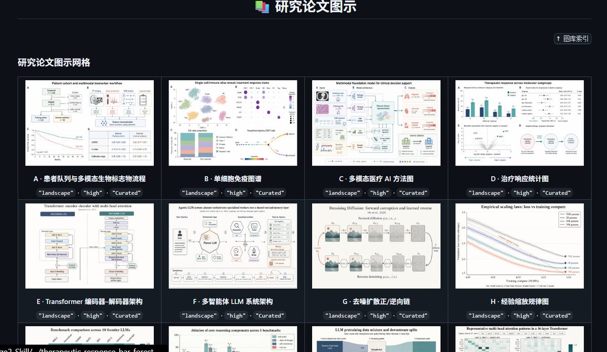
Case Media
Case Notes
This page keeps the media, full prompt, and original source together so you can inspect the result first and decide whether the prompt is worth copying, saving, or comparing.
Case Insights
To make this page easier to search, cite, and reuse later, the case is also broken down into practical guidance about usage, visual cues, and prompt structure.
Best Fit Scenarios
- Use this as a model & community benchmark when you need a fast style baseline before rewriting your own prompt.
- It is especially helpful if your target overlaps with Portrait, Cinematic, Poster and you want to judge the image result before tuning wording.
- Keep it as a control sample when you compare nearby prompt variants one variable at a time.
Visual Signals To Notice
- The clearest style signals here are Portrait, Cinematic, Poster, so those should usually stay in your first rewrite.
- This kind of case is strongest when you watch deltas: what changed, what broke, and which prompt choice caused that shift.
- This case keeps one primary output, so the first image should be treated as the main visual reference.
How The Prompt Is Structured
- The prompt reads as a long, highly specified prompt, which is useful when you want to judge how much specificity this direction needs.
- Its keyword cluster is centered on Portrait, Cinematic, Poster, so you can usually keep that cluster while swapping subject, camera, layout, or copy details.
- A practical rewrite path is: keep the outcome, keep the strongest style cues, then replace only the subject and environment blocks.
Good Follow-up Questions
- What changes first if you keep Portrait, Cinematic, Poster but switch the subject matter?
- Which part of the result comes from section-level structure (Model & Community) versus tag-level style cues?
- Which related cases in the same section give you a cleaner or more extreme variation of the same direction?
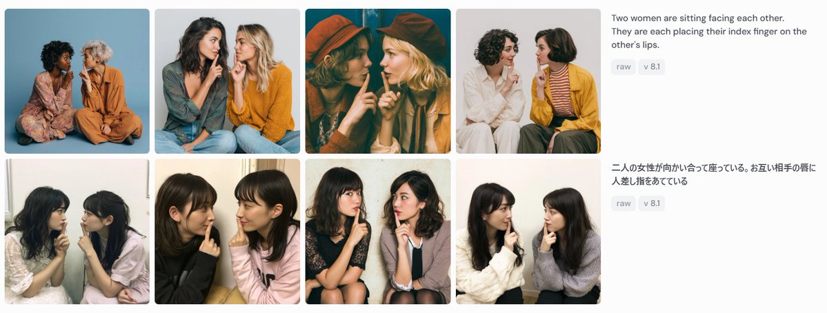
Full Prompt
Goal: Create a wide screenshot-style comparison panel showing image-generation results for the same prompt in two languages. Canvas: Use a horizontal 1199×461 px composition on a very light gray/off-white background, like a social media screenshot or web gallery capture. Layout: Arrange the left 75% as a 2-row by 4-column gallery of exactly 8 rounded-corner photo cards, with narrow white gutters between cards. Each card is a square-ish portrait photograph of two women sitting close together, facing each other or angled inward, each placing one index finger on the other person's lips in a mutual “shh” gesture. On the right 25%, place two stacked prompt description blocks aligned with the two gallery rows. Gallery details: Include exactly 8 distinct generated-photo cards: 1. Top-left: two women seated on the floor against a blue studio backdrop, one in a floral dress, one in an orange outfit. 2. Top-second: two women in casual sweaters, one dark-haired and one blonde, seated close together against a pale gray background. 3. Top-third: warm cinematic dark teal/orange image, both women wearing hats, faces partially obscured by large soft blur rectangles. 4. Top-fourth: two women on a white background, one in white clothing and one in a mustard cardigan with striped shirt. 5. Bottom-left: two young women seated indoors near a window, soft casual snapshot lighting. 6. Bottom-second: two young women in black and pale pink tops, close-up casual indoor portrait. 7. Bottom-third: two young women seated on chairs, one in a dark dress and one in a light cardigan, against a plain wall. 8. Bottom-fourth: two young women in white and gray sweaters, seated indoors against a light wall. Face treatment: All visible faces in the 8 cards should be anonymized with soft rectangular mosaic/blur blocks over the face area, matching the screenshot-like privacy masking. Right-side text content: At the top right, show the English prompt text: “{argument name="English prompt text" default="Two women are sitting facing each other. They are each placing their index finger on the other's lips."}” Under it, place two small rounded gray tags reading “raw” and “v 8.1”. Below, aligned with the second row, show the Japanese prompt text: “{argument name="Japanese prompt text" default="二人の女性が向かい合って座っている。お互い相手の唇に人差し指をあてている"}” Under it, place two matching gray tags reading “raw” and “v 8.1”. Visual style: Photorealistic generated-image thumbnails, varied lighting and wardrobes, clean UI spacing, rounded image corners, sans-serif interface text in dark gray, small pale-gray pill tags. The overall image should look like a captured comparison grid demonstrating prompt-following consistency, not a polished poster. Constraints: Use exactly 8 photo cards, exactly 2 text blocks, and exactly 4 pill tags total. Do not add logos, watermarks, browser chrome, captions inside the photo cards, or extra UI elements.