Case Media
Case Notes
This page keeps the media, full prompt, and original source together so you can inspect the result first and decide whether the prompt is worth copying, saving, or comparing.
Case Insights
To make this page easier to search, cite, and reuse later, the case is also broken down into practical guidance about usage, visual cues, and prompt structure.
Best Fit Scenarios
- Use this as a model & community benchmark when you need a fast style baseline before rewriting your own prompt.
- It is especially helpful if your target overlaps with Poster, UI, Screenshot and you want to judge the image result before tuning wording.
- Keep it as a control sample when you compare nearby prompt variants one variable at a time.
Visual Signals To Notice
- The clearest style signals here are Poster, UI, Screenshot, so those should usually stay in your first rewrite.
- This kind of case is strongest when you watch deltas: what changed, what broke, and which prompt choice caused that shift.
- This case keeps one primary output, so the first image should be treated as the main visual reference.
How The Prompt Is Structured
- The prompt reads as a long, highly specified prompt, which is useful when you want to judge how much specificity this direction needs.
- Its keyword cluster is centered on Poster, UI, Screenshot, so you can usually keep that cluster while swapping subject, camera, layout, or copy details.
- A practical rewrite path is: keep the outcome, keep the strongest style cues, then replace only the subject and environment blocks.
Good Follow-up Questions
- What changes first if you keep Poster, UI, Screenshot but switch the subject matter?
- Which part of the result comes from section-level structure (Model & Community) versus tag-level style cues?
- Which related cases in the same section give you a cleaner or more extreme variation of the same direction?
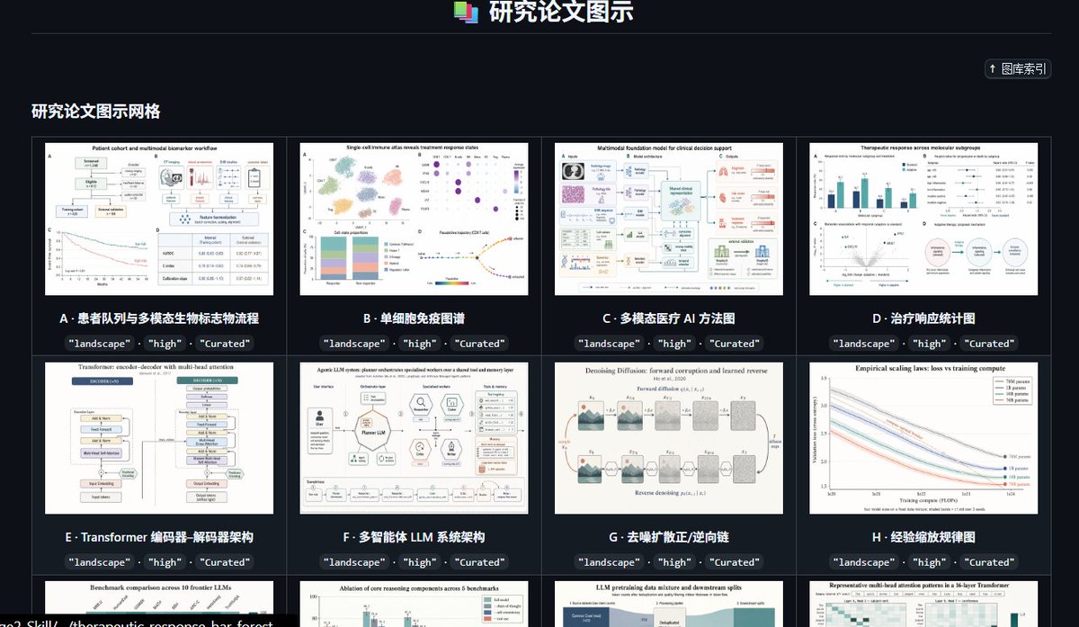
Full Prompt
Goal: Create a dark, high-end gallery index page for a curated preset library of research paper figure styles, titled {argument name="headline text" default="研究论文图示"}. The interface should look like a polished web app screenshot showcasing academic diagram thumbnails. Canvas: Wide landscape browser-like composition, approximately 16:9, dark charcoal background, subtle grid borders, crisp UI typography, high contrast white and cyan text. Header: Center the title at the top with a small stacked multicolor document icon to its left. Add a thin horizontal divider line below the header. In the upper-right area, place a compact rounded button labeled “↑ 图库索引”. Section title: On the left below the divider, show the section heading {argument name="section title" default="研究论文图示网格"} in bold light text. Layout: Display a 4-column gallery grid with thin gray borders and dark card gutters. Show exactly 12 visible gallery cards: 8 full cards in the first two rows and 4 partially visible cards in the third row at the bottom edge. Each card contains a white research-paper-style thumbnail image, a bold lettered title underneath, and three small dark rounded tag pills below the title reading exactly “landscape”, “high”, and “Curated”. Visible card count and labels: Card A: “患者队列与多模态生物标志物流称流程”, thumbnail showing a patient cohort workflow with boxes, charts, and a survival curve. Card B: “单细胞免疫图谱”, thumbnail showing a single-cell immune atlas with UMAP clusters, dot plot, stacked bar chart, and trajectory plot. Card C: “多模态医疗 AI 方法图”, thumbnail showing a multimodal foundation model clinical decision support diagram with medical image, pathology, text, and model blocks. Card D: “治疗响应统计图”, thumbnail showing therapeutic response statistics with bar charts, forest plots, scatter plot, and a circular workflow. Card E: “Transformer 编码器-解码器架构”, thumbnail showing a transformer encoder-decoder architecture diagram with stacked module blocks. Card F: “多智能体 LLM 系统架构”, thumbnail showing an LLM multi-agent system architecture with central model block, surrounding tool icons, memory, reflection, and evaluation modules. Card G: “去噪扩散正/逆向链”, thumbnail showing a denoising diffusion forward and reverse process chain with noisy image panels and arrows. Card H: “经验缩放规律图”, thumbnail showing empirical scaling laws with multiple descending colored curves and a legend. Bottom partially visible card 1: title begins “Benchmark comparison across 10 frontier LLMs”, thumbnail with bar chart comparisons. Bottom partially visible card 2: title begins “Ablation of core reasoning components across 5 benchmarks”, thumbnail with grouped bars. Bottom partially visible card 3: title begins “LLM pretraining data mixture and downstream splits”, thumbnail with stacked area/data mixture blocks. Bottom partially visible card 4: title begins “Representative multi-head attention patterns in a 16-layer Transformer”, thumbnail with heatmaps. Visual style: Use a modern SaaS dashboard aesthetic, dark mode, neat academic curation feel, subtle cyan accents, small but legible labels, and realistic research figure thumbnails that resemble high-quality journal diagrams. Keep thumbnails varied but consistently white-background scientific figures. Constraints: Preserve the Chinese interface labels and card titles as written. Do not add people, photos, watermarks, browser address bars, or decorative clutter. The composition should feel like a screenshot of a curated research-figure template library named {argument name="project name" default="GPT-IMAGE-2-SKILL"}.