Case Media
Case Notes
This page keeps the media, full prompt, and original source together so you can inspect the result first and decide whether the prompt is worth copying, saving, or comparing.
Case Insights
To make this page easier to search, cite, and reuse later, the case is also broken down into practical guidance about usage, visual cues, and prompt structure.
Best Fit Scenarios
- Use this as a model & community benchmark when you need a fast style baseline before rewriting your own prompt.
- It is especially helpful if your target overlaps with Neon, Cinematic, Poster and you want to judge the image result before tuning wording.
- Keep it as a control sample when you compare nearby prompt variants one variable at a time.
Visual Signals To Notice
- The clearest style signals here are Neon, Cinematic, Poster, so those should usually stay in your first rewrite.
- This kind of case is strongest when you watch deltas: what changed, what broke, and which prompt choice caused that shift.
- This case keeps one primary output, so the first image should be treated as the main visual reference.
How The Prompt Is Structured
- The prompt reads as a long, highly specified prompt, which is useful when you want to judge how much specificity this direction needs.
- Its keyword cluster is centered on Neon, Cinematic, Poster, so you can usually keep that cluster while swapping subject, camera, layout, or copy details.
- A practical rewrite path is: keep the outcome, keep the strongest style cues, then replace only the subject and environment blocks.
Good Follow-up Questions
- What changes first if you keep Neon, Cinematic, Poster but switch the subject matter?
- Which part of the result comes from section-level structure (Model & Community) versus tag-level style cues?
- Which related cases in the same section give you a cleaner or more extreme variation of the same direction?
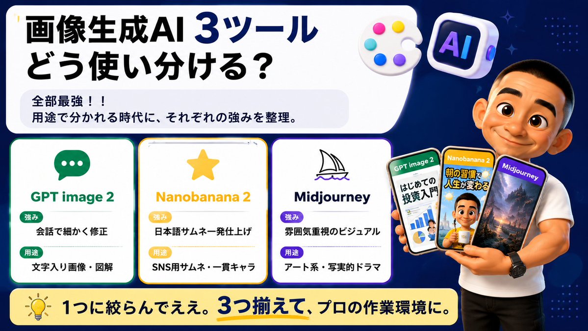
Full Prompt
Goal: Create a wide Japanese social-media comparison thumbnail about how to use three image-generation AI tools, with a clean tech infographic look and a presenter holding example phone screens. Canvas: 16:9 horizontal banner, dark navy blue background with subtle dotted patterns and small sparkle accents. Use a large rounded white headline panel across the upper left and center, leaving the right side for the presenter. Bright, high-contrast, polished YouTube/X thumbnail style with crisp vector text, soft shadows, rounded cards, and glossy 3D icons. Main headline area: In the large white rounded rectangle, place bold Japanese headline text: {argument name="headline text" default="画像生成AI 3ツール\nどう使い分ける?"}. Make “3ツール” extra large and dark blue, with the rest in heavy black. Under it, add a pale gray rounded sub-box containing two lines: “全部最強!!” and “用途で分かれる時代に、それぞれの強みを整理。” Top decorative icons: Include exactly 2 floating 3D icons near the top right of the headline panel: 1 white artist palette with 5 colored paint dots, and 1 rounded square AI app icon with the letters “AI” in purple-blue neon. Comparison section: Place exactly 3 rounded white tool cards aligned horizontally across the lower left/middle, each with a colored border, an icon, a title, and two labeled rows. Card 1 has a green border and chat bubble icon, title “GPT image 2”, label “強み” with text “会話で細かく修正”, label “用途” with text “文字入り画像・図解”. Card 2 has a yellow border and star icon, title “Nanobanana 2”, label “強み” with text “日本語サムネ一発仕上げ”, label “用途” with text “SNS用サムネ・一貫キャラ”. Card 3 has a purple border and simple sailboat line icon, title “Midjourney”, label “強み” with text “雰囲気重視のビジュアル”, label “用途” with text “アート系・写実的ドラマ”. Use green/yellow/purple pill badges for the labels and keep all Japanese text bold and readable. Presenter and phones: On the right side, show a muscular casually dressed male presenter in a fitted white T-shirt and black pants, cropped from head to thighs, standing in front of the navy background. His face should be intentionally covered by a plain skin-tone rectangular blur/censor block. He holds exactly 3 smartphones fanned in his hand. Phone 1 is labeled “GPT image 2” and shows an investment beginner infographic with charts and Japanese text; phone 2 is labeled “Nanobanana 2” and shows a Japanese morning-routine thumbnail with a person and bold yellow text; phone 3 is labeled “Midjourney” and shows a cinematic fantasy landscape with mountains and dramatic lighting. The phones should overlap slightly and have glossy black bezels. Bottom banner: Add a long rounded pale yellow banner across the bottom with a lightbulb icon on the left and bold Japanese text: {argument name="bottom message" default="1つに絞らんでええ。3つ揃えて、プロの作業環境に。"}. Emphasize “3つ揃えて” in dark blue with a yellow underline. Visual style: Japanese creator thumbnail, modern infographic, clean rounded rectangles, thick bold typography, high readability, dark blue/white/yellow/green/purple palette, subtle glow around cards, professional but friendly. Avoid extra cards, extra phones, watermarks, or unreadable small text.