Case Media
Case Notes
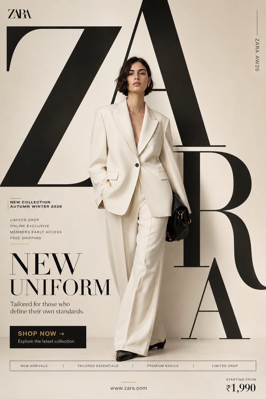
This page keeps the media, full prompt, and original source together so you can inspect the result first and decide whether the prompt is worth copying, saving, or comparing.
Case Insights
To make this page easier to search, cite, and reuse later, the case is also broken down into practical guidance about usage, visual cues, and prompt structure.
Best Fit Scenarios
- Use this as a model & community benchmark when you need a fast style baseline before rewriting your own prompt.
- It is especially helpful if your target overlaps with Fashion, Poster, UI and you want to judge the image result before tuning wording.
- Keep it as a control sample when you compare nearby prompt variants one variable at a time.
Visual Signals To Notice
- The clearest style signals here are Fashion, Poster, UI, so those should usually stay in your first rewrite.
- This kind of case is strongest when you watch deltas: what changed, what broke, and which prompt choice caused that shift.
- This case keeps 2 media outputs, which makes it easier to check whether the style remains stable across multiple results.
How The Prompt Is Structured
- The prompt reads as a long, highly specified prompt, which is useful when you want to judge how much specificity this direction needs.
- Its keyword cluster is centered on Fashion, Poster, UI, so you can usually keep that cluster while swapping subject, camera, layout, or copy details.
- A practical rewrite path is: keep the outcome, keep the strongest style cues, then replace only the subject and environment blocks.
Good Follow-up Questions
- What changes first if you keep Fashion, Poster, UI but switch the subject matter?
- Which part of the result comes from section-level structure (Model & Community) versus tag-level style cues?
- Which related cases in the same section give you a cleaner or more extreme variation of the same direction?
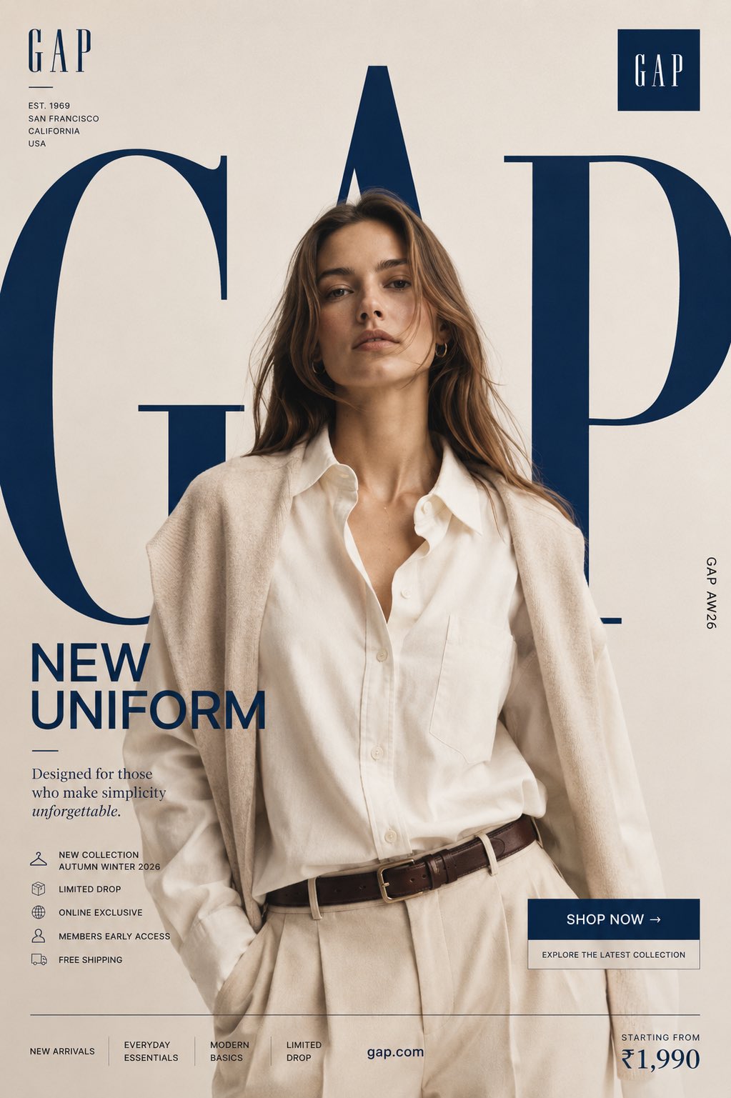
Full Prompt
Prompt : GAP "NEW UNIFORM" FORMAT Ultra-Premium Fashion SMM Promotional Poster Vertical 4:5 Instagram Hero Creative American Lifestyle Fashion Advertising Commercial Fashion Graphic Design Agency-Level Art Direction Behance Front Page Quality 8K UHD Hyper-Realistic Fashion × Graphic Design Fusion Zero AI Slop Zero Generic Fashion Campaigns Zero Editorial-Only Aesthetic CORE STRATEGY This is not a fashion campaign. This is a lifestyle statement disguised as a promotional poster. The design should feel like Gap's flagship storefront, a premium lifestyle magazine cover, and a global billboard campaign merged into one visual. The graphic design is equally important as the fashion. Typography is not decoration. Typography is architecture. CAMPAIGN IDEA "NEW UNIFORM" Not office uniform. Not school uniform. The uniform of modern confidence. The clothes aren't being sold. The lifestyle is. MASTER VISUAL Massive oversized GAP typography dominates the entire composition. The word: GAP occupies nearly 75% of the canvas. Typography is integrated into the design. Letters extend beyond frame edges. Some letters cropped. Some hidden behind the model. Some functioning as compositional structures. The typography should feel monumental. The iconic GAP square logo appears subtly integrated within the layout. HERO SUBJECT Female model. Natural beauty. Confident expression. Minimal makeup. Effortless American luxury energy. No smiling. No dramatic posing. Relaxed confidence. Wardrobe: Oversized cream Oxford shirt. Relaxed tailored trousers. Premium neutral knit layering. Classic leather accessories. Elevated everyday styling. Modern American minimalism. POSE Model stepping through the giant typography. One foot slightly forward. Direct eye contact. Hands relaxed. Body partially intersecting typography. The feeling: She owns the moment effortlessly. COMPOSITION Typography occupies 70%. Model occupies 20%. Promotional elements occupy 10%. Visual hierarchy: GAP ↓ Model ↓ Promotion ↓ CTA Everything feels intentional. COLOR SYSTEM Primary: Cream Ivory Stone Soft Beige Navy Blue White Accent: Classic Gap Navy Muted Silver No bright colors. No trend-chasing palettes. Timeless restraint. BACKGROUND Clean luxury backdrop. Large soft gradient. Minimal studio environment. Subtle paper texture. No architecture. No scenery. No distractions. The design itself creates the environment. GRAPHIC DESIGN SYSTEM Floating collection cards. Lifestyle editorial labels. Minimal grid system. Thin lines. Micro typography. Premium retail campaign hierarchy. Global flagship-store energy. PROMOTIONAL ELEMENTS NEW COLLECTION AUTUMN WINTER 2026 LIMITED DROP ONLINE EXCLUSIVE MEMBERS EARLY ACCESS FREE SHIPPING Integrated naturally into layout. Not banner spam. TYPOGRAPHY HIERARCHY Top Left GAP small luxury wordmark Center Massive Typography G A P occupying most of composition bold heritage typography extremely large scale partially cropped Campaign Title NEW UNIFORM bold elegant typography Supporting Copy Designed for those who make simplicity unforgettable. PROMOTIONAL CTA BLOCK SHOP NOW → Explore the latest collection BOTTOM FEATURE STRIP NEW ARRIVALS EVERYDAY ESSENTIALS MODERN BASICS LIMITED DROP Bottom Right Starting From ₹1,990 Bottom Center http:// gap.com Vertical Edge Text GAP AW26 LIGHTING Luxury studio lighting. Large soft source. Editorial contrast. Natural skin rendering. Premium fabric highlights. Subtle shadows. Lifestyle campaign quality. CAMERA ARRI Alexa Mini LF 85mm Lens Commercial fashion photography Shallow depth of field Extremely sharp fabric rendering Ultra-premium advertising quality POST-PRODUCTION Premium American fashion campaign grading. Rich navy tones. Cream highlights. Visible textile texture. Natural skin detail. No excessive retouching. No artificial HDR. No fake luxury effects.