Case Media
Case Notes
This page keeps the media, full prompt, and original source together so you can inspect the result first and decide whether the prompt is worth copying, saving, or comparing.
Case Insights
To make this page easier to search, cite, and reuse later, the case is also broken down into practical guidance about usage, visual cues, and prompt structure.
Best Fit Scenarios
- Use this as a model & community benchmark when you need a fast style baseline before rewriting your own prompt.
- It is especially helpful if your target overlaps with Portrait, Fashion, Poster and you want to judge the image result before tuning wording.
- Keep it as a control sample when you compare nearby prompt variants one variable at a time.
Visual Signals To Notice
- The clearest style signals here are Portrait, Fashion, Poster, so those should usually stay in your first rewrite.
- This kind of case is strongest when you watch deltas: what changed, what broke, and which prompt choice caused that shift.
- This case keeps one primary output, so the first image should be treated as the main visual reference.
How The Prompt Is Structured
- The prompt reads as a long, highly specified prompt, which is useful when you want to judge how much specificity this direction needs.
- Its keyword cluster is centered on Portrait, Fashion, Poster, so you can usually keep that cluster while swapping subject, camera, layout, or copy details.
- A practical rewrite path is: keep the outcome, keep the strongest style cues, then replace only the subject and environment blocks.
Good Follow-up Questions
- What changes first if you keep Portrait, Fashion, Poster but switch the subject matter?
- Which part of the result comes from section-level structure (Model & Community) versus tag-level style cues?
- Which related cases in the same section give you a cleaner or more extreme variation of the same direction?
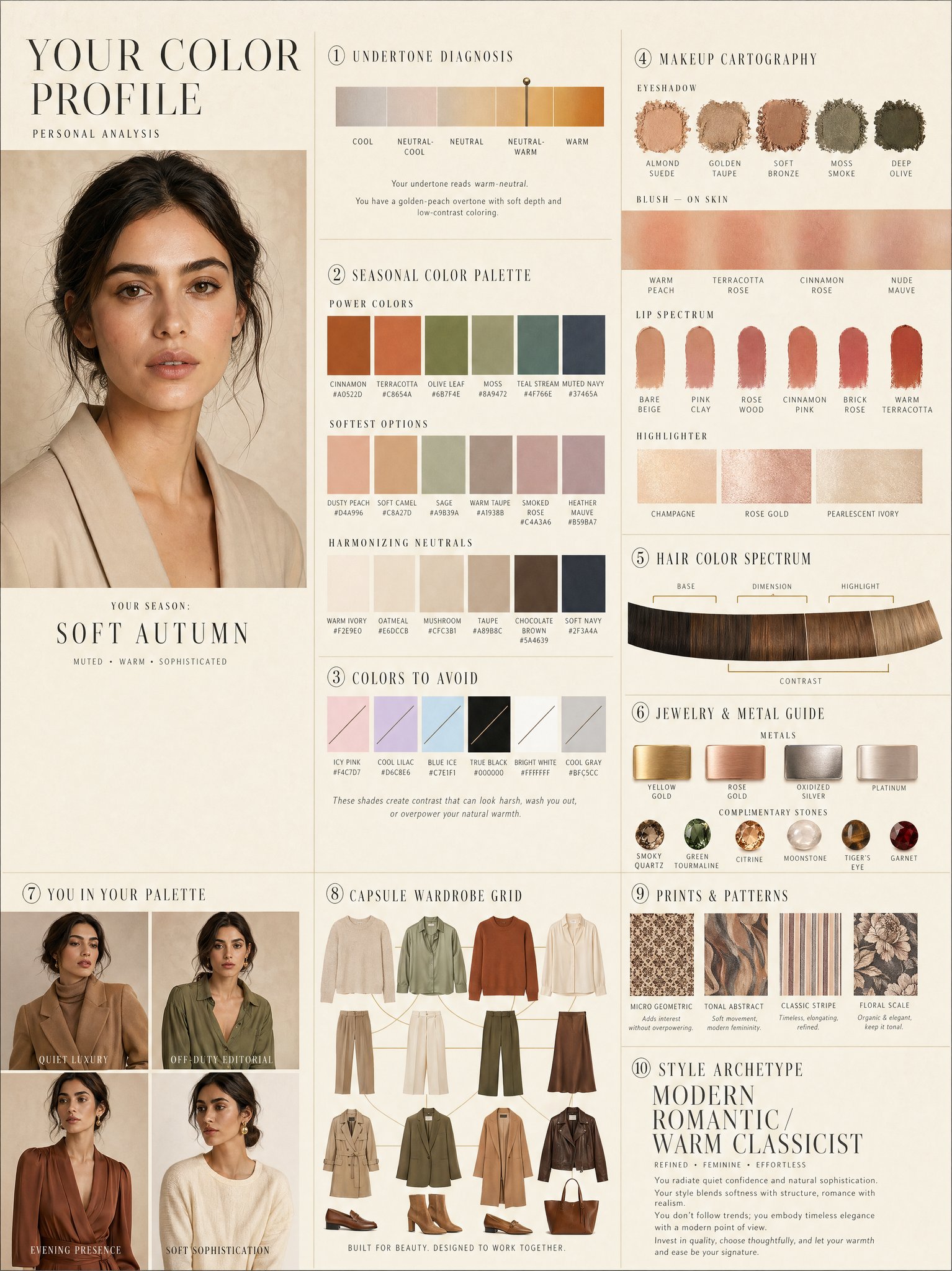
Full Prompt
LUXURY PERSONAL COLOR PROFILE — EDITORIAL LAYOUT Studio portrait of subject as anchor — skin retouched to luminous glass-like perfection, preserved natural structure, realistic pore texture, soft directional key lighting, no facial alteration. Background: warm ecru parchment with subtle linen grain texture. Layout reads like a Vogue Italia beauty supplement printed on heavyweight matte stock. Structured editorial grid, 3-column asymmetric, wide negative space, serif condensed display headers, all labels in spaced uppercase tracking, cohesive warm ivory/sand/ecru background system throughout all panels, ultra-photorealistic 8K, soft diffused studio lighting, flat elegant surfaces, no drop shadows. PANELS: ① UNDERTONE DIAGNOSIS — Tonal spectrum bar from cool ash to warm amber, precision needle marker on subject's reading. Labels: Cool / Neutral-Cool / Neutral / Neutral-Warm / Warm. Fine annotation text. ② SEASONAL COLOR PALETTE — 10–12 fabric-textured swatches in subject's optimal season. Each labeled with poetic color name and HEX. Grouped: Power Colors / Softest Options / Harmonizing Neutrals. ③ COLORS TO AVOID — Desaturated row of clashing tones with fine editorial strikethrough. Clean, non-harsh presentation. ④ MAKEUP CARTOGRAPHY — Eyeshadow gradient dust swatches / blush tones fanned on skin strip / lip spectrum barely-there to bold / highlighter finishes labeled: champagne, rose gold, pearlescent ivory. ⑤ HAIR COLOR SPECTRUM — Curved gradient strip: base, dimension, highlight, contrast tones. Gold bracket indicators on best options. ⑥ JEWELRY & METAL GUIDE — Flat-lay editorial render: yellow gold, rose gold, oxidized silver, platinum finishes alongside complementary stone tones. Minimal styling. ⑦ YOU IN YOUR PALETTE — 3–4 editorial lookbook frames, subject in palette-correct outfits. Mood labels: Quiet Luxury / Off-Duty Editorial / Evening Presence. ⑧ CAPSULE WARDROBE GRID — Outfit flatlay: tops, bottoms, outerwear, shoes, bag — all palette-correct. Coordinating lines showing interchangeability. Net-a-Porter editorial aesthetic. ⑨ PRINTS & PATTERNS — 4 fabric print thumbnails: micro geometric, tonal abstract, classic stripe, floral scale. One-line styling note per print. ⑩ STYLE ARCHETYPE — Single typographic panel. Style identity title set large (e.g. "Modern Romantic / Warm Classicist"). Three defining aesthetic words. Four-line editorial wardrobe philosophy note. RENDER SPECS: Ultra-photorealistic, 8K, editorial magazine print quality, warm neutral color grading, soft diffused studio lighting consistent across all panels, one serif display font + one fine sans-serif body font, no gradients, flat matte surfaces only.