Case Media
Case Notes
This page keeps the media, full prompt, and original source together so you can inspect the result first and decide whether the prompt is worth copying, saving, or comparing.
Case Insights
To make this page easier to search, cite, and reuse later, the case is also broken down into practical guidance about usage, visual cues, and prompt structure.
Best Fit Scenarios
- Use this as a model & community benchmark when you need a fast style baseline before rewriting your own prompt.
- It is especially helpful if your target overlaps with Portrait, Fashion, Character and you want to judge the image result before tuning wording.
- Keep it as a control sample when you compare nearby prompt variants one variable at a time.
Visual Signals To Notice
- The clearest style signals here are Portrait, Fashion, Character, so those should usually stay in your first rewrite.
- This kind of case is strongest when you watch deltas: what changed, what broke, and which prompt choice caused that shift.
- This case keeps one primary output, so the first image should be treated as the main visual reference.
How The Prompt Is Structured
- The prompt reads as a long, highly specified prompt, which is useful when you want to judge how much specificity this direction needs.
- Its keyword cluster is centered on Portrait, Fashion, Character, so you can usually keep that cluster while swapping subject, camera, layout, or copy details.
- A practical rewrite path is: keep the outcome, keep the strongest style cues, then replace only the subject and environment blocks.
Good Follow-up Questions
- What changes first if you keep Portrait, Fashion, Character but switch the subject matter?
- Which part of the result comes from section-level structure (Model & Community) versus tag-level style cues?
- Which related cases in the same section give you a cleaner or more extreme variation of the same direction?
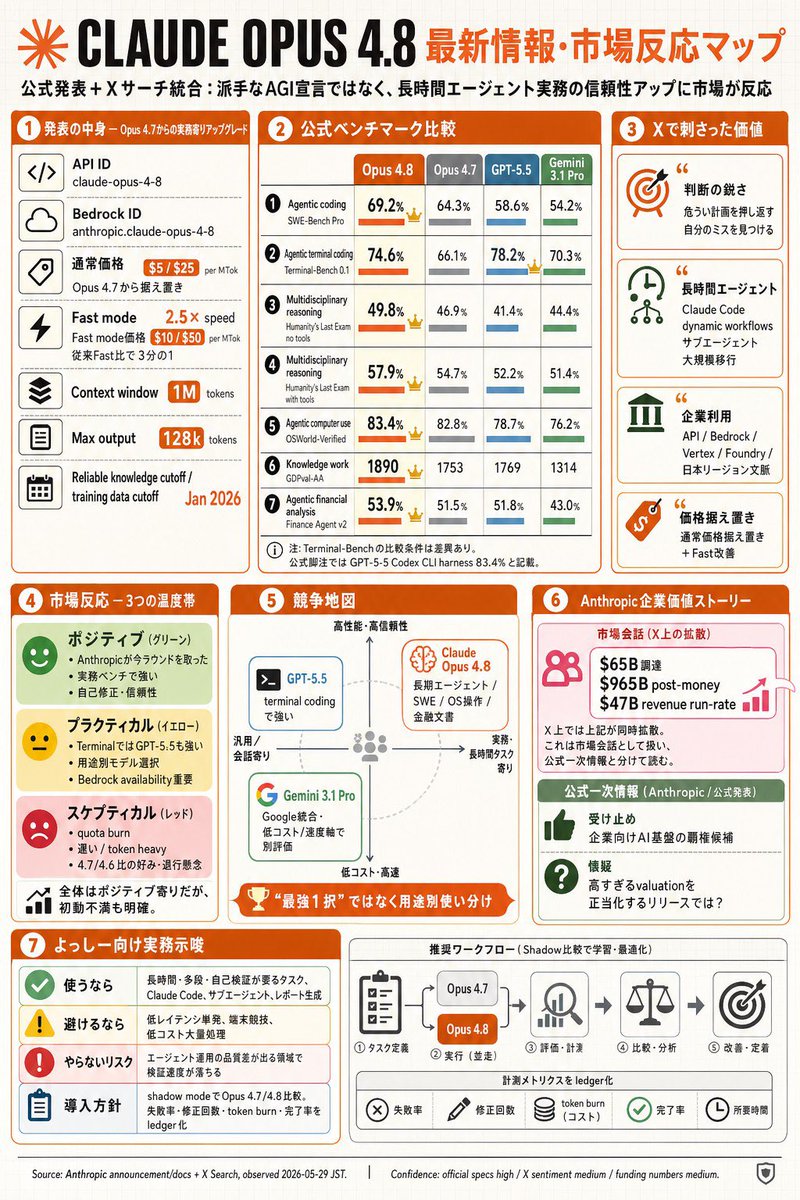
Full Prompt
Goal: Create a dense Japanese tech infographic about {argument name="main topic" default="CLAUDE OPUS 4.8"} and market reaction, styled as a GPT-image-2 generated editorial slide. Canvas: Portrait 2:3 infographic, off-white graph-paper background with faint grid lines, orange and black headline branding, rounded rectangular cards, thin gray dividers, orange section headers, small flat icons, and compact Japanese typography. Use a clean business-tech layout with a slightly hand-assembled newsletter feel. Top header: Large black title “CLAUDE OPUS 4.8” with an orange radial starburst logo at far left. To the right, an orange Japanese headline: {argument name="headline text" default="最新情報・市場反応マップ"}. Under it, a smaller Japanese subtitle: “公式発表+Xサーチ統合:派手なAGI宣言ではなく、長時間エージェント実務の信頼性アップに市場が反応”. Overall layout: Use exactly 7 numbered main sections, each with an orange circular number badge and orange title bar. Arrange sections 1–3 across the upper half, sections 4–6 in the middle, and section 7 plus a workflow strip across the bottom. Keep all content packed but readable. Section 1, left column, “発表の中身 — Opus 4.7からの実務寄りアップグレード”: Show exactly 6 stacked spec rows with square black line icons on the left and labels/values on the right: 1) API ID, value “claude-opus-4-8”; 2) Bedrock ID, value “anthropic.claude-opus-4-8”; 3) 通常価格, orange price pills “$5 / $25 per MTok” and note “Opus 4.7から据え置き”; 4) Fast mode, orange “2.5× speed” and price pills “$10 / $50 per MTok”, note “従来Fast比で3分の1”; 5) Context window, orange pill “1M tokens”; 6) Max output, orange pill “128k tokens”; add a bottom small row “Reliable knowledge cutoff / training data cutoff” with orange date {argument name="training cutoff date" default="Jan 2026"}. Section 2, top center, “公式ベンチマーク比較”: Create a comparison table with exactly 4 model columns labeled “Opus 4.8”, “Opus 4.7”, “GPT-5.5”, and “Gemini 3.1 Pro”. Use orange for Opus 4.8, gray for Opus 4.7, blue for GPT-5.5, green for Gemini. Include exactly 7 benchmark rows with small numbered circles, metric names, percentages/scores, horizontal mini bars, and small crown icons where Opus 4.8 leads: 1) Agentic coding / SWE-Bench Pro: 69.2%, 64.3%, 58.6%, 54.2%; 2) Agentic terminal coding / Terminal-Bench 0.1: 74.6%, 66.1%, 78.2%, 70.3%; 3) Multidisciplinary reasoning / Humanity’s Last Exam no tools: 49.8%, 46.9%, 41.4%, 44.4%; 4) Multidisciplinary reasoning / Humanity’s Last Exam with tools: 57.9%, 54.7%, 52.2%, 51.4%; 5) Agentic computer use / OSWorld-Verified: 83.4%, 82.8%, 78.7%, 76.2%; 6) Knowledge work / GDPval-AA: 1890, 1753, 1769, 1314; 7) Agentic financial analysis / Finance Agent v2: 53.9%, 51.5%, 51.8%, 43.0%. Add a small Japanese footnote beneath the table. Section 3, top right, “Xで刺さった価値”: Show exactly 4 stacked insight cards with large icons and quotation marks: 1) orange target icon, title “判断の鋭さ”, note about catching dangerous blind spots and noticing your own mistakes; 2) green clock/network icon, title “長時間エージェント”, note “Claude Code dynamic workflows / サブエージェント / 大規模移行”; 3) green enterprise-building icon, title “企業利用”, note listing “API / Bedrock / Vertex / Foundry / 日本リージョン文脈”; 4) orange price-tag icon, title “価格据え置き”, note “通常価格据え置き + Fast改善”. Section 4, middle left, “市場反応 — 3つの温度帯”: Create exactly 3 sentiment bands plus one summary band: 1) green “ポジティブ(グリーン)” with smiling face icon and three bullets about winning back trust in Anthropic, strong real benchmarks, and self-correction/reliability; 2) yellow “プラクティカル(イエロー)” with neutral face icon and three bullets about Terminal being strong for GPT-5.5, usage model selection, and Bedrock availability; 3) red “スケプティカル(レッド)” with sad face icon and three bullets about quota burn, heavy token burn, and suspicion of 4.7/4.6 comparison; 4) white summary row with tiny bar-chart icon: “全体はポジティブ寄りだが、初動不満も明確。” Section 5, middle center, “競争地図”: Draw a quadrant map with vertical axis “高性能・高信頼性” at top to “低コスト・高速” at bottom, horizontal axis “汎用/会話寄り” left to “実務・長時間タスク寄り” right. Include exactly 3 model cards: a blue “GPT-5.5” card on the upper-left/center labeled “terminal codingで強い”; an orange “Claude Opus 4.8” card in the upper-right with a brain icon and text “長期エージェント / SWE / OS操作 / 金融文書”; a green “Gemini 3.1 Pro” card in the lower-left with Google-style G icon and text “Google統合・低コスト / 速度軸で別評価”. Add a dashed circular guide and a bottom orange trophy ribbon reading “最強1択ではなく用途別使い分け”. Section 6, middle right, “Anthropic 企業価値ストーリー”: Split into exactly 2 cards. Top pink card titled “市場会話(X上の拡散)” with people icon, growth arrow, and three bold funding lines: “$65B 調達”, “$965B post-money”, “$47B revenue run-rate”; add small caveat text that X treats these as market conversation and they are not official announcement figures. Bottom green card titled “公式一次情報(Anthropic / 公式発表)” with exactly 2 rows: thumbs-up icon “受け止め 企業向けAI基盤の覇権候補”; question icon “懐疑 高すぎるvaluationを正当化するリリースでは?”. Section 7, bottom left, “よっしー向け実務示唆”: Make exactly 4 rows with colored icons: 1) green check “使うなら” followed by tasks such as long-duration, many-step, self-verification, Claude Code, migration, and refactoring; 2) yellow warning “避けるなら” followed by low-latency single-shot, simple searches, and high-cost large-volume processing; 3) red exclamation “やらないリスク” followed by missing early signals in engineering and product domains; 4) blue clipboard “導入方針” followed by comparing shadow mode with Opus 4.7/4.8 and logging failures, correction count, token burn, and completion rate. Bottom workflow strip, to the right of section 7: Title it “推奨ワークフロー(Shadow比較で学習・最適化)”. Show exactly 5 process steps connected by arrows: 1) task-definition clipboard icon “タスク定義”; 2) comparison block with two pills “Opus 4.7” and orange “Opus 4.8”, label “実行(並走)”; 3) magnifier/chart icon “評価・計測”; 4) scales icon “比較・分析”; 5) target icon “改善・定着”. Beneath, add a metrics ledger row with exactly 5 chips/icons: “失敗率”, “修正回数”, “token burn(コスト)”, “完了率”, “所要時間”. Footer: Add tiny source and confidence text along the bottom: “Source: Anthropic announcement/docs + X Search, observed 2026-05-29 JST.” and “Confidence: official specs high / X sentiment medium / funding numbers medium.” Include a small shield icon at bottom right. Visual constraints: Use mostly orange, black, gray, green, blue, yellow, and red accents; include many small icons but no photorealism; keep the page crisp, flat, legible, and information-dense; no watermark; no extra sections beyond the 7 numbered sections and the workflow strip.