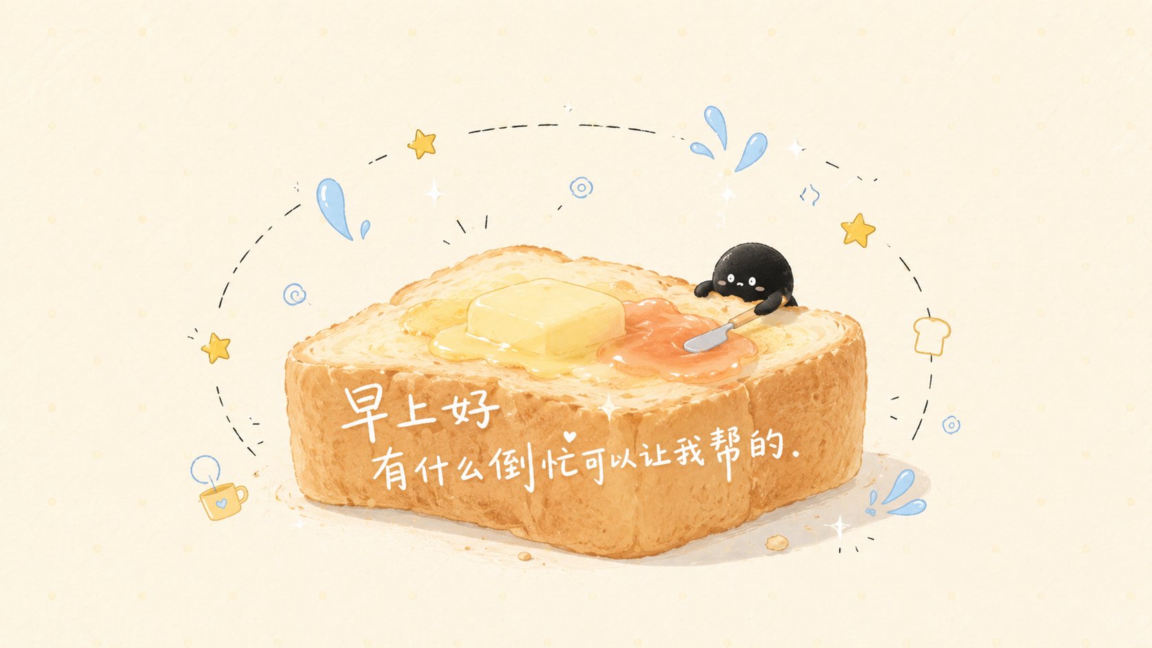
Case Media
Case Notes
This page keeps the media, full prompt, and original source together so you can inspect the result first and decide whether the prompt is worth copying, saving, or comparing.
Case Insights
To make this page easier to search, cite, and reuse later, the case is also broken down into practical guidance about usage, visual cues, and prompt structure.
Best Fit Scenarios
- Use this as a character design benchmark when you need a fast style baseline before rewriting your own prompt.
- It is especially helpful if your target overlaps with Poster, Character, Typography and you want to judge the image result before tuning wording.
- Keep it as a control sample when you compare nearby prompt variants one variable at a time.
Visual Signals To Notice
- The clearest style signals here are Poster, Character, Typography, so those should usually stay in your first rewrite.
- Look at silhouette, costume language, mood styling, and whether the character reads clearly at a glance.
- This case keeps one primary output, so the first image should be treated as the main visual reference.
How The Prompt Is Structured
- The prompt reads as a long, highly specified prompt, which is useful when you want to judge how much specificity this direction needs.
- Its keyword cluster is centered on Poster, Character, Typography, so you can usually keep that cluster while swapping subject, camera, layout, or copy details.
- A practical rewrite path is: keep the outcome, keep the strongest style cues, then replace only the subject and environment blocks.
Good Follow-up Questions
- What changes first if you keep Poster, Character, Typography but switch the subject matter?
- Which part of the result comes from section-level structure (Character Design) versus tag-level style cues?
- Which related cases in the same section give you a cleaner or more extreme variation of the same direction?
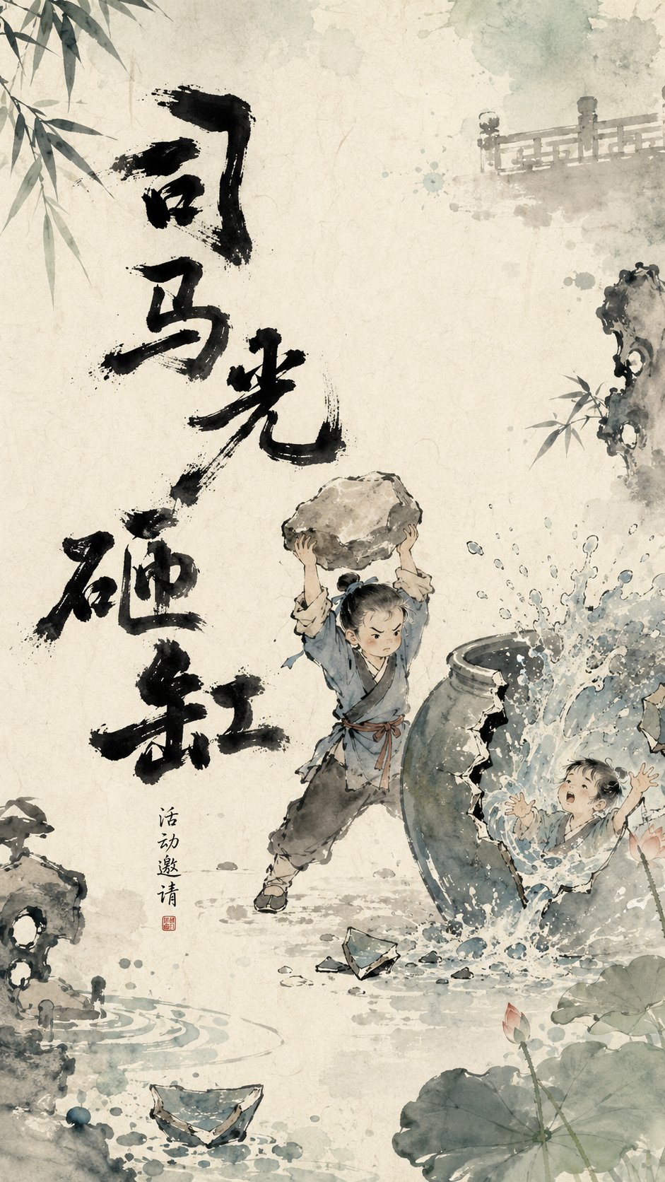
Full Prompt
Design a visual poster with Oriental ink wash animation temperament for the theme [Straw Boats Borrowing Arrows]. The overall visual logic follows 'heavy ink to establish the bones, light colors to create the atmosphere, negative space for narration, and breathing edges.' The background is a warm Xuan paper texture with natural smudging of off-white, light blue-grey, and light watery tones, featuring slight paper grain, watermarks, and ink diffusion. The core text in the image is not fixed in one position but is intelligently laid out according to the main subject's movement, line of sight, negative space, and visual center of gravity. The title can appear on the left, right, top, bottom, diagonally, partially exposed at the edges, or scattered around the main subject. The text position should look like a naturally grown part of the image, rather than post-production typography pasted on. The main title serves as a heavy ink visual anchor participating in the composition, playing the role of grounding the image, supporting the main subject, guiding the line of sight, or creating rhythm. The title font is hand-written heavy ink calligraphy, with strokes that are thick, wet, naive, and irregular, featuring 'flying white', broken strokes, ink clumps, seepage, and rough edges. Character sizes are varied, with a slightly swaying center of gravity, possessing the handcrafted feel of children's picture books and Chinese ink wash animation opening titles. The title does not use regular commercial fonts but should be like a set of black graphic symbols, echoing the main subject, edge elements, and negative space. The center of the image maintains moderate negative space, letting the main characters or core objects rest lightly in the air of the paper. Add light-colored edge elements based on the theme (e.g., [straw boats, arrows in the fog]), which extend in from the outside of the frame, showing only parts and not fully displayed. Edge elements use ink wash light colors, transparent smudging, and local blurring to create off-screen space and a sense of breathing. Color mainly appears at the edges and four corners, while the center area remains restrained and clean. The overall temperament is poetic, childlike, Oriental, warm, and has a hand-drawn feel, like a breathing frame of a Chinese ink wash animation poster. The image should have a high-end design sense of 'heavy ink text as the skeleton, light color edges as the atmosphere, and negative space to tell the story.' Theme: Straw Boats Borrowing Arrows Ratio: 9:16