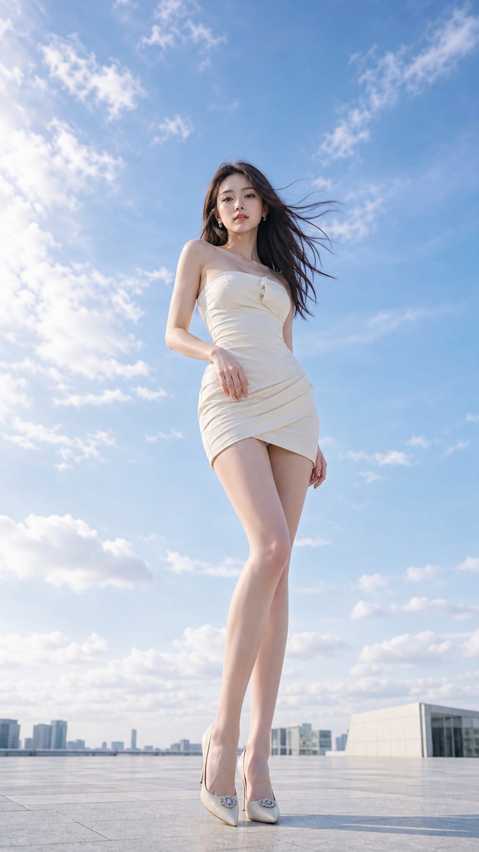
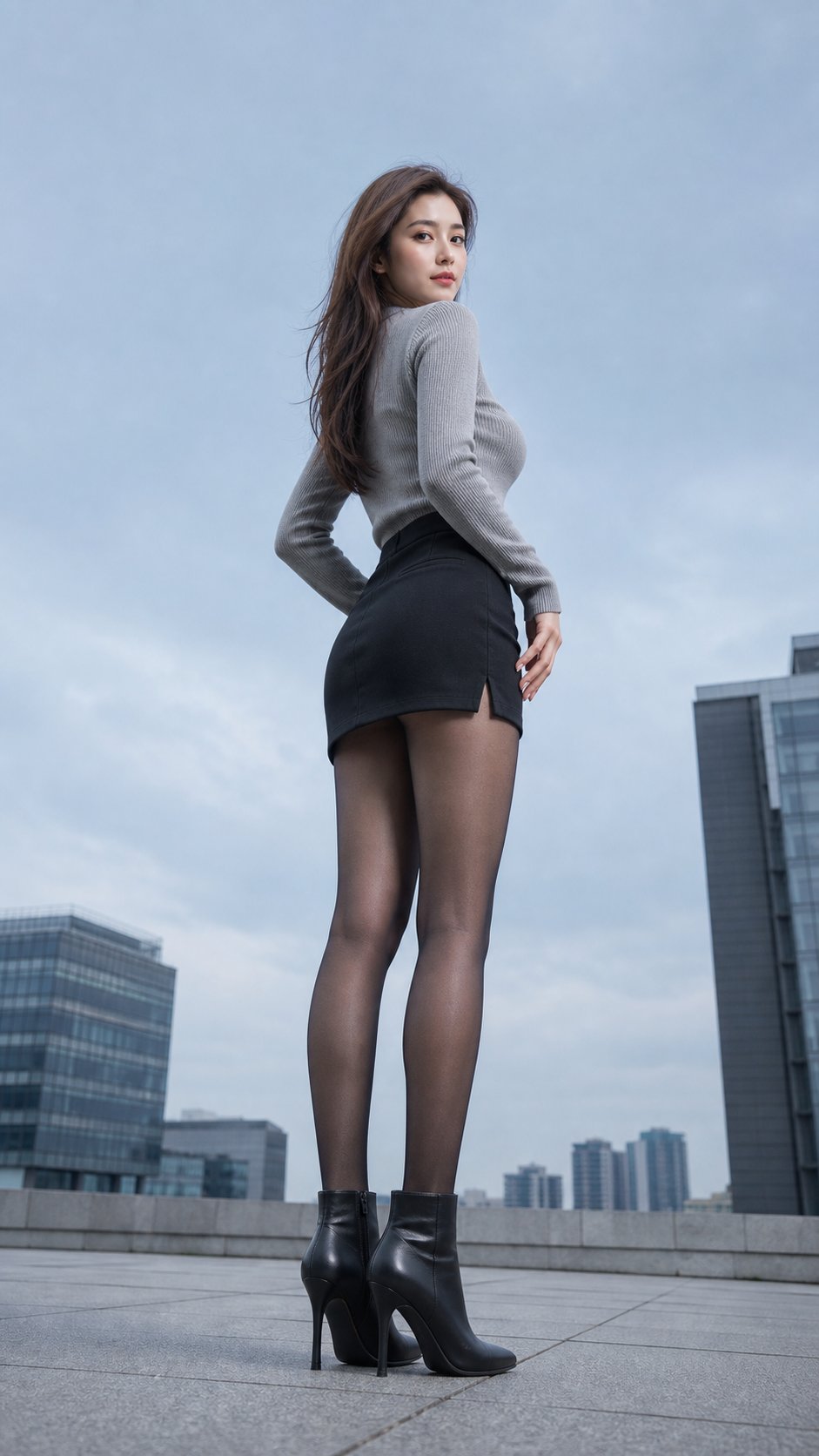
Case Media
Case Notes
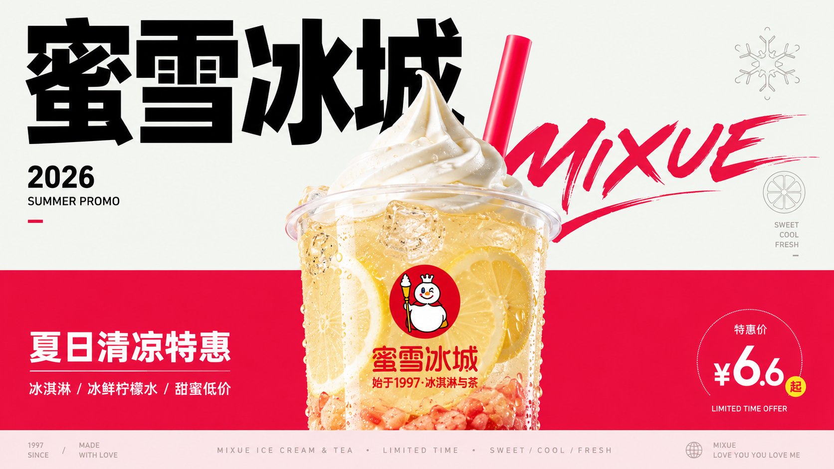
This page keeps the media, full prompt, and original source together so you can inspect the result first and decide whether the prompt is worth copying, saving, or comparing.
Case Insights
To make this page easier to search, cite, and reuse later, the case is also broken down into practical guidance about usage, visual cues, and prompt structure.
Best Fit Scenarios
- Use this as a character design benchmark when you need a fast style baseline before rewriting your own prompt.
- It is especially helpful if your target overlaps with Fashion, Poster, Character and you want to judge the image result before tuning wording.
- Keep it as a control sample when you compare nearby prompt variants one variable at a time.
Visual Signals To Notice
- The clearest style signals here are Fashion, Poster, Character, so those should usually stay in your first rewrite.
- Look at silhouette, costume language, mood styling, and whether the character reads clearly at a glance.
- This case keeps 2 media outputs, which makes it easier to check whether the style remains stable across multiple results.
How The Prompt Is Structured
- The prompt reads as a long, highly specified prompt, which is useful when you want to judge how much specificity this direction needs.
- Its keyword cluster is centered on Fashion, Poster, Character, so you can usually keep that cluster while swapping subject, camera, layout, or copy details.
- A practical rewrite path is: keep the outcome, keep the strongest style cues, then replace only the subject and environment blocks.
Good Follow-up Questions
- What changes first if you keep Fashion, Poster, Character but switch the subject matter?
- Which part of the result comes from section-level structure (Character Design) versus tag-level style cues?
- Which related cases in the same section give you a cleaner or more extreme variation of the same direction?
Full Prompt
Generate a vertical editorial advertising-style visual poster based on specific theme content, first splitting the theme into two visible fields. The upper part is a lighter, emptier, lower-saturation conceptual air field, carrying the title, lightweight symbols, a sense of the year markers, and reading breath; the lower part is a more saturated, more supportive physical experience field, carrying the main subject, materials, short sentences, and emotional temperature. Maintain a clear hard-cut boundary or an approximate hard-cut color plane transition between the two fields; the boundary line is like a layout structure rather than natural scenery, without using complex scenes to explain the theme. The core object is located on the central axis, slightly lower, and spans the boundary, with the top or outer edge entering the conceptual field and the main mass sinking into the experience field; the edges integrate transparency, reflective relationships, same-color layering, contour compression, and highlight refraction, slightly merging with the two background fields, making the object like a bridge connecting two semantics rather than material pasted on a background color. The highest detail density is only concentrated inside the core object, expressing its material, texture, refraction, particles, internal layers, and touchable realism; the background, icons, and text remain flat, clean, and low-noise. The colors adopt a hierarchical relationship of large-area structural colors, sharp dark text, white or high-brightness highlights, and small-area theme trigger colors; when the theme changes, change the hue and temperature, but maintain the proportion of light upper field, heavy lower field, dark text, bright subject, and small but accurate trigger colors. Let the main title become a graphic structure in the upper half of the image, using strong scale differences, restrained black, and a tough font skeleton, and set a glyph event with more curved tension or high contrast to participate in overlay and rhythm, making the text like a visible trajectory of smell, speed, or emotion. Auxiliary text is compressed into edge annotations, short sentences below the subject, and low-contrast miniature metadata at the bottom; the bottom can form a very shallow information band, ending quietly like a publication footer. Arrange a hollow single-line symbol derived from the thematic semantics in the conceptual field, with simple lines, low density, and serving only as sensory or conceptual evidence. The overall design retains wide white space and asymmetrical balance, with a stable central subject, edge text forming slight pressure, and the bottom information band closing the layout; the first visual glance sees the hard-cut dual fields, the cross-field subject, huge black characters, low-volume symbols, and clean modern graphic order. —————— Theme for this session: Lu Xun's book "Call to Arms" recommendation poster Ratio 16:9 landscape