Case Media
Case Notes
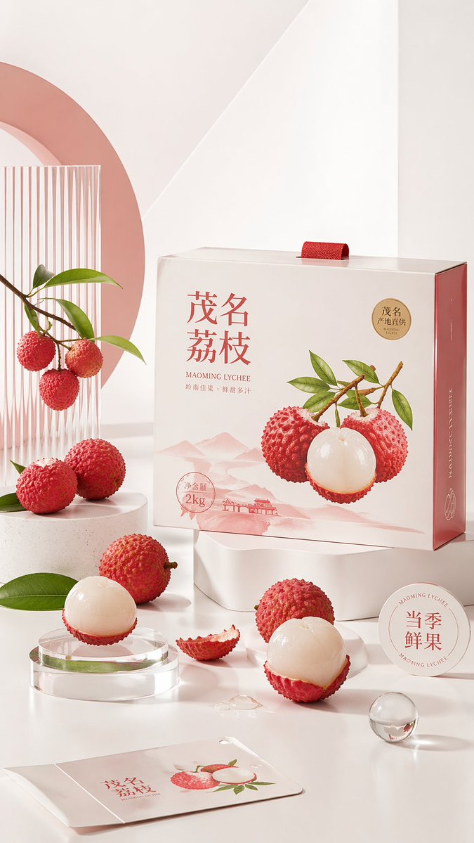
This page keeps the media, full prompt, and original source together so you can inspect the result first and decide whether the prompt is worth copying, saving, or comparing.
Case Insights
To make this page easier to search, cite, and reuse later, the case is also broken down into practical guidance about usage, visual cues, and prompt structure.
Best Fit Scenarios
- Use this as a character design benchmark when you need a fast style baseline before rewriting your own prompt.
- It is especially helpful if your target overlaps with Poster, Character, Minimal and you want to judge the image result before tuning wording.
- Keep it as a control sample when you compare nearby prompt variants one variable at a time.
Visual Signals To Notice
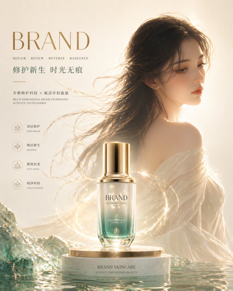
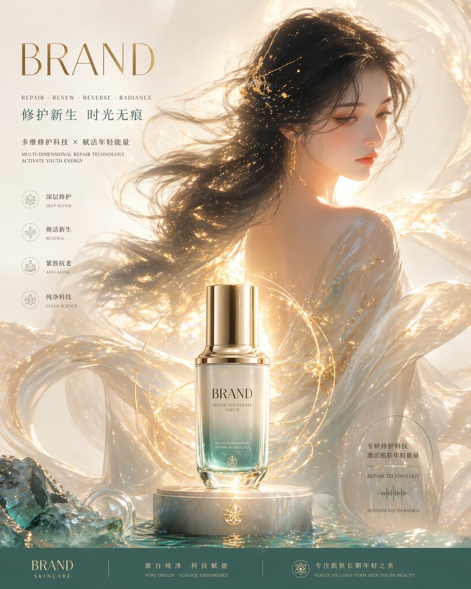
- The clearest style signals here are Poster, Character, Minimal, so those should usually stay in your first rewrite.
- Look at silhouette, costume language, mood styling, and whether the character reads clearly at a glance.
- This case keeps 2 media outputs, which makes it easier to check whether the style remains stable across multiple results.
How The Prompt Is Structured
- The prompt reads as a long, highly specified prompt, which is useful when you want to judge how much specificity this direction needs.
- Its keyword cluster is centered on Poster, Character, Minimal, so you can usually keep that cluster while swapping subject, camera, layout, or copy details.
- A practical rewrite path is: keep the outcome, keep the strongest style cues, then replace only the subject and environment blocks.
Good Follow-up Questions
- What changes first if you keep Poster, Character, Minimal but switch the subject matter?
- Which part of the result comes from section-level structure (Character Design) versus tag-level style cues?
- Which related cases in the same section give you a cleaner or more extreme variation of the same direction?
Full Prompt
Please create a "minimalist geometric installation style product poster" for the [Theme Product]. If I provide a product image, please use this image as the main reference, retain the product's core appearance features, packaging form, color, material, brand identity, and overall temperament, and prioritize adopting the main tone and color matching relationship from the product image for the design. If I do not provide a product image, please automatically generate product appearance and packaging design that fits the positioning of the [Theme Product], and automatically match natural and reasonable main colors, auxiliary colors, prop shapes, and display methods based on the product attributes, category characteristics, and temperament. Overall poster style requirements: The image uses a high-key white or warm white photography studio background, overall clean, transparent, soft, and bright, with a premium commercial feel and modern brand visual temperament. The composition is not an ordinary e-commerce studio shot, but a conceptual poster combining brand visual proposals, artistic still life photography, and 3D product display. The main subjects of the image should include: 1. The [Theme Product] itself 2. Product packaging 3. Raw materials, slices, components, functional elements, or material details related to the product The three together form a complete visual chain, allowing viewers to understand at a glance "what this product is, what the content is, what the selling point or source is". Add simple and design-sense geometric installation props to the scene, for example: cylinders, squares, long strips, rings, spheres, semicircles, platforms, stacked building blocks, acrylic stands, toy-like structures, used to support, suspend, surround, or set off the main product body, forming an artistic display composition rich in order, rhythm, and layering. The overall color matching should naturally unfold around the product itself, with the product-related color as the main visual core, paired with neutral colors such as white, cream, and light gray, adding a small amount of auxiliary accent colors when necessary, making the picture colors unified, restrained, comfortable, and refreshing, not cluttered or flashy. Different products should automatically adapt to different color schemes, without fixedly using a certain background color. The material expression should be delicate and realistic, with a high-quality commercial rendering texture. Transparent plastic, acrylic, frosted material, paper labels, glass, metal, smooth plastic, fruit flesh texture, food ingredient texture, or product surface details should all be natural and credible. There can be slight reflections and soft shadows, but they should not be too heavy or dirty and messy. The composition requires sufficient white space, clear main subject, balanced picture, clean visuals, with a relaxed, gentle, modern, exquisite, approachable, slightly playful but not childish brand temperament. The overall feeling is like a high-aesthetic brand product KV poster, very suitable for e-commerce main visuals, social media seeding pictures, and product display pictures. Output requirements: - Vertical composition - Proportion - Single poster - Premium feel, simple feel, strong brand feel