Case Media
Case Notes
This page keeps the media, full prompt, and original source together so you can inspect the result first and decide whether the prompt is worth copying, saving, or comparing.
Case Insights
To make this page easier to search, cite, and reuse later, the case is also broken down into practical guidance about usage, visual cues, and prompt structure.
Best Fit Scenarios
- Use this as a character design benchmark when you need a fast style baseline before rewriting your own prompt.
- It is especially helpful if your target overlaps with Poster, Character, Minimal and you want to judge the image result before tuning wording.
- Keep it as a control sample when you compare nearby prompt variants one variable at a time.
Visual Signals To Notice
- The clearest style signals here are Poster, Character, Minimal, so those should usually stay in your first rewrite.
- Look at silhouette, costume language, mood styling, and whether the character reads clearly at a glance.
- This case keeps one primary output, so the first image should be treated as the main visual reference.
How The Prompt Is Structured
- The prompt reads as a long, highly specified prompt, which is useful when you want to judge how much specificity this direction needs.
- Its keyword cluster is centered on Poster, Character, Minimal, so you can usually keep that cluster while swapping subject, camera, layout, or copy details.
- A practical rewrite path is: keep the outcome, keep the strongest style cues, then replace only the subject and environment blocks.
Good Follow-up Questions
- What changes first if you keep Poster, Character, Minimal but switch the subject matter?
- Which part of the result comes from section-level structure (Character Design) versus tag-level style cues?
- Which related cases in the same section give you a cleaner or more extreme variation of the same direction?
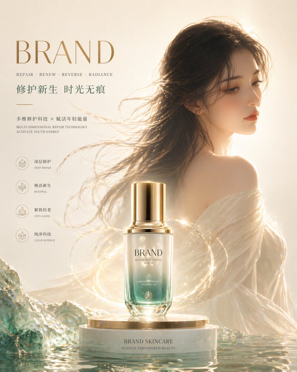
Full Prompt
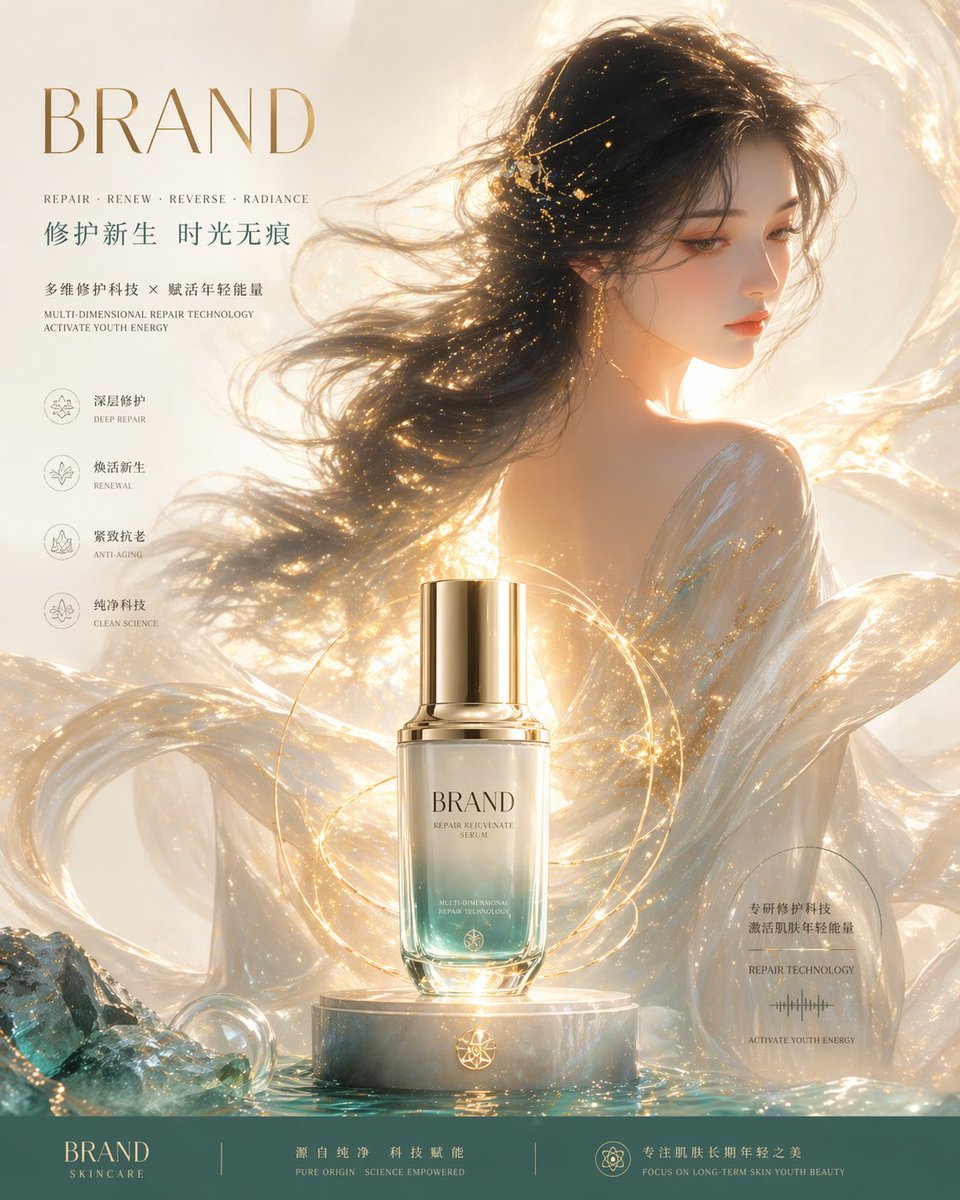
Minimalist Eastern high-end advertising style, high-end skincare brand KV poster, brand name "BRAND", overall temperament pure, restrained, with repair, regeneration, anti-aging and pure technology sense The center of the picture is a high-end essence product, glass bottle body, transparent gradient texture (upper transparent -> lower cold-toned cyan-green), liquid texture is clear, paired with a champagne gold metal bottle cap, the product is placed on a simple circular highlight base (polished stone + metal texture), the structure is clean and neat, edge highlights are clear and sharp, strengthening the product outline and volume sense, as the absolute visual center Only a small number of exquisite golden energy halos and extremely thin flowing light bands are kept around the product (control the number of particles, avoid excessive decoration), forming a restrained slight S-shaped movement line, spreading outward from the product, symbolizing repair and regeneration energy (light effects are clean, orderly, not cluttered) An Eastern woman is located slightly to the right behind the picture, half-body looking back with side face, calm and elegant temperament, delicate and natural facial features, cold white and delicate skin presenting a real transparent luster (emphasizing skincare effects), minimalist and high-end makeup, avoiding excessive highlights Black long hair flows slightly, hair strands are clean and neat, only a small number of faint golden light dots embellish, creating a subtle connection with the product light effects (remove complex flower decorations, overall more restrained) Wearing semi-transparent silk clothing, simple structure, transparent material, with a very slight metallic luster and soft reflection, avoiding overly strong textures The light and shadow system is a real studio lighting effect (studio lighting), the warm golden main light source illuminates from the side and rear, the product is the main light focus point, the character is auxiliary light-receiving, the edge light is clean and neat, the volumetric light is extremely weak, only retaining the spatial transparency sense, the overall light control is precise without overexposure The background is a minimalist light-colored gradient (off-white + warm gold), a large area of clean negative space, no redundant particles and decorations, strengthening the advertising layout space The bottom of the picture adds restrained cold-toned cyan-green water surface or mineral slice elements (low detail, low contrast), as a symbol of the brand's "pure technology", but not stealing the visual center The color system is strictly controlled: the main color is off-white + gold, embellished with cold-toned cyan-green and champagne gold, overall low saturation, high-end, unified The composition is a stable center composition, weakening dynamic exaggeration, the overall tends to balance and high-end static expression, visual hierarchy is clear (product > light > character > environment) Overall style: international high-end skincare brand visual (similar to La Mer / HR / SK-II), emphasizing real texture and restrained expression Ultra-fine, 8K texture, commercial photography-level real material performance Negative: too many golden particles, complex decorations, blurry product, fuzzy edges, crowded picture, chaotic light and shadow, messy colors, cheap texture, overexposure