Case Media
Case Notes
This page keeps the media, full prompt, and original source together so you can inspect the result first and decide whether the prompt is worth copying, saving, or comparing.
Case Insights
To make this page easier to search, cite, and reuse later, the case is also broken down into practical guidance about usage, visual cues, and prompt structure.
Best Fit Scenarios
- Use this as a character design benchmark when you need a fast style baseline before rewriting your own prompt.
- It is especially helpful if your target overlaps with Poster, Illustration, Character and you want to judge the image result before tuning wording.
- Keep it as a control sample when you compare nearby prompt variants one variable at a time.
Visual Signals To Notice
- The clearest style signals here are Poster, Illustration, Character, so those should usually stay in your first rewrite.
- Look at silhouette, costume language, mood styling, and whether the character reads clearly at a glance.
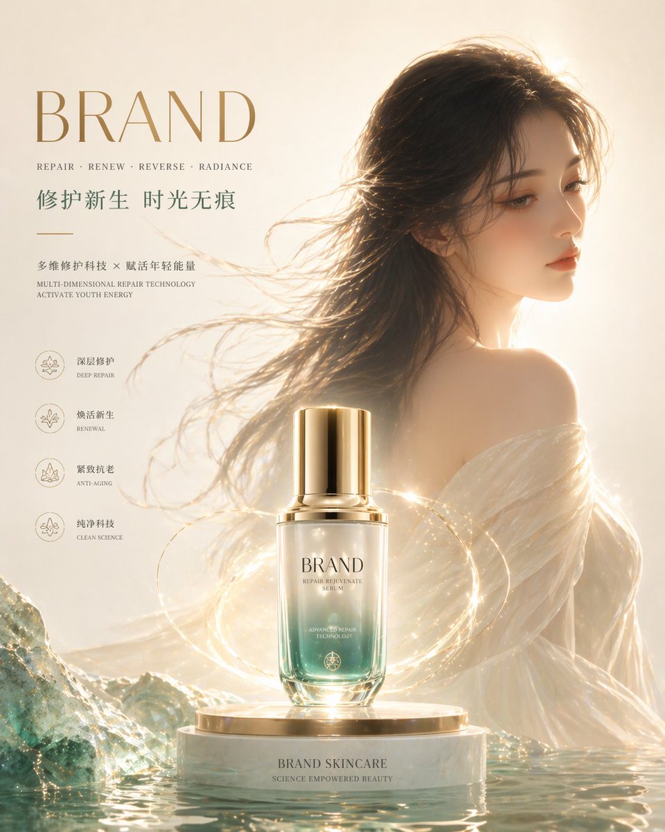
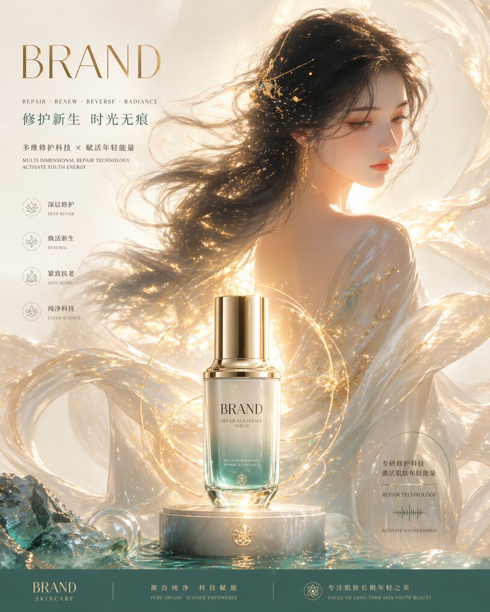
- This case keeps 2 media outputs, which makes it easier to check whether the style remains stable across multiple results.
How The Prompt Is Structured
- The prompt reads as a long, highly specified prompt, which is useful when you want to judge how much specificity this direction needs.
- Its keyword cluster is centered on Poster, Illustration, Character, so you can usually keep that cluster while swapping subject, camera, layout, or copy details.
- A practical rewrite path is: keep the outcome, keep the strongest style cues, then replace only the subject and environment blocks.
Good Follow-up Questions
- What changes first if you keep Poster, Illustration, Character but switch the subject matter?
- Which part of the result comes from section-level structure (Character Design) versus tag-level style cues?
- Which related cases in the same section give you a cleaner or more extreme variation of the same direction?
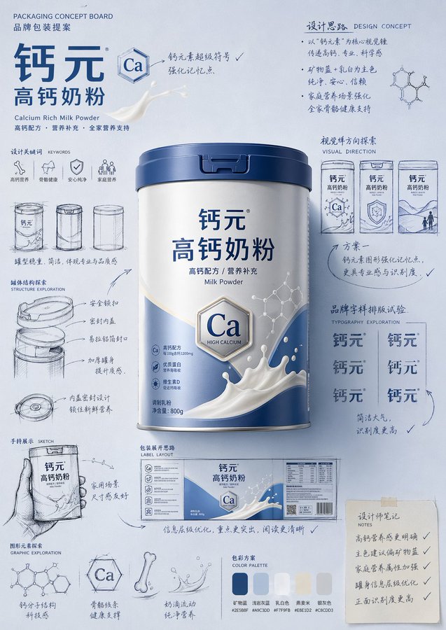
Full Prompt
Please generate a product introduction poster in the style of a "hand-drawn packaging proposal board" for [Product Name]. If I provide a product image, please use this image as the main reference, retain the product's core appearance features, packaging form, color, material, brand identity and overall temperament, and prioritize adopting the main color tone and color scheme from the product image for the design. If I do not provide a product image, please automatically generate a product appearance and packaging design that matches the positioning of [Product Name], and automatically match natural and reasonable main color, auxiliary color, and background color based on product attributes, category characteristics, and temperament. Overall poster style requirements: This is not an ordinary e-commerce detail page, nor a simple studio-shot poster, but a creative proposal board that integrates "finished product image + packaging design sketch + brand concept development process". The overall presentation is a highly aesthetic, high-completion brand design display image, like a designer presenting a packaging concept scheme. Image requirements: - Vertical composition - Use a unified and brand-aware main color tone background, the background color is naturally determined by the product itself, not fixed to a certain color - The color scheme should be coordinated with product attributes: if there is a reference image, prioritize inheriting the main color and brand color of the reference image; if there is no reference image, automatically generate a reasonable color scheme based on the product name - Place the most complete and eye-catching product main visual in the center of the image, with realistic texture, three-dimensional light and shadow, and commercial finished product effect - Add multiple auxiliary visual elements around the product: packaging sketches from different angles, structural sketches, partial shape explorations, hand-held display drafts, packaging unfolding ideas, brand typography layout experiments - Add natural and casual black or dark hand-drawn line drafts, arrows, circled marks, symbols, handwritten Chinese annotations, to give the image a strong sense of "design process" and "creative proposal" - The finished product image should be relatively exquisite and realistic, while the sketch part should be relatively casual and dynamic, forming a contrast between "finished product + design sketch" - The layout looks relaxed and free, but the overall should have order, rhythm, and a visual center, reflecting a high-end graphic design sense - Can moderately add small graphics, small symbols or fun elements related to the product to enhance brand memory points - The final effect should have a sense of brand, creativity, process, and visual impact Color scheme principles: - Do not fix a yellow background - Automatically select the main color tone based on product type, material, purpose, consumer feeling, and brand temperament - The background color, product color, text color, and sketch line color should be coordinated with each other - Can use a high-saturation single-color background, or a soft and unified color palette background, as long as the overall has a sense of brand and visual impact - Colors should naturally serve the product, rather than overshadowing it Style keywords: Packaging design proposal board, brand concept development, hand-drawn sketch, design process sense, moodboard, creative review draft, finished product rendering, visual experiment, commercial design poster Please pay special attention: - If there is a reference product image, prioritize following the reference image, do not deviate from the product itself - If there is no reference image, automatically generate a reasonable product appearance, packaging, and color scheme based on the product name, and maintain the overall style unity - The focus of the image is "product introduction + creative design process display" - Do not make it into an ordinary e-commerce detail page, do not make it into a promotional poster, do not make it overly neat and rigid, do not lack sketches and handwritten annotations, do not have a cheap sense, do not have a low-brow cartoon sense