Case Media
Case Notes
This page keeps the media, full prompt, and original source together so you can inspect the result first and decide whether the prompt is worth copying, saving, or comparing.
Case Insights
To make this page easier to search, cite, and reuse later, the case is also broken down into practical guidance about usage, visual cues, and prompt structure.
Best Fit Scenarios
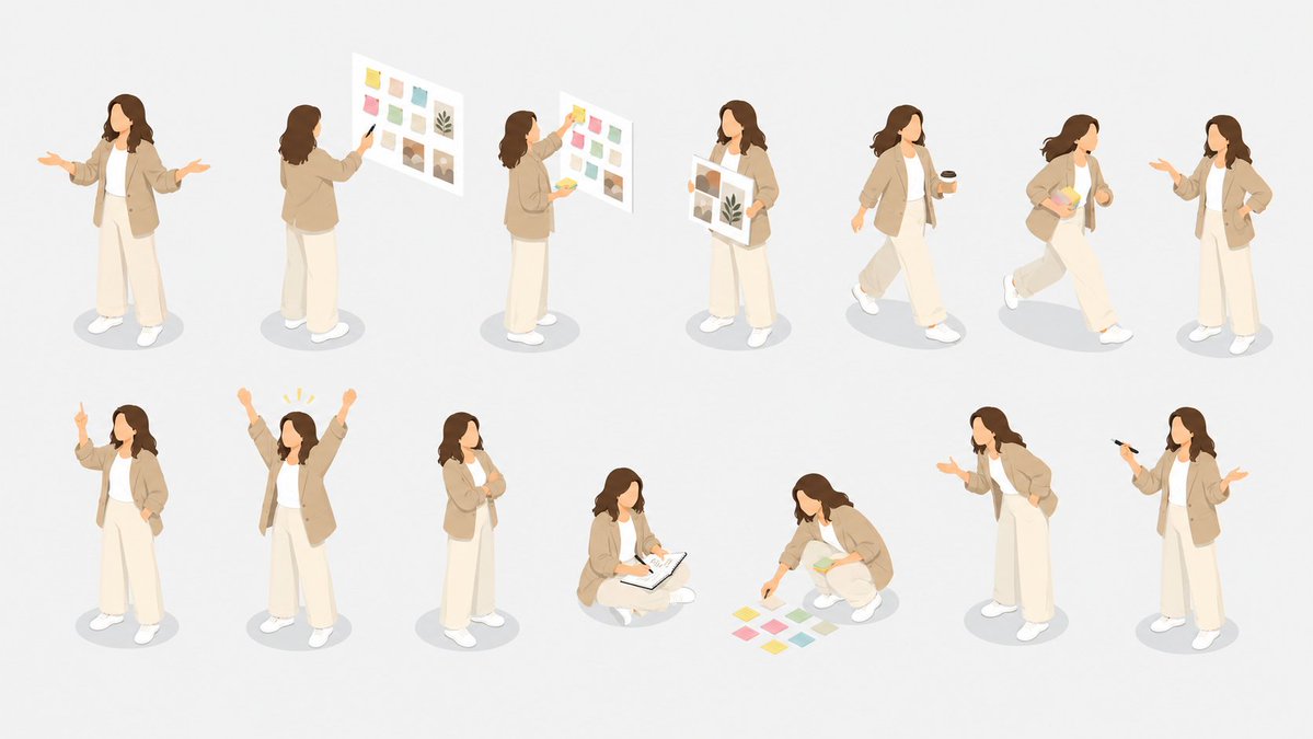
- Use this as a character design benchmark when you need a fast style baseline before rewriting your own prompt.
- It is especially helpful if your target overlaps with Illustration, Screenshot, Character and you want to judge the image result before tuning wording.
- Keep it as a control sample when you compare nearby prompt variants one variable at a time.
Visual Signals To Notice
- The clearest style signals here are Illustration, Screenshot, Character, so those should usually stay in your first rewrite.
- Look at silhouette, costume language, mood styling, and whether the character reads clearly at a glance.
- This case keeps 4 media outputs, which makes it easier to check whether the style remains stable across multiple results.
How The Prompt Is Structured
- The prompt reads as a long, highly specified prompt, which is useful when you want to judge how much specificity this direction needs.
- Its keyword cluster is centered on Illustration, Screenshot, Character, so you can usually keep that cluster while swapping subject, camera, layout, or copy details.
- A practical rewrite path is: keep the outcome, keep the strongest style cues, then replace only the subject and environment blocks.
Good Follow-up Questions
- What changes first if you keep Illustration, Screenshot, Character but switch the subject matter?
- Which part of the result comes from section-level structure (Character Design) versus tag-level style cues?
- Which related cases in the same section give you a cleaner or more extreme variation of the same direction?
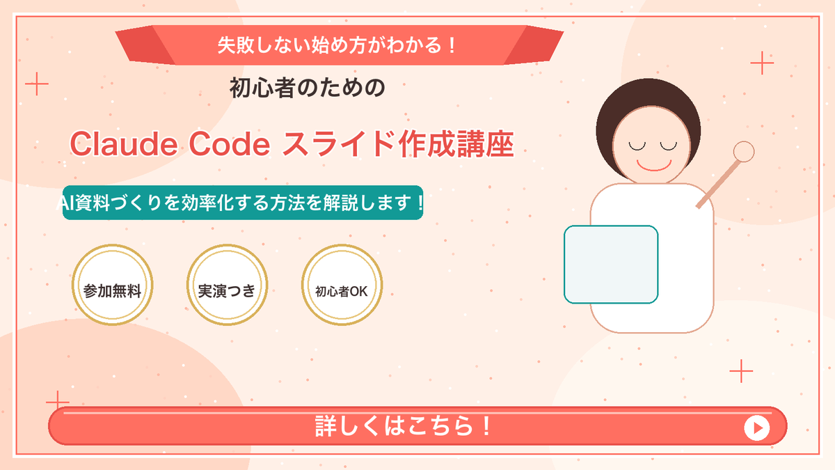
Full Prompt
Goal: Create a Japanese webinar/lesson announcement slide in a cute, simple “Marcy-style” presentation design for {argument name="course topic" default="Claude Code slide creation course"}. Canvas: 16:9 horizontal slide, 1200×675 px, warm cream-peach background with soft abstract circular blobs in pale peach and off-white. Add a thin coral-red rectangular border inset about 20 px from the edge. Layout: Center-left text-heavy composition with a simple mascot illustration on the right. At the top center, place a wide coral-red folded ribbon banner with angled darker red folded ends. Below it, stack the main headline and subheadline. Place three circular badges in a row under the subheadline. Along the bottom, add one large rounded coral-red call-to-action bar spanning almost the full width. Text content: Use Japanese text exactly as follows. Top ribbon text: {argument name="top ribbon text" default="失敗しない始め方がわかる!"}. Small centered heading below ribbon: {argument name="audience line" default="初心者のための"}. Large main title in coral-red with white outline/drop shadow: {argument name="main title" default="Claude Code スライド作成講座"}. Teal rounded label below title: {argument name="supporting line" default="AI資料づくりを効率化する方法を解説します!"}. Three badge labels, exactly 3 badges from left to right: 「参加無料」, 「実演つき」, 「初心者OK」. Bottom CTA text: 「詳しくはこちら!」 in large bold white letters. Add a white circular play button at the right end of the CTA bar with a small coral-red triangle inside. Subject details: On the right side, draw one minimalist female presenter mascot with a round face, closed eyes, simple smile, short dark-brown bob hair, peach outline, and a white body. Her right arm is raised diagonally holding a small circular pointer. In front of her torso, place one pale blue rounded rectangle laptop/tablet with teal outline. Decorative elements: Add exactly 4 thin coral plus signs: one near the upper-left edge, one near the upper-right area, one near the lower-left area above the CTA, and one near the lower-right area. Scatter many tiny coral and white dots across the background like confetti, keeping them subtle and not text-like. Visual style: Flat vector illustration, soft pastel colors, clean Japanese slide design, friendly educational seminar aesthetic. Coral red, teal, cream, gold, and dark brown palette. Use bold rounded sans-serif Japanese typography. Keep all text crisp and centered/aligned like a polished promotional slide. Constraints: Include exactly 3 circular badges, exactly 1 mascot, exactly 1 CTA bar, exactly 1 play icon, and exactly 4 plus-sign decorations. Do not add logos, watermarks, extra characters, extra badges, QR codes, or additional text.