Case Media
Case Notes
This page keeps the media, full prompt, and original source together so you can inspect the result first and decide whether the prompt is worth copying, saving, or comparing.
Case Insights
To make this page easier to search, cite, and reuse later, the case is also broken down into practical guidance about usage, visual cues, and prompt structure.
Best Fit Scenarios
- Use this as a character design benchmark when you need a fast style baseline before rewriting your own prompt.
- It is especially helpful if your target overlaps with Poster, Illustration, Character and you want to judge the image result before tuning wording.
- Keep it as a control sample when you compare nearby prompt variants one variable at a time.
Visual Signals To Notice
- The clearest style signals here are Poster, Illustration, Character, so those should usually stay in your first rewrite.
- Look at silhouette, costume language, mood styling, and whether the character reads clearly at a glance.
- This case keeps 2 media outputs, which makes it easier to check whether the style remains stable across multiple results.
How The Prompt Is Structured
- The prompt reads as a long, highly specified prompt, which is useful when you want to judge how much specificity this direction needs.
- Its keyword cluster is centered on Poster, Illustration, Character, so you can usually keep that cluster while swapping subject, camera, layout, or copy details.
- A practical rewrite path is: keep the outcome, keep the strongest style cues, then replace only the subject and environment blocks.
Good Follow-up Questions
- What changes first if you keep Poster, Illustration, Character but switch the subject matter?
- Which part of the result comes from section-level structure (Character Design) versus tag-level style cues?
- Which related cases in the same section give you a cleaner or more extreme variation of the same direction?
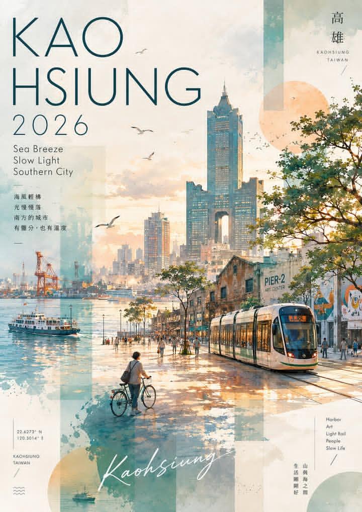
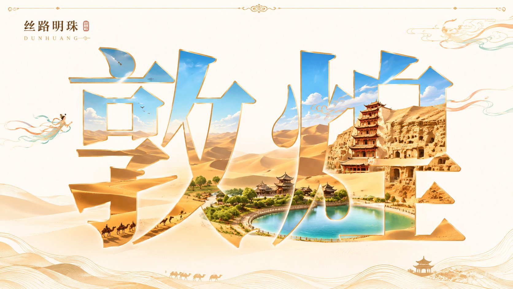
Full Prompt
Generate a 16:9 horizontal city visual poster themed 'Dunhuang'. The main body of the image is a set of large Chinese characters for the city name, with a clear, upright, and elegant font using a Chinese character mask/cutout/transparent window effect. Do not turn the text into 3D architectural letters or deform the strokes. First, generate a unified, continuous, and complete long scroll of the city landscape, then use the entire set of Chinese characters as a mask to crop this landscape. Regardless of how many characters the city name has, all characters must collectively display the same main city scene, rather than each character having an independent scene. The main landmark should appear only once, with unified perspective, light source, and color. A small amount of line-drawing decorations or auxiliary elements matching the city's temperament can be added around the text, but must be restrained. The overall color is bright and clear with moderate to high saturation, a clean background, and a high-end commercial illustration poster texture. From a distance, it is the city name; up close, a city is hidden within the name. No collage feel, no gray tones, no watermarks. City Name: Dunhuang