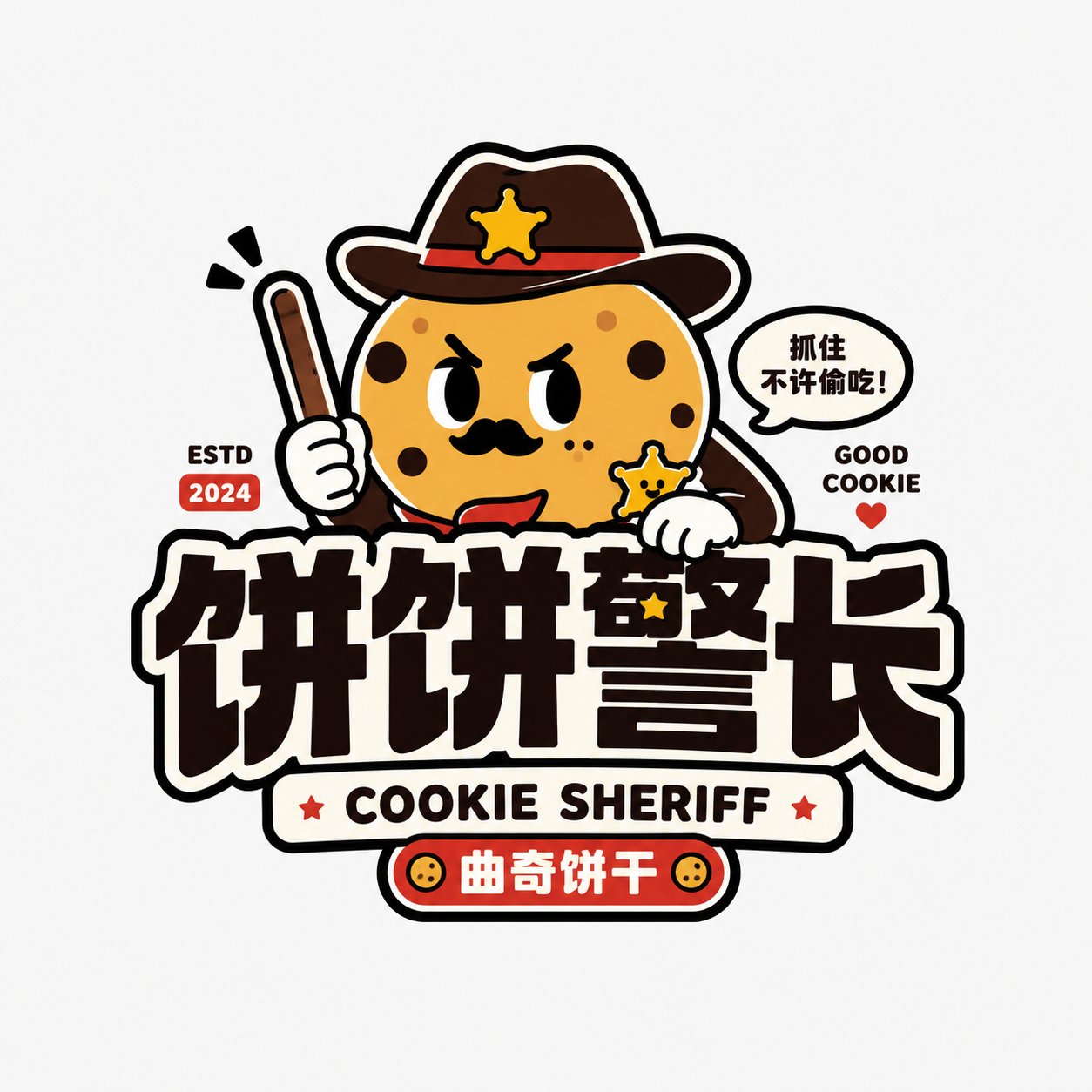
Case Media
Case Notes
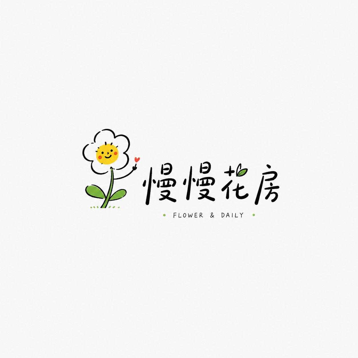
This page keeps the media, full prompt, and original source together so you can inspect the result first and decide whether the prompt is worth copying, saving, or comparing.
Case Insights
To make this page easier to search, cite, and reuse later, the case is also broken down into practical guidance about usage, visual cues, and prompt structure.
Best Fit Scenarios
- Use this as a character design benchmark when you need a fast style baseline before rewriting your own prompt.
- It is especially helpful if your target overlaps with Poster, Illustration, Character and you want to judge the image result before tuning wording.
- Keep it as a control sample when you compare nearby prompt variants one variable at a time.
Visual Signals To Notice
- The clearest style signals here are Poster, Illustration, Character, so those should usually stay in your first rewrite.
- Look at silhouette, costume language, mood styling, and whether the character reads clearly at a glance.
- This case keeps 2 media outputs, which makes it easier to check whether the style remains stable across multiple results.
How The Prompt Is Structured
- The prompt reads as a long, highly specified prompt, which is useful when you want to judge how much specificity this direction needs.
- Its keyword cluster is centered on Poster, Illustration, Character, so you can usually keep that cluster while swapping subject, camera, layout, or copy details.
- A practical rewrite path is: keep the outcome, keep the strongest style cues, then replace only the subject and environment blocks.
Good Follow-up Questions
- What changes first if you keep Poster, Illustration, Character but switch the subject matter?
- Which part of the result comes from section-level structure (Character Design) versus tag-level style cues?
- Which related cases in the same section give you a cleaner or more extreme variation of the same direction?
Full Prompt
Please design a high-completion 'Healing Hand-drawn Playful Wordmark Logo' based on the user-entered [Brand Name / Project Name] [Subtitle / Product Name] [Type / Industry] [Brand Positioning] [Core Image] [Character / Graphic Setting] [Emotional Temperament] [Main Color] [Secondary Color] [Aspect Ratio]. [User Input] Brand Name / Project Name: [Brand Name / Project Name] Subtitle / Product Name: [Subtitle / Product Name] Type / Industry: [Coffee / Bread / Floral / Bookstore / Grocery / B&B / Travel / Cultural and Creative / Home / Selection Store / Children's Brand / Lifestyle Brand, etc.] Brand Positioning: [Brand Positioning] Core Image: [Flower / Bird / Cat / Cloud / Sun / Bread / Book / Hand / Little Monster / Cup / Balloon / Home Small Items, etc.] Character / Graphic Setting: [A light hand-drawn small character / small object / small graphic / anthropomorphic image] Emotional Temperament: [Healing, relaxed, gentle, cute, dazing, humorous, slightly romantic, light and quirky, sense of life, etc.] Main Color: [Main Color] Secondary Color: [Secondary Color] Aspect Ratio: [Aspect Ratio] [Core Goal] The goal this time is to design a 'Healing Hand-drawn Playful Wordmark Logo'. It is not a heavy commercial brand badge, nor a high-saturation trendy toy IP, nor a complex cartoon illustration, but centered around a lightweight, memorable small hand-drawn graphic, paired with a relaxed brand wordmark and a small amount of English / small annotations, forming a lightweight Logo suitable for niche brands, shopkeepers' small stores, lifestyle brands, and cultural and creative brands. The final effect should be relaxed, clean, breathable, and likable, like a Logo that a real independent small shop or lifestyle brand can use directly. [Design Essence] The key to this type of Logo is not complexity, but emotion, cleverness, and affinity: 1. Establish the first memory point with a small hand-drawn image; 2. Establish brand recognition with a relaxed and natural wordmark; 3. Establish a sense of lightness with plenty of white space; 4. Establish warmth with a small amount of bright color accents; 5. Establish a hand-drawn feel with imperfect but controlled lines; 6. Overall convey a healing, relaxed, niche, and life-oriented brand tone. [Most Important Principles] 1. Graphics should be simple but must be clever; 2. Text should be relaxed and natural, not like typing directly with common system fonts; 3. The whole thing should have a Logo nature, not just an illustration; 4. There should be a lot of white space, do not fill the screen; 5. Color matching should be restrained, usually based on black lines, paired with 1-2 accent colors; 6. The style should be relaxed but not rough; 7. Not childish, not like children's graffiti, nor like common emojis; 8. It should have the aesthetic temperament of independent brands, small shops, and owner-operated brands. [Graphic / Character Requirements] Please design a light hand-drawn small graphic or character around the [Core Image]. Graphic requirements: 1. Simple outline, relaxed lines; 2. Does not pursue a precise vector feel, allows slight hand-drawn irregularities; 3. Expressions or movements must have memory points; 4. The graphic should not be too large and should not overwhelm the text; 5. Can have a bit of anthropomorphism, humor, or sense of life; 6. Do not draw as a complex illustration, do not make it into a heavy mascot. [Wordmark Requirements] 1. Brand Name / Project Name must be clearly readable; 2. The wordmark should have a light hand-written feel, a relaxed feel, and an independent shop feel; 3. Can be Chinese, English, or a mix of Chinese and English; 4. Letter spacing, size, and position can vary slightly to form a natural rhythm; 5. Small English words, Pinyin, small slogans, years, and symbols can be added; 6. Text cannot be too industrial, too serious, or too heavy; 7. Text should be designed together with the graphic, rather than just typed on later. [Composition Requirements] The overall composition should be light and breathable: 1. The graphic can be above the wordmark, beside it, interspersed within the text, or form a small interaction with the text; 2. Maintain a large amount of white space; 3. The main body should not be too full, avoid complex backgrounds; 4. A very small number of dots, short lines, arcs, small stars, and small handwritten annotations can be added; 5. The whole should be like an independent Logo, not a collection of posters or stickers. [Color Requirements] The overall color should be restrained, refreshing, and likable: 1. Usually based on black line art; 2. Paired with 1-2 small area accent colors; 3. Light yellow, sky blue, grass green, tomato red, light pink, orange, mint green, etc., can be used; 4. Accent colors should be small and precise, do not fill large areas; 5. Avoid heavy gradients, complex shadows, and high-saturation full-plate color matching; 6. Colors should be like a 'light tap' rather than forcibly creating impact. [Texture Requirements] 1. Lines have a hand-drawn feel; 2. Shapes are slightly naive but controllable; 3. Overall clean; 4. Can have a small amount of irregular strokes; 5. Not too precise, not too commercial template-like; 6. Not excessively rough or messy. [Style Keywords] Healing hand-drawn playful wordmark logo, Healing Hand-drawn Playful Wordmark Logo, relaxed hand-drawn graphic and text logo, independent shop logo, lifestyle brand logo, light hand-drawn, small image, childlike but not immature, healing, cute, relaxed, white space, small amount of accent colors, handwritten wordmark. [Acceptance Criteria] Please ensure the final result satisfies: 1. Simple but clever graphics; 2. Clearly readable brand name; 3. Overall hand-drawn relaxed feel; 4. Sufficient white space; 5. Restrained but memorable color matching; 6. Not childish, not messy, not commercial template-like; 7. Like a logo that real niche brands can use; 8. Possesses a healing, playful, and lifestyle temperament. [Output Requirements] Please finally output a high-completion 'Healing Hand-drawn Playful Wordmark Logo'. It must use a light hand-drawn graphic as the core identification, with a relaxed wordmark as the auxiliary structure, and form a refreshing, cute, healing, and life-oriented brand logo with a small amount of accent colors and a large amount of white space.