Case Media
Case Notes
This page keeps the media, full prompt, and original source together so you can inspect the result first and decide whether the prompt is worth copying, saving, or comparing.
Case Insights
To make this page easier to search, cite, and reuse later, the case is also broken down into practical guidance about usage, visual cues, and prompt structure.
Best Fit Scenarios
- Use this as a character design benchmark when you need a fast style baseline before rewriting your own prompt.
- It is especially helpful if your target overlaps with Portrait, Poster, Illustration and you want to judge the image result before tuning wording.
- Keep it as a control sample when you compare nearby prompt variants one variable at a time.
Visual Signals To Notice
- The clearest style signals here are Portrait, Poster, Illustration, so those should usually stay in your first rewrite.
- Look at silhouette, costume language, mood styling, and whether the character reads clearly at a glance.
- This case keeps 2 media outputs, which makes it easier to check whether the style remains stable across multiple results.
How The Prompt Is Structured
- The prompt reads as a long, highly specified prompt, which is useful when you want to judge how much specificity this direction needs.
- Its keyword cluster is centered on Portrait, Poster, Illustration, so you can usually keep that cluster while swapping subject, camera, layout, or copy details.
- A practical rewrite path is: keep the outcome, keep the strongest style cues, then replace only the subject and environment blocks.
Good Follow-up Questions
- What changes first if you keep Portrait, Poster, Illustration but switch the subject matter?
- Which part of the result comes from section-level structure (Character Design) versus tag-level style cues?
- Which related cases in the same section give you a cleaner or more extreme variation of the same direction?
Full Prompt
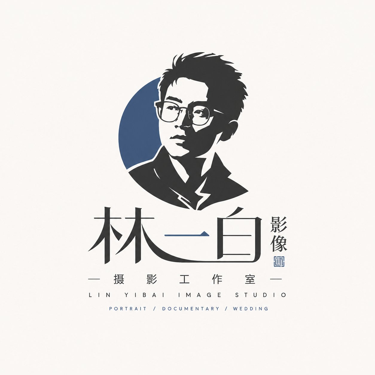
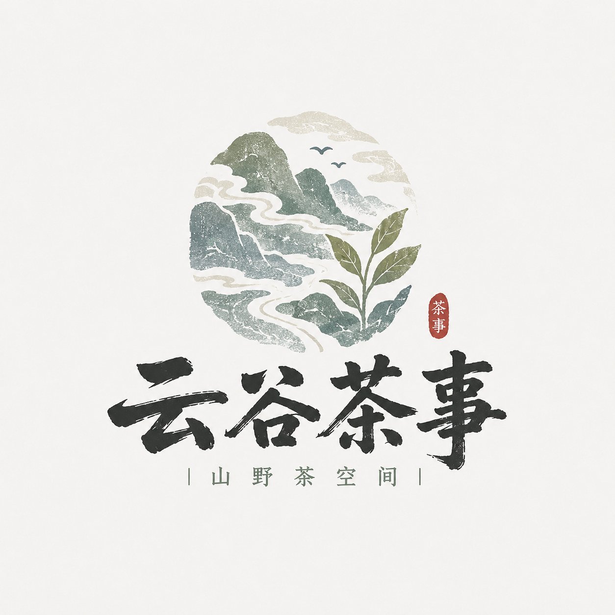
Please design a high-completion 'Local Craft Illustrated Wordmark Logo' based on user input for [Brand Name / Project Name] [Subtitle / Product Name] [Type / Industry] [Brand Positioning] [Core Keywords] [Core Graphics] [Terroir Info] [Emotional Vibe] [Main Color] [Accent Color] [Aspect Ratio]. [User Input] Brand Name / Project Name: [] Subtitle / Product Name: [] Type / Industry: [] Brand Positioning: [] Core Keywords: [] Core Graphics: [] Terroir Info: [] Emotional Vibe: [] Main Color: [] Accent Color: [] Aspect Ratio: [] [Core Goal] The design objective is a 'Local Craft Illustrated Wordmark Logo' that truly possesses a sense of place and handmade texture. [Design Essence] The focus of this type of logo is not to be 'explosive', but to be 'flavorful', 'local', and 'handmade'. Please complete the following integration: 1. Primary recognition via Chinese brand name; 2. Supplement terroir information with small graphics; 3. Establish mountain/food/craft vibe with low-saturation natural colors; 4. Enhance brand warmth with light woodcut, light printing, and light handmade texture; 5. Form a wordmark logo suitable for small shops, local brands, and cultural/creative brands. [Most Important Principles] 1. The Chinese brand name must be the protagonist, clear, recognizable, with a calligraphic or small shop signage feel; 2. Graphics should be small and precise, used to express place information, food attributes, or craft characteristics; 3. Do not make it a large commercial badge or a heavy national-trend catering trademark; 4. Do not make it a high-saturation trendy cartoon; 5. Do not just write text, and do not just draw images, it must be a fusion of 'Text + Image'; 6. It must have a handmade and rustic feel, but cannot be roughly out of control; 7. Must retain a natural, quiet, and authentic brand temperament; 8. Must avoid directly copying the specific mountain shape, composition, figures, borders, or symbol combinations of any ready-made brand or reference image; only borrow style methods, not specific patterns. [Font / Wordmark Requirements] 1. Chinese brand name as the main body; 2. Wordmark should have a handwritten feel, brush stroke feel, folk signage feel, small shop writing feel, or light woodcut feel; 3. Can be slightly naive, rustic, or folk-art style, but must be clearly readable; 4. Do not make it a modern corporate sans-serif font, nor too geometric; 5. Do not make it overly explosive wild cursive calligraphy; 6. Needs to look like 'a name grown from this local brand itself', rather than a stiffly applied font. [Graphic System Requirements] Please design small illustrated elements around [Core Graphics] and [Terroir Info]. Graphics can include but are not limited to: - Mountains, water, clouds, bridges, fields, ancient roads, villages, doors and windows, arches; - Tea leaves, rice grains, wine jars, stone mills, tofu, bowls, chopsticks, steam, noodles; - Birds, branches, foliage, small beasts, rural animals; - Craftsmen, handmade scenes, printmaking-style small figures; - Local patterns, seals, small labels. Graphic Requirements: 1. Graphics should assist brand recognition, not overshadow it; 2. Graphics should be simple, informative, and have a local feel; 3. Graphics can be hand-drawn, woodcut, print, or printing-feel oriented; 4. Do not make it complex realistic illustration; 5. Graphics must have a clear relationship with the industry and brand temperament; 6. Do not make it identical to the specific patterns, mountain shapes, figure postures, or door/window styles in reference images; perform clear reorganization and innovation in element selection and compositional relationships. [Composition Requirements] Choose a suitable composition method according to the brand type: 1. Mountain & Terroir Type: Chinese wordmark + small landscape graphic + white space; 2. Handmade Food Type: Chinese wordmark + food/utensil graphic + small subtitle; 3. Printmaking Craft Type: Chinese wordmark + craftsman/woodcut frame small image + vertical small text; 4. Terroir Artifact Type: Chinese wordmark + symbolic object like wine jar/stone mill/tea ware/door view. [Color Requirements] Overall color scheme is mainly low saturation, natural, and rustic. Requirements: 1. Number of colors should not be too many; suggest 2~5 main colors; 2. Colors should resemble natural objects, old prints, ingredients, or handmade materials; 3. Do not use overly fluorescent, gorgeous, or trendy high-saturation colors; 4. Red can only be used as a small accent, not overused. [Texture Requirements] Please moderately express: 1. Light woodcut feel; 2. Light printmaking feel; 3. Light printing graininess; 4. Light paper texture feel; 5. Hand-drawn edge feel; 6. Handmade warmth feel. [Auxiliary Element Requirements] Small auxiliary information can be added: - Small subtitle - Small seal - Small dots - Small slogan - Origin / Handmade / Craftsmanship explanation - Pinyin or English minimal support But must be restrained; the focus remains on the Logo body. [Visual Presentation Requirements] 1. This is an independent Logo display image, not a poster; 2. Background clean; light gray-white, beige, or paper white suggested; 3. Logo body clear, complete, and centered; 4. Overall look like a mature small brand main mark; 5. Suitable for packaging, storefront, cup stickers, labels, social media avatars, and brand main images. [Style Keywords] Local Craft Illustrated Wordmark Logo, Local Craft Illustrated Wordmark Logo, sense of place, small shop vibe, mountain terroir, handmade eatery, printmaking craftsman, natural color scheme, text-image fusion, Chinese written wordmark, light printing feel, folk art temperament, cultural/creative small shop brand. [Acceptance Criteria] Ensure the final result satisfies: 1. Brand name readable at a glance; 2. Sense of place or food/craft attribute felt at a glance; 3. Small shop brand feel, not large corporate trademark feel; 4. Natural combination of text and image; 5. Natural and pleasing color scheme; 6. Unified style but not overly imitating reference images; 7. Can stand as a real brand logo. [Output Requirement] Please finally output a high-completion 'Local Craft Illustrated Wordmark Logo'. It must take the Chinese brand name as the core, combined with terroir graphics, natural colors, and light handmade printing texture, to form a small shop-style mark that has local flavor, brand recognition, and can be used in reality.