Case Media
Case Notes
This page keeps the media, full prompt, and original source together so you can inspect the result first and decide whether the prompt is worth copying, saving, or comparing.
Case Insights
To make this page easier to search, cite, and reuse later, the case is also broken down into practical guidance about usage, visual cues, and prompt structure.
Best Fit Scenarios
- Use this as a character design benchmark when you need a fast style baseline before rewriting your own prompt.
- It is especially helpful if your target overlaps with 35mm, Illustration, Character and you want to judge the image result before tuning wording.
- Keep it as a control sample when you compare nearby prompt variants one variable at a time.
Visual Signals To Notice
- The clearest style signals here are 35mm, Illustration, Character, so those should usually stay in your first rewrite.
- Look at silhouette, costume language, mood styling, and whether the character reads clearly at a glance.
- This case keeps one primary output, so the first image should be treated as the main visual reference.
How The Prompt Is Structured
- The prompt reads as a long, highly specified prompt, which is useful when you want to judge how much specificity this direction needs.
- Its keyword cluster is centered on 35mm, Illustration, Character, so you can usually keep that cluster while swapping subject, camera, layout, or copy details.
- A practical rewrite path is: keep the outcome, keep the strongest style cues, then replace only the subject and environment blocks.
Good Follow-up Questions
- What changes first if you keep 35mm, Illustration, Character but switch the subject matter?
- Which part of the result comes from section-level structure (Character Design) versus tag-level style cues?
- Which related cases in the same section give you a cleaner or more extreme variation of the same direction?
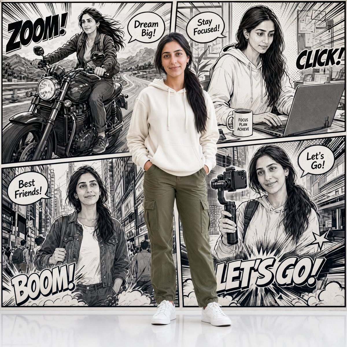
Full Prompt
A real photograph of a {argument name="subject appearance" default="young woman standing confidently in the center, wearing a casual outfit — white sneakers, olive cargo pants, and a cream hoodie"}. She has a warm smile and straight hair tied in a low ponytail. Behind her is a full-page comic panel background in black and white ink art style, divided into multiple panels showing her illustrated alter-ego in different scenes: riding a motorcycle on an open highway, working at a desk with a laptop and coffee mug, walking through a busy city street, and filming content with a camera gimbal. Each panel has bold comic sound effects like 'ZOOM!', 'CLICK!', 'BOOM!', 'LET'S GO!' in stylized bold typography, all in English. Speech bubbles with English phrases like 'Dream Big!', 'Stay Focused!', and 'Best Friends!' scattered across panels. Speed lines, halftone dots, and dramatic comic shading fill the background. The overall image blends realistic photography with comic book illustration seamlessly, clean white studio floor reflection visible at the bottom.