案例媒体
案例说明
这个页面把案例媒体、完整 Prompt 和出处放在一起,方便你先看结果,再判断这条 Prompt 是否值得复制、收藏或加入对比。
案例解读
为了方便搜索、引用和后续复用,这里会把案例的适用场景、画面重点和 Prompt 结构拆成更容易浏览的说明。
这类案例适合用在什么场景
- 把它当作 UI 与社交媒体截图 的基准案例最合适,先看成片方向,再决定自己的 Prompt 要往哪边改。
- 如果你的目标也落在 霓虹、海报、UI 这些方向,这条案例特别适合先看图判断风格,再回头微调描述。
- 做 Prompt 对比时,也很适合作为控制组,只改一个变量去看结果变化。
画面重点与风格信号
- 这条案例最明显的风格信号集中在 霓虹、海报、UI,所以第一次改写时最好先保留这些关键词。
- 这类案例更值得先看界面密度、卡片层级,以及屏幕内容有没有先于文字讲清故事。
- 当前只有一张主图,所以第一张结果图就是最核心的参考基准。
Prompt 结构可以怎么理解
- 这条 Prompt 整体属于一条比较长、约束条件很多的 Prompt,很适合拿来判断这类方向到底需要写到多细。
- 关键词簇主要围绕 霓虹、海报、UI 展开,所以复用时可以先保留这组风格词,再替换主体、镜头、环境或文案信息。
- 最稳的改写方式通常是先保留结果方向和最强风格信号,只替换主体设定与场景块。
如果你是带着问题来的,可以先看这些角度
- 如果保留 霓虹、海报、UI,只换主体题材,结果最先变化的会是哪一部分?
- 这条结果里,哪些特征更像是 UI 与社交媒体截图 的结构特征,哪些又是标签风格本身带来的?
- 同分类的相关案例里,哪几条能给你更克制或更极致的相邻变体?
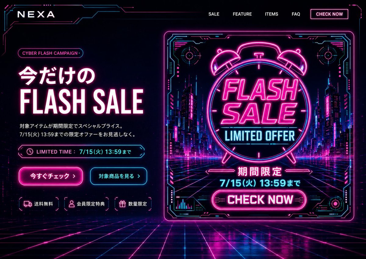
完整 Prompt
Goal: Create a cyberpunk e-commerce desktop first-view landing page for {argument name="brand name" default="NEXA"}, promoting a limited-time {argument name="campaign name" default="CYBER FLASH CAMPAIGN"} in a neon futuristic style. Canvas: Wide 16:9 website hero screen, dark black/navy background, full-bleed cyber grid floor receding in perspective, glowing magenta and cyan circuitry framing the edges. High contrast, glossy reflections, electric neon bloom, futuristic HUD aesthetic. Layout: Top navigation bar with the brand logo on the left and exactly 5 navigation items on the right: “SALE”, “FEATURE”, “ITEMS”, “FAQ”, and a bordered neon button “CHECK NOW”. The hero section is split into two columns: left text-and-CTA area, right large promotional banner graphic. Left hero content: Add a small rounded pill label reading {argument name="campaign name" default="CYBER FLASH CAMPAIGN"}. Main headline in Japanese and English: “今だけの” above huge bold “FLASH SALE”, white letters with hot-pink glow. Below it, two short Japanese description lines: “対象アイテムが期間限定でスペシャルプライス。” and “7/15(火) 13:59までの限定オファーをお見逃しなく。” Add a neon outlined limited-time bar with a clock icon and text “LIMITED TIME : 7/15(火) 13:59まで”. Beneath are exactly 2 CTA buttons: a hot-pink filled glowing button “今すぐチェック ›” and a cyan outlined button “対象商品を見る ›”. At the bottom of the left column, show exactly 3 small benefit chips with icons: truck icon “送料無料”, user icon “会員限定特典”, gift icon “数量限定”. Right promotional graphic: A large square/near-square neon poster card with a glowing magenta border and cyan HUD corner details, set slightly right of center. Inside the card, show a futuristic city street at night with skyscrapers, magenta/cyan lights, and a perspective grid road. Center a large neon alarm clock outline containing bold stacked text “FLASH SALE” and cyan text “LIMITED OFFER”. Below it, add Japanese “期間限定”, then the deadline {argument name="deadline text" default="7/15(火) 13:59まで"}, then a bright magenta rounded button “CHECK NOW”. Include small decorative HUD charts, circular targets, circuit marks, and arrows around the poster, but keep all text legible. Visual style: Use black, deep navy, hot magenta, electric cyan, and white. Typography should be bold condensed sans-serif for English sale text, clean modern Japanese sans-serif for Japanese copy. Add strong neon glows, thin circuit-line borders, chromatic highlights, and polished reflections on the grid floor. Constraints: Desktop website first-view only, no browser chrome, no people, no extra product images, no watermark. Keep the exact visible counts: 5 navigation items, 2 CTA buttons, 3 benefit chips, and 1 large right-side sale poster. Make the composition feel like a finished PC landing page hero based on a banner design.