案例媒体
案例说明
这个页面把案例媒体、完整 Prompt 和出处放在一起,方便你先看结果,再判断这条 Prompt 是否值得复制、收藏或加入对比。
案例解读
为了方便搜索、引用和后续复用,这里会把案例的适用场景、画面重点和 Prompt 结构拆成更容易浏览的说明。
这类案例适合用在什么场景
- 把它当作 UI 与社交媒体截图 的基准案例最合适,先看成片方向,再决定自己的 Prompt 要往哪边改。
- 如果你的目标也落在 霓虹、电影感、海报 这些方向,这条案例特别适合先看图判断风格,再回头微调描述。
- 做 Prompt 对比时,也很适合作为控制组,只改一个变量去看结果变化。
画面重点与风格信号
- 这条案例最明显的风格信号集中在 霓虹、电影感、海报,所以第一次改写时最好先保留这些关键词。
- 这类案例更值得先看界面密度、卡片层级,以及屏幕内容有没有先于文字讲清故事。
- 当前只有一张主图,所以第一张结果图就是最核心的参考基准。
Prompt 结构可以怎么理解
- 这条 Prompt 整体属于一条比较长、约束条件很多的 Prompt,很适合拿来判断这类方向到底需要写到多细。
- 关键词簇主要围绕 霓虹、电影感、海报 展开,所以复用时可以先保留这组风格词,再替换主体、镜头、环境或文案信息。
- 最稳的改写方式通常是先保留结果方向和最强风格信号,只替换主体设定与场景块。
如果你是带着问题来的,可以先看这些角度
- 如果保留 霓虹、电影感、海报,只换主体题材,结果最先变化的会是哪一部分?
- 这条结果里,哪些特征更像是 UI 与社交媒体截图 的结构特征,哪些又是标签风格本身带来的?
- 同分类的相关案例里,哪几条能给你更克制或更极致的相邻变体?
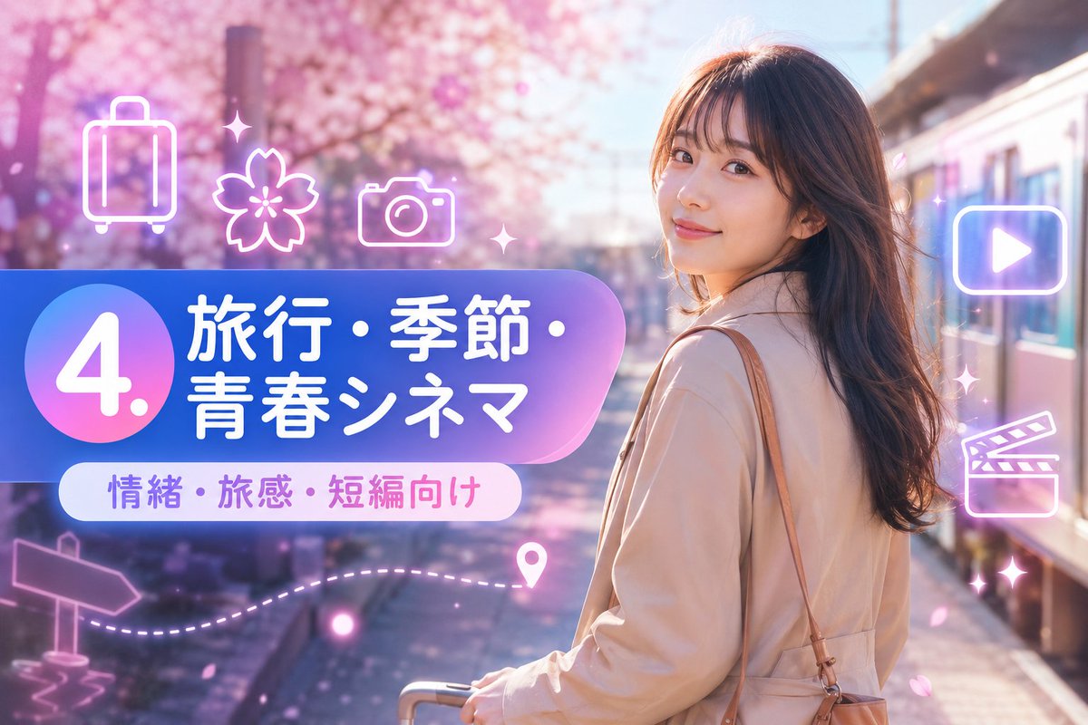
完整 Prompt
Goal: Create a vibrant Japanese travel-video title card for a short-form prompt collection, combining a cinematic spring travel photo background with glossy neon UI graphics. Canvas: Horizontal 16:9 image, 1152×768 feel, high-resolution, bright pastel color grading, soft bloom and lens flare. Background: A young woman traveler stands on the right side at a train platform beside a modern train, viewed from behind/three-quarter back, face intentionally obscured by a plain skin-tone rectangular blur. She has long wavy dark brown hair, wears a light beige trench coat, carries a tan shoulder bag, and holds the handle of a small rolling suitcase near the bottom center. The setting is a dreamy cherry-blossom station in spring, with pink sakura trees filling the left and upper background, scattered falling petals, warm sunlight, and shallow depth of field. Main graphic layout: Place a large rounded gradient banner across the left-center, extending toward the woman. The banner uses a blue-to-purple-to-pink translucent glossy gradient with a large circular badge on the far left. Inside the circle, display a huge white number {argument name="section number" default="4."}. To the right of the circle, set bold rounded Japanese headline text in white: {argument name="headline text" default="旅行・季節・青春シネマ"}. Below it, add a smaller white rounded pill label with purple-pink text: {argument name="subtitle text" default="情緒・旅感・短編向け"}. Visible text count: exactly 3 text elements: 1 large number badge reading "4.", 1 main Japanese headline reading "旅行・季節・青春シネマ", and 1 subtitle pill reading "情緒・旅感・短編向け". Neon icon overlay count: exactly 9 glowing white-pink line icons and decorative elements around the banner and right side: 1 suitcase icon at upper left, 1 cherry blossom icon near upper center-left, 1 camera icon above the banner, 1 play button icon inside a rounded rectangle on the upper right, 1 clapperboard icon on the mid-right, 1 signpost arrow icon at lower left, 1 dotted travel path sweeping along the lower left-to-center, 1 map pin near the end of the dotted path, and 2 small sparkle/star accents near the top center and right side. Keep all icons semi-transparent, neon outlined, and softly glowing. Style: Japanese social-media thumbnail design, cute travel aesthetic, glossy gradient panels, soft pink and lavender atmosphere, cinematic bokeh, dreamy sakura petals, clean rounded typography, bright white text with subtle glow, polished promotional-card composition. Constraints: Keep the woman on the right and the graphic title block on the left, do not add extra text, do not add logos or watermarks, keep the face covered by a simple rectangular blur, and maintain a cheerful spring travel mood.