案例媒体
案例说明
这个页面把案例媒体、完整 Prompt 和出处放在一起,方便你先看结果,再判断这条 Prompt 是否值得复制、收藏或加入对比。
案例解读
为了方便搜索、引用和后续复用,这里会把案例的适用场景、画面重点和 Prompt 结构拆成更容易浏览的说明。
这类案例适合用在什么场景
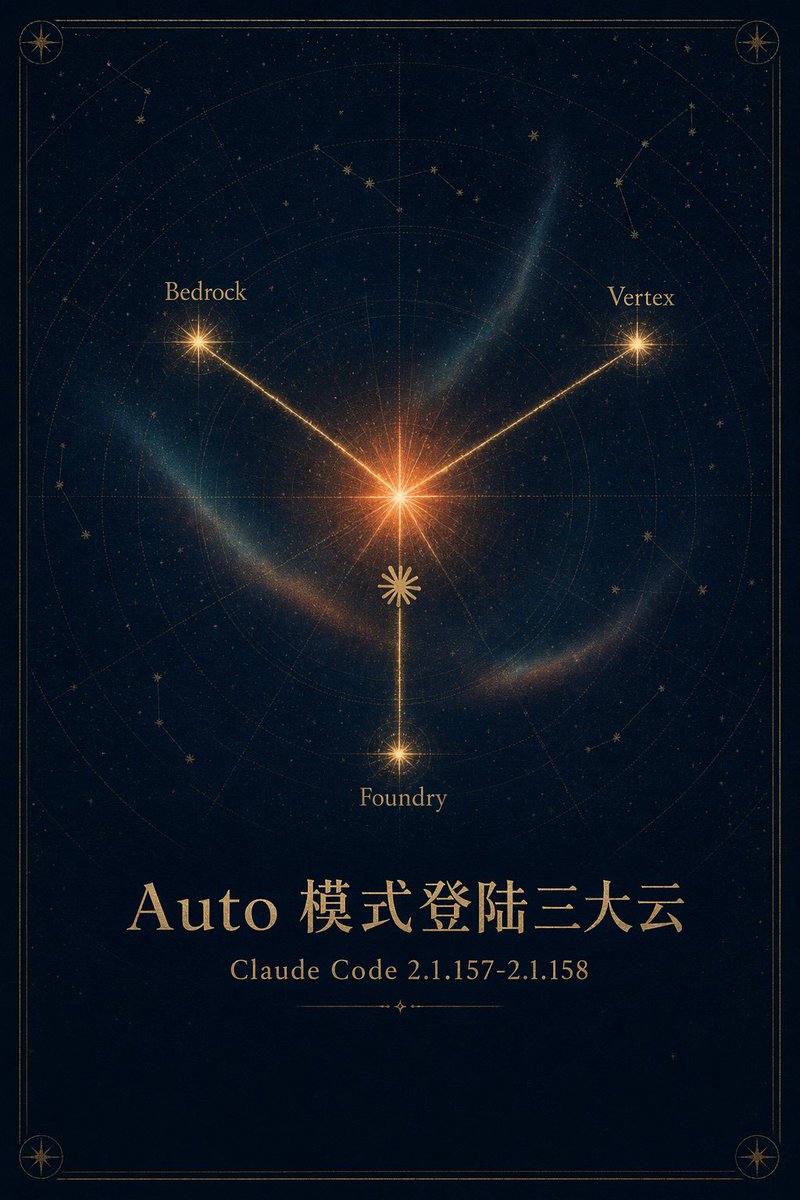
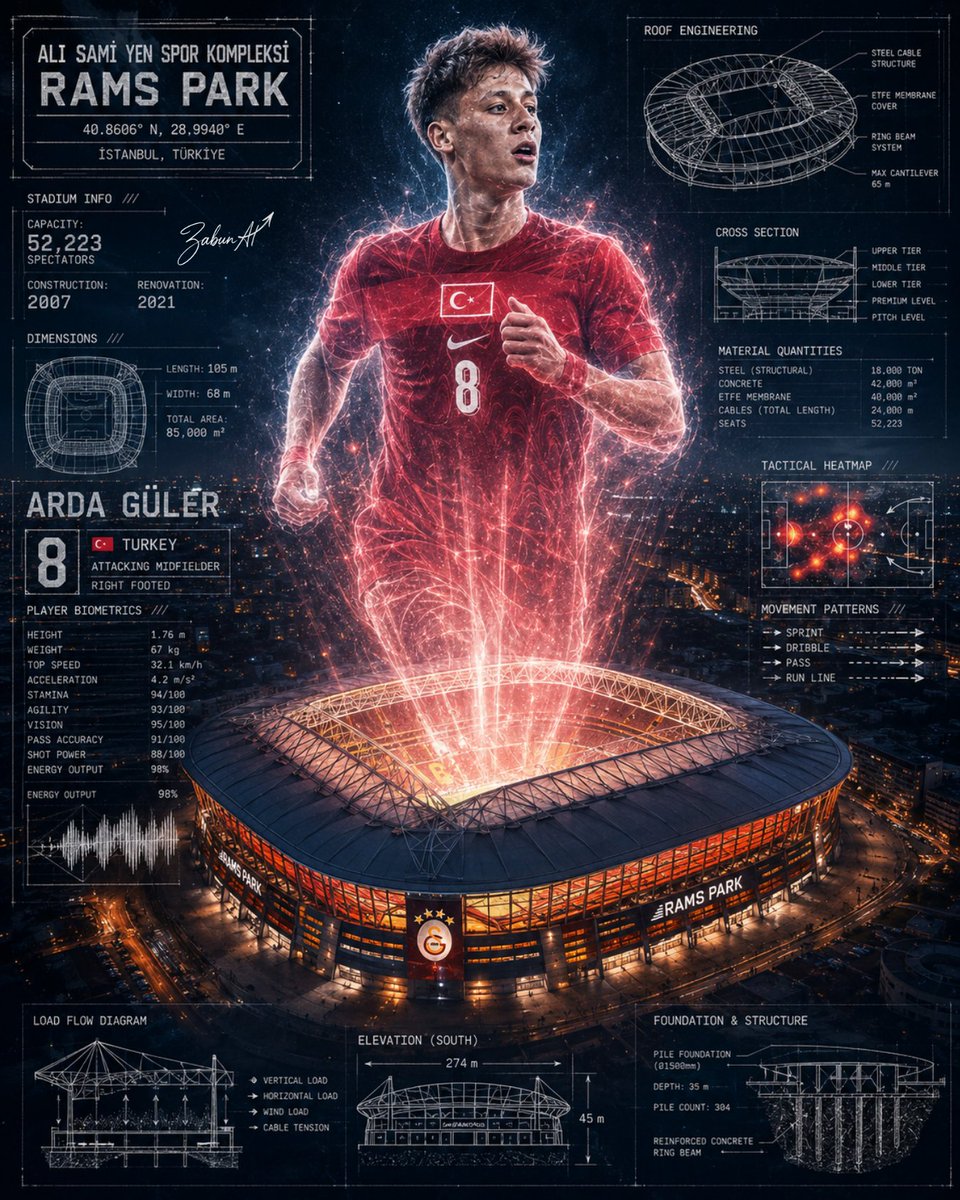
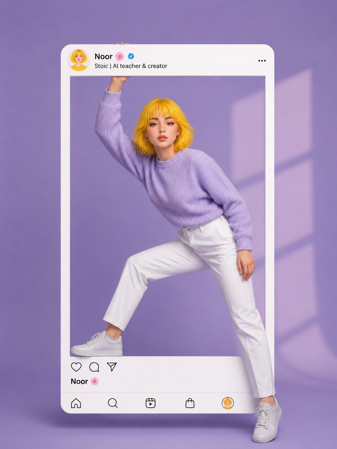
- 把它当作 UI 与社交媒体截图 的基准案例最合适,先看成片方向,再决定自己的 Prompt 要往哪边改。
- 如果你的目标也落在 电影感、海报、UI 这些方向,这条案例特别适合先看图判断风格,再回头微调描述。
- 做 Prompt 对比时,也很适合作为控制组,只改一个变量去看结果变化。
画面重点与风格信号
- 这条案例最明显的风格信号集中在 电影感、海报、UI,所以第一次改写时最好先保留这些关键词。
- 这类案例更值得先看界面密度、卡片层级,以及屏幕内容有没有先于文字讲清故事。
- 当前保留了 2 份媒体输出,适合顺手观察同一方向在多张结果里的稳定性。
Prompt 结构可以怎么理解
- 这条 Prompt 整体属于一条比较长、约束条件很多的 Prompt,很适合拿来判断这类方向到底需要写到多细。
- 关键词簇主要围绕 电影感、海报、UI 展开,所以复用时可以先保留这组风格词,再替换主体、镜头、环境或文案信息。
- 最稳的改写方式通常是先保留结果方向和最强风格信号,只替换主体设定与场景块。
如果你是带着问题来的,可以先看这些角度
- 如果保留 电影感、海报、UI,只换主体题材,结果最先变化的会是哪一部分?
- 这条结果里,哪些特征更像是 UI 与社交媒体截图 的结构特征,哪些又是标签风格本身带来的?
- 同分类的相关案例里,哪几条能给你更克制或更极致的相邻变体?
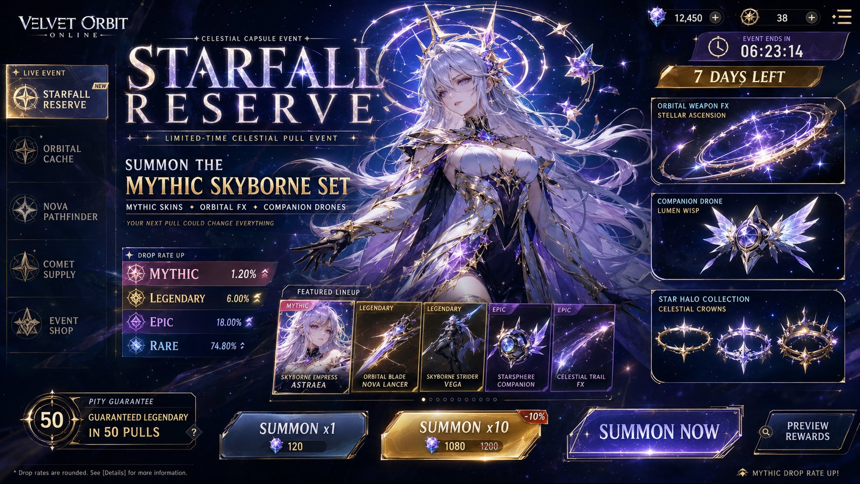
完整 Prompt
Create a premium, highly believable Lootbox / Capsule Drop Ad for an imaginary game, platform, or collectible system called [DROP NAME]. The goal is to make the drop feel addictive, valuable, visually irresistible, and immediately legible as a limited capsule release that players or collectors would obsess over. It should feel like an official monetized event, gacha banner, blind-box campaign, or capsule collection ad with strong rarity tension and hype. Drop details: - Drop name: [DROP NAME] - Drop type: [LOOTBOX / GACHA BANNER / BLIND BOX / CAPSULE DROP / MYSTERY PACK / EVENT BUNDLE / SUMMON BANNER] - Platform / game / universe: [WHERE IT EXISTS] - Core concept: [WHAT THIS DROP CONTAINS] - Main fantasy: [WHAT PEOPLE HOPE TO PULL / UNLOCK / OWN] - Audience: [AUDIENCE] - Tone: [HYPE / LUXURY / CHAOTIC / EPIC / CUTE / MYSTERIOUS / PRESTIGE / ELECTRIC] - Cultural vibe: [GENSHIN-LIKE / MOBILE GACHA / STREETWEAR DROP / POP MART / ESPORTS SHOP / ANIME COLLECTIBLE / Y2K GAMECORE / PRESTIGE DIGITAL GOODS] - Reality level: [BELIEVABLE LIVE GAME / BELIEVABLE COLLECTIBLE DROP / STYLIZED BUT REAL / DEADPAN FICTIONAL] Ad structure: Build the visual like an official drop or summon campaign. Include sections such as: - drop title - hero item, skin, or featured pull - rarity tiers - pull pool or featured lineup - odds cues or rarity signals - event duration - optional price or currency - optional “limited time” banner - optional guaranteed reward note - optional event iconography or pack art - optional “open now” or “summon” CTA For the copy, include: - one strong drop headline - 1 to 3 support lines - short hype language that feels native to game or collector culture - a balance between urgency, desirability, and system clarity - wording that feels official, not generic Include: - a strong drop title treatment - premium rarity hierarchy - visually distinct featured items - believable monetization cues - strong event timing / scarcity signals - polished platform-native UI language - clear value fantasy - instantly shareable collector-hype energy Visual direction: - Make the ad feel like a real live event people would spend money on immediately - Emphasize rarity, exclusivity, emotional pull, and shiny desirability - Balance commercial monetization design with polished visual worldbuilding - Make it suitable for social launch posts, in-game store banners, event promo art, or collectible-culture content - The result should look like a genuine limited-time drop from a successful platform or game Art direction: - Style: [MOBILE GACHA BANNER / PREMIUM COLLECTIBLE DROP AD / ANIME SUMMON SCREEN / ARCADE CAPSULE POSTER / DIGITAL SHOP CAMPAIGN / HYPEBEAST TOY DROP] - Color palette: [PALETTE] - Typography feel: [BOLD HYPE SANS / CLEAN GAME UI / PREMIUM DROP TYPE / ANIME EVENT DISPLAY / COLLECTOR LABELING] - Material feel: [IN-GAME SHOP BANNER / MOBILE EVENT SCREEN / DIGITAL DROP POSTER / CAPSULE TOY CAMPAIGN / STORE PANEL] - Lighting or image mood: [GLOWING / ELECTRIC / CINEMATIC / CANDY-POP / DARK PRESTIGE / LOOT REVEAL SHINE] - Background: [UI SPACE / STARFIELD / CAPSULE MACHINE / SUMMON VOID / EVENT STAGE / DIGITAL STOREBACK] Composition: - Show the ad as one cohesive drop-campaign image - Make the featured reward, rarity tiers, and event timing instantly readable - Use real shop-banner hierarchy and monetization logic - Make the drop feel tempting, limited, and systemically believable - Make the final output feel like a premium fake loot-drop ad with viral potential Output quality: - ultra-detailed - visually structured - commercially believable - culturally fluent - polished drop-system styling - strong hierarchy and spacing - premium event-banner composition - instantly shareable visual concept Optional content blocks: - pity / guarantee note - drop odds strip - event countdown - in-game currency icon - capsule art - “new exclusive” label - season marker - collaboration badge - preview carousel - CTA button Avoid: - generic reward icons - weak rarity logic - fake-looking monetization cues - cluttered banner design - random typography choices - amateur event aesthetics - too much copy fighting the featured item - obvious parody unless intentionally chosen