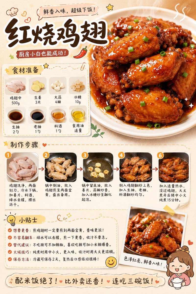
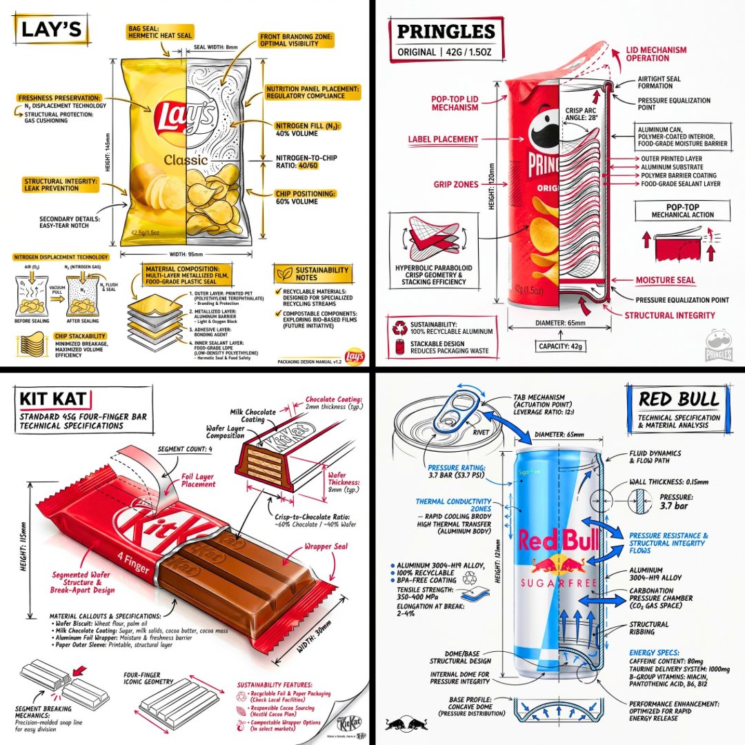
案例媒体
案例说明
这个页面把案例媒体、完整 Prompt 和出处放在一起,方便你先看结果,再判断这条 Prompt 是否值得复制、收藏或加入对比。
案例解读
为了方便搜索、引用和后续复用,这里会把案例的适用场景、画面重点和 Prompt 结构拆成更容易浏览的说明。
这类案例适合用在什么场景
- 把它当作 UI 与社交媒体截图 的基准案例最合适,先看成片方向,再决定自己的 Prompt 要往哪边改。
- 如果你的目标也落在 插画、UI、截图 这些方向,这条案例特别适合先看图判断风格,再回头微调描述。
- 做 Prompt 对比时,也很适合作为控制组,只改一个变量去看结果变化。
画面重点与风格信号
- 这条案例最明显的风格信号集中在 插画、UI、截图,所以第一次改写时最好先保留这些关键词。
- 这类案例更值得先看界面密度、卡片层级,以及屏幕内容有没有先于文字讲清故事。
- 当前保留了 2 份媒体输出,适合顺手观察同一方向在多张结果里的稳定性。
Prompt 结构可以怎么理解
- 这条 Prompt 整体属于一条比较长、约束条件很多的 Prompt,很适合拿来判断这类方向到底需要写到多细。
- 关键词簇主要围绕 插画、UI、截图 展开,所以复用时可以先保留这组风格词,再替换主体、镜头、环境或文案信息。
- 最稳的改写方式通常是先保留结果方向和最强风格信号,只替换主体设定与场景块。
如果你是带着问题来的,可以先看这些角度
- 如果保留 插画、UI、截图,只换主体题材,结果最先变化的会是哪一部分?
- 这条结果里,哪些特征更像是 UI 与社交媒体截图 的结构特征,哪些又是标签风格本身带来的?
- 同分类的相关案例里,哪几条能给你更克制或更极致的相邻变体?
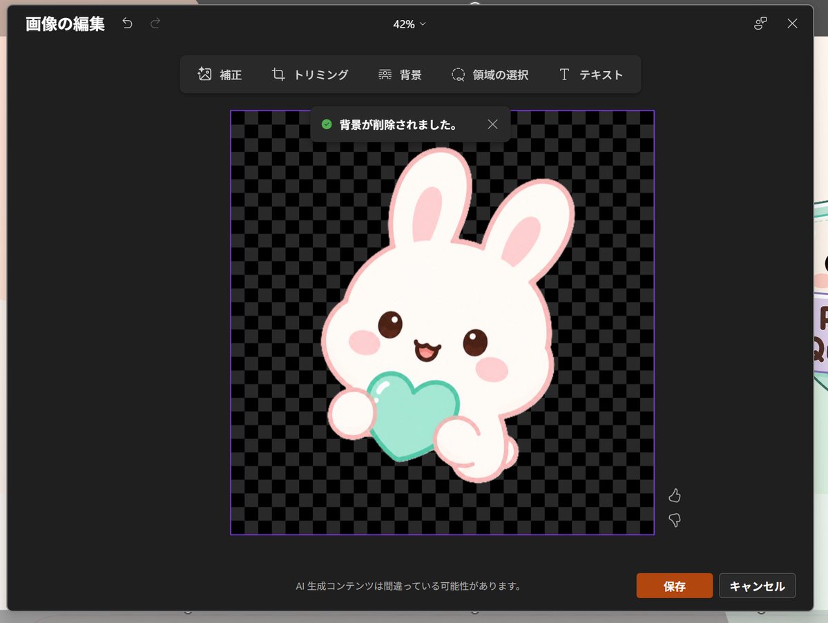
完整 Prompt
Goal: Create a realistic screenshot of a dark-themed PowerPoint-style image editing window in Japanese, showing a cute dreamy kawaii icon after background removal. Canvas: 1024×768 landscape screenshot with a dark charcoal modal editor centered on screen, rounded corners, subtle shadow, and a faint glimpse of the underlying slide behind the modal edges. The interface zoom indicator at the top center reads “42%”. Layout: At the top left, show the Japanese title “画像の編集” with two small undo/redo arrow icons. At the top right, show a small connected-dots icon and an X close icon. Below the top bar, center a floating toolbar with exactly 6 tools labeled: “補正”, “トリミング”, “背景”, “領域の選択”, “テキスト”, plus their small simple line icons, arranged horizontally in dark rounded rectangles. Main editing area: In the center, place a square image area outlined with a thin purple border. Inside it, use a black and dark-gray checkerboard transparency pattern. Near the top of this square, show a dark notification toast with a green check icon and the Japanese text “背景が削除されました。” plus a small X close icon. Subject details: Center the icon inside the checkerboard square: one pastel yume-kawaii white rabbit mascot with a thick pale pink outline, oversized rounded head, two long upright ears with pink inner ears, small brown glossy eyes, pink oval blush cheeks, and a happy open mouth. The bunny holds exactly 1 mint-aqua heart-shaped object in front of its body with two rounded paws visible. Add soft highlights on the heart and a clean sticker-like vector style with no harsh shadows. The character should feel like a cute app icon or sticker. Use {argument name="character" default="a white kawaii rabbit"}, {argument name="held object" default="a mint-aqua heart"}, and {argument name="accent color" default="pale pink"}. Footer and controls: At the bottom center of the modal, show the small Japanese warning text “AI 生成コンテンツは間違っている可能性があります。” At the bottom right, show exactly 2 buttons: an orange “保存” button and a dark gray “キャンセル” button. Near the right side of the image area, include exactly 2 small vertical feedback icons: thumbs up above thumbs down. Visual style: Realistic software screenshot, crisp UI text, dark Microsoft-style interface, clean Japanese typography, transparent-background checkerboard, cute pastel sticker art. Keep the composition faithful to a PowerPoint built-in image editor after background removal, not a standalone illustration.