案例媒体
案例说明
这个页面把案例媒体、完整 Prompt 和出处放在一起,方便你先看结果,再判断这条 Prompt 是否值得复制、收藏或加入对比。
案例解读
为了方便搜索、引用和后续复用,这里会把案例的适用场景、画面重点和 Prompt 结构拆成更容易浏览的说明。
这类案例适合用在什么场景
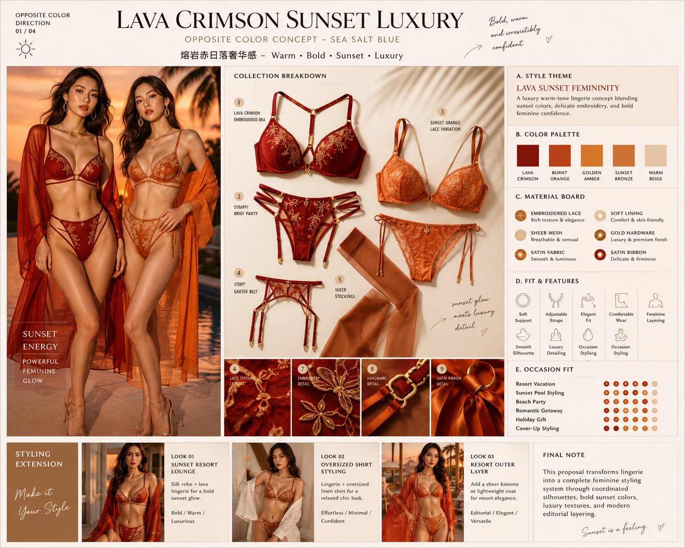
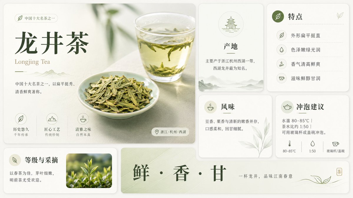
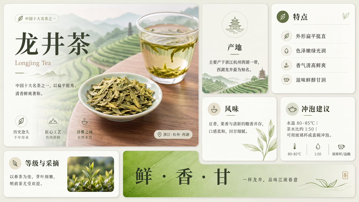
- 把它当作 UI 与社交媒体截图 的基准案例最合适,先看成片方向,再决定自己的 Prompt 要往哪边改。
- 如果你的目标也落在 时尚、海报、UI 这些方向,这条案例特别适合先看图判断风格,再回头微调描述。
- 做 Prompt 对比时,也很适合作为控制组,只改一个变量去看结果变化。
画面重点与风格信号
- 这条案例最明显的风格信号集中在 时尚、海报、UI,所以第一次改写时最好先保留这些关键词。
- 这类案例更值得先看界面密度、卡片层级,以及屏幕内容有没有先于文字讲清故事。
- 当前保留了 2 份媒体输出,适合顺手观察同一方向在多张结果里的稳定性。
Prompt 结构可以怎么理解
- 这条 Prompt 整体属于一条比较长、约束条件很多的 Prompt,很适合拿来判断这类方向到底需要写到多细。
- 关键词簇主要围绕 时尚、海报、UI 展开,所以复用时可以先保留这组风格词,再替换主体、镜头、环境或文案信息。
- 最稳的改写方式通常是先保留结果方向和最强风格信号,只替换主体设定与场景块。
如果你是带着问题来的,可以先看这些角度
- 如果保留 时尚、海报、UI,只换主体题材,结果最先变化的会是哪一部分?
- 这条结果里,哪些特征更像是 UI 与社交媒体截图 的结构特征,哪些又是标签风格本身带来的?
- 同分类的相关案例里,哪几条能给你更克制或更极致的相邻变体?
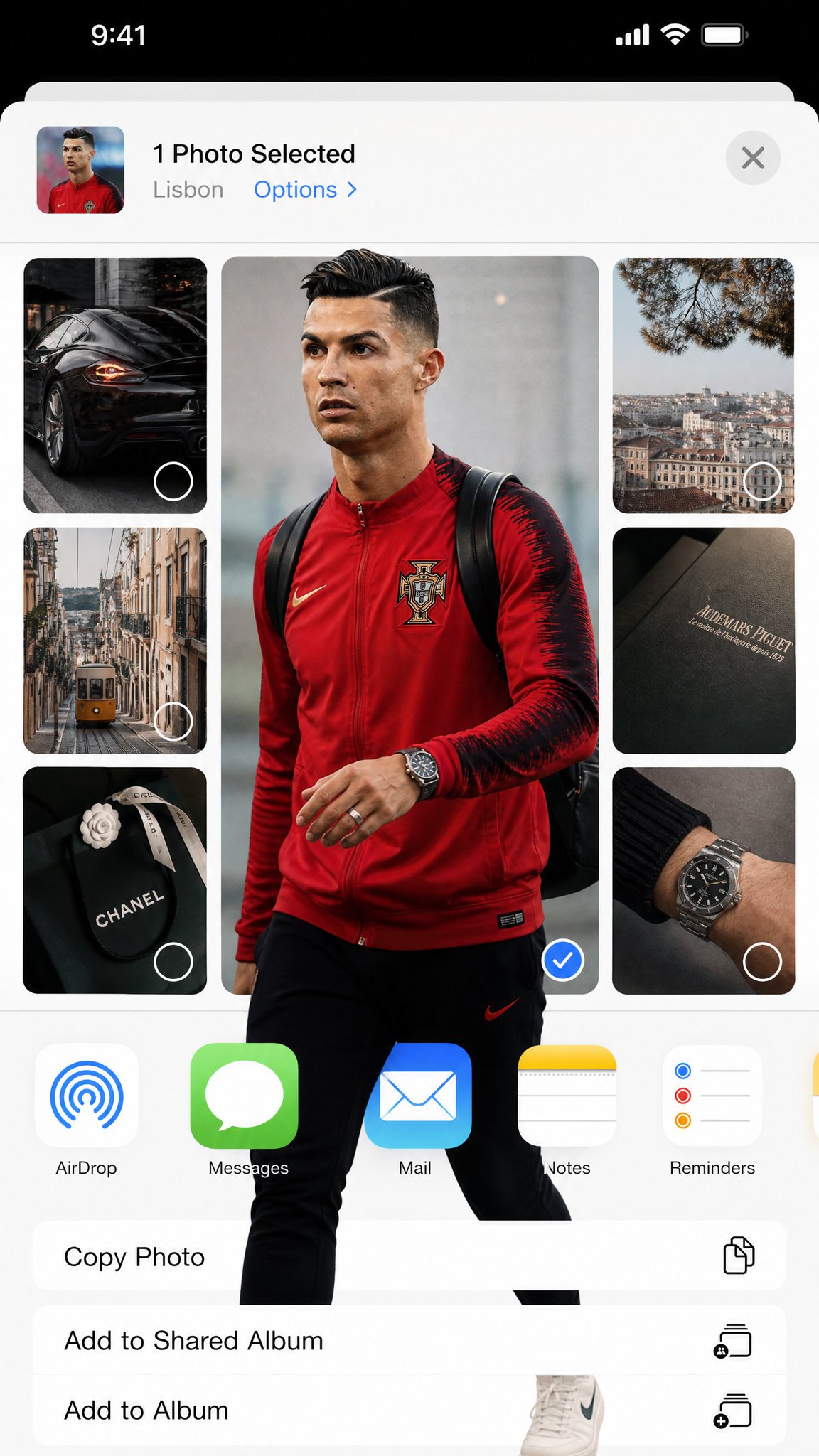
完整 Prompt
Transform the uploaded image into a highly stylized iOS photo-selection interface collage while keeping ALL original iPhone / iOS system elements completely unchanged, authentic, and photorealistic. 4:5 ratio The final image must look EXACTLY like a real screenshot captured from an actual iPhone while selecting or sharing photos inside Instagram Stories, iOS Photos, or the native Share Sheet. EXTREMELY IMPORTANT: - Preserve the real iOS interface design exactly. - Keep authentic Apple UI proportions, spacing, typography, icons, buttons, status bar, battery, signal, dynamic island, navigation layout, AirDrop icon, and app icons unchanged. - DO NOT redesign the operating system. - DO NOT create a futuristic UI. - DO NOT invent fake app elements. - It must feel indistinguishable from a genuine iPhone screenshot. MAIN VISUAL STYLE: - Editorial fashion collage - Pinterest / Are .na / luxury moodboard aesthetic - Rounded rectangle image cards - Minimal luxury lifestyle feeling - Neutral beige / gray / soft white palette - Soft daylight - Realistic shadows - Subtle grain and phone screenshot compression - Spacious clean layout - Elegant asymmetrical composition VERY IMPORTANT — FRAME BREAK EFFECT: The subject MUST physically break outside the image frame boundaries. The “out of frame” effect should feel dimensional and realistic: - legs extending beyond the rounded photo card - shoes overlapping the white UI background - hands, bags, hair, jackets, or clothing protruding outside the crop - layered overlap between neighboring image cards - depth illusion as if the subject exists above the interface This effect is mandatory. The overlap must look natural, realistic, and integrated with the iOS interface — NOT like a sticker pasted on top. COMPOSITION: - One large dominant central image - Several smaller supporting images around it - Rounded corners everywhere - Authentic iOS share-sheet layout - Realistic mobile screenshot proportions - Large white negative space - Editorial balance - Clean modern composition VISUAL MOOD: - luxury editorial photography - casual European street fashion - curated lifestyle archive - minimalist tech aesthetic - polished but organic LIGHTING: - soft daylight - muted contrast - realistic reflections - subtle shadows - natural depth DO NOT: - distort iOS UI - replace Apple fonts - create fantasy interface elements - flatten the collage - make it look like a poster - remove the realism of the screenshot The final result should feel like: “A real iPhone screenshot of an ultra-stylish editorial photo-selection interface where the subject physically escapes the image frames.”