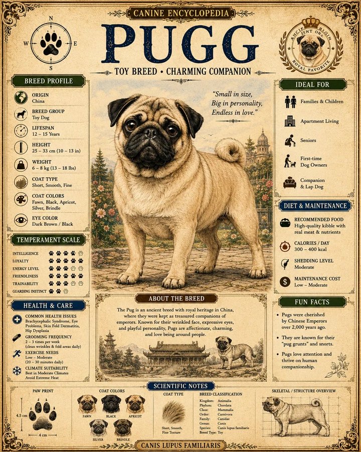
案例媒体
案例说明
这个页面把案例媒体、完整 Prompt 和出处放在一起,方便你先看结果,再判断这条 Prompt 是否值得复制、收藏或加入对比。
案例解读
为了方便搜索、引用和后续复用,这里会把案例的适用场景、画面重点和 Prompt 结构拆成更容易浏览的说明。
这类案例适合用在什么场景
- 把它当作 UI 与社交媒体截图 的基准案例最合适,先看成片方向,再决定自己的 Prompt 要往哪边改。
- 如果你的目标也落在 海报、插画、UI 这些方向,这条案例特别适合先看图判断风格,再回头微调描述。
- 做 Prompt 对比时,也很适合作为控制组,只改一个变量去看结果变化。
画面重点与风格信号
- 这条案例最明显的风格信号集中在 海报、插画、UI,所以第一次改写时最好先保留这些关键词。
- 这类案例更值得先看界面密度、卡片层级,以及屏幕内容有没有先于文字讲清故事。
- 当前只有一张主图,所以第一张结果图就是最核心的参考基准。
Prompt 结构可以怎么理解
- 这条 Prompt 整体属于一条比较长、约束条件很多的 Prompt,很适合拿来判断这类方向到底需要写到多细。
- 关键词簇主要围绕 海报、插画、UI 展开,所以复用时可以先保留这组风格词,再替换主体、镜头、环境或文案信息。
- 最稳的改写方式通常是先保留结果方向和最强风格信号,只替换主体设定与场景块。
如果你是带着问题来的,可以先看这些角度
- 如果保留 海报、插画、UI,只换主体题材,结果最先变化的会是哪一部分?
- 这条结果里,哪些特征更像是 UI 与社交媒体截图 的结构特征,哪些又是标签风格本身带来的?
- 同分类的相关案例里,哪几条能给你更克制或更极致的相邻变体?
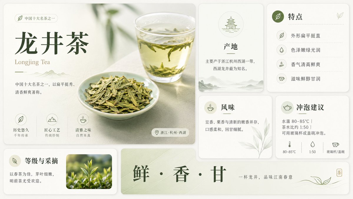
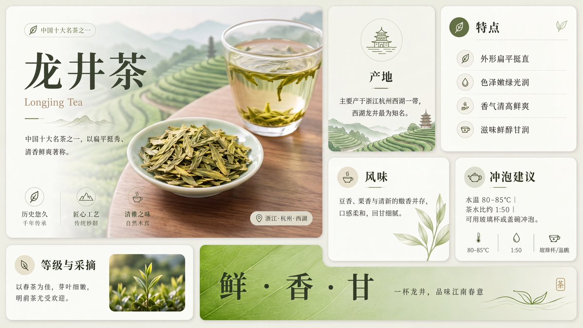
完整 Prompt
Using the provided reference image, redraw and upscale it into a cleaner, sharper, more polished version while preserving the same overall infographic layout, all original text content, and the Longjing tea theme. Keep the product title {argument name="tea name" default="龙井茶"} and the English subtitle {argument name="English tea name" default="Longjing Tea"} unchanged. Goal: Make the image look less like a rough GPT-generated graphic by removing broken, noisy, meaningless textures and replacing them with crisp, intentional detail. Enhancements to apply: Increase resolution and clarity; sharpen typography, icons, borders, tea leaves, glass, and card edges; make the lighting softer and more natural; improve material realism for the tea, cup, dried leaves, and ceramic dish; clean up any fuzzy or fragmented artifacts. Meaningful detail additions: In the main hero panel, replace the vague pale background with a refined scenic tea plantation landscape of layered green terraces, misty mountains, and a wooden tabletop beneath the tea cup and plate. In the origin card, add a small matching tea-terrace landscape illustration at the bottom. Make the bottom green banner more vivid with a natural leaf-vein texture. Layout constraints: Preserve exactly 7 visible content panels/sections: the large hero panel, origin card, features card, flavor card, brewing suggestion card, grade-and-picking card, and bottom slogan banner. Preserve exactly 4 feature rows in the features card, exactly 3 small icon benefits in the hero panel, and exactly 3 brewing parameter icons along the bottom of the brewing card. Do not add extra sections, extra labels, watermarks, logos, or decorative clutter. Style: Elegant Chinese tea brochure design, cream-and-sage palette, refined minimal UI cards, soft shadows, crisp vector-like icons, realistic tea photography elements, calm premium product-advertising finish.